The team behind chrome has put a great deal of effort in making chrome one of the most developer friendly browsers in the market. Some may disagree, but anyone who uses chrome as their primary dev and testing platform will agree with this point. When I started out as a web dev back in 2015, I thought that chrome devtools was just for visualizing the DOM tree and for finding out JS errors using the console, but after using it for a while I realized that it is more than that.
Alright, enough babbling and lets have a look at 5 cool things you can do with chrome devtools which will make you the cool kid in the block.
1) Your Project work-space
I am a huge fan of VS Code and I can't really imagine carrying out my development without setting up vs code in the first place. The hard reality is that you will not have access to fancy editors all the time. Sometimes when you have to put up a simple but vital web project and if you are left with no code editors, then you needn't worry. Chrome devtools provide an option to map your project folder into it and use devtools as a minimalist version of a code editor.
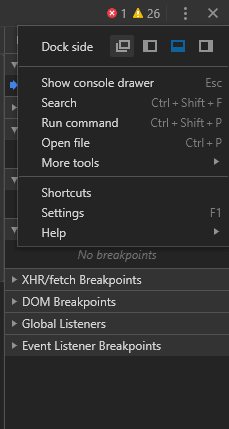
This will be more convenient if you "un-dock" devtools to a separate window,
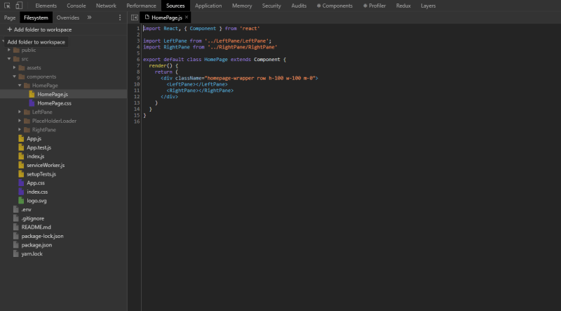
Navigate to the Sources tab and it will initially show the "Page" based sources, and for adding your project folder to use devtools as a work-space, you have to switch to the "File System" tab from the Page tab.
Now you can hop on to any folder in your work-space and get things done. This will really come in handy for showing web demos on-the-go and for getting things done when you are trying to put up a small project.
2) Testing Responsiveness
Making a website responsive is a whole new level of challenge. Of course, there are frameworks to do the heavy lifting for you, but it often takes a lot of time to perfect your project based on the factor of responsiveness.
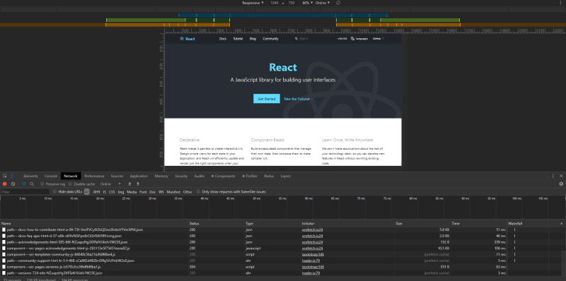
I used to test my responsiveness back in the days by resizing my browser window and I believe some of you still do this to test how the elements get rearranged when the viewport dimension changes. While this is a simple way to test responsiveness, if you wish to have more freedom in testing the responsive behavior of your web page, then chrome comes with a builtin Device toggle mode which emulates your web page into the chosen viewport dimension which makes testing and troubleshooting a much simpler process.
After opening devtools, you either have to press "Ctrl + Shift + M" or just click on the "Toggle device" icon to get into the multi device mode. From here on, you can set your web page to fit into a set of standard mobile device viewport to see how it looks or you can go set it to responsive mode and adjust the emulated display size to test the same with manually specified dimensions.
The most useful thing within this section is that the devtools can even show the available media queries respective to your page. You can cycle through them to see if the results are being rendered as expected.
3) Taking Full page screenshots
This is not a developer oriented feature, but it will be a good one to have in your toolkit and there may come a situation when this feature will save the day.
If you use the snipping tool from windows or the screenshot option from MacOS, then it will actually let you capture only the portion of the web page which is within the viewing area. What if you wish to capture the whole page as a screenshot? Well the devtools provides a single click option to do it
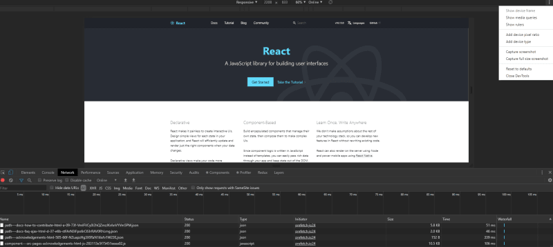
Remember the topic we covered atop this one. You have to open the device toggle mode for this and click on the options icon from the right hand side corner. This will open a popup menu from which you have to select the option "Capture full size screenshot". This will take a relative amount of time if the web page is a long one, but it will get the job done in just a click.
I have managed to capture a full size screenshot of the whole Wikipedia page of star wars and you can find the resultant image here
4) Playing around with CSS attributes
Setting CSS attributes for components and visualizing the effects in real time is often a cumbersome process. This is because, if the styling is not right then it involves a lot of switching back and forth between your editor and browser.
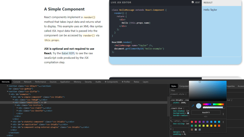
Chrome devtools offers a solution to solve this. The first step involves you setting up your work-space within chrome following the topic covered at the top of this article. Once this is done, you can simply inspect your live web page and try out CSS attributes on the go.
The devtools styling lets you try out colors, play with box-shadow attributes, transition timing functions and so on. As your work-space is now linked, after trying out the attributes, you need not go back to your editor and update the CSS file. As your work-space is now linked, all the changes you make from the devtools will be automatically synchronized with your CSS file.
5) The Quick command palette
You need a lot of hours to explore all the options the devtools offers within which you can complete the whole LOTR saga.
If you require some actions to be performed using the devtools, then it often requires you digging deep into a cluster of other options to pin point the one you actually need. During hard times like these is when the quick command palette will come for the rescue.
It can be opened by pressing the hotkey combo "Ctrl ( or cmd ) + Shift + P".
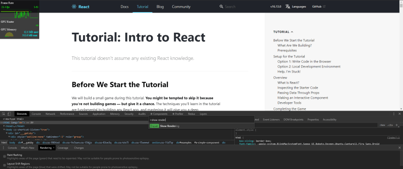
From the palette you can search for options you need just by typing in the phrase. For instance, lets say if you want to see the DOM render options, then all you need to do is just type in "show rendering" and pressing Enter. This will bring up all the rendering options to visualize the DOM renders in real time.
Not just this! Every feature the devtools hold is just a simple search and press away from within this palette.
These are some of the features of the chrome devtools which I find fascinating and useful as a web developer.





Top comments (1)
Thx some command I knew already, but there are some that will help me alot. Like the Screenshot functionality 😉