One of the biggest confusions in web design is caused by none other than the font-size property.
The most commonly used font sizes are the pixel(px), em and rem.
Alongside with this property, confusion is commonly caused by CSS Columns.
If you are interested in layout properties, check out this article about the property that is used often - position.
First, we will focus on the font size property.
In CSS, there are multiple units (such as pixel, em and rem) that can be used which can only cause the designer additional headache. In this article, we will clarify the usage of those units and any misconceptions.
PX Unit
The most common and popular unit is the pixel (px) one. Most people start with using the pixel(px) unit because it gives you a full control over the text size. If the font size is not specified, the default size for normal text, like a paragraph, is 16px.
The main problem with using pixel(px) units is that, unlike the em or rem unit, they are not scalable and making changes in the font size on different screen sizes can be challenging.
Also, the pixel(px) unit is not related to anything. So if you want to change the size of, for example, the entire page based on the screen size, you would have to change the font size of each element individually.
EM Unit
The em unit is a scalable font size unit. It is related to the font size of the parent container. One em (1em) is equal to the current font size. So for example, if the parent element has the font size of 16px than 1em is equal to 16px, 2em is equal to 32px and so on…
Making your design responsive becomes much easier if you use em units instead of px.
But, there is one thing that needs to be looked after. When using the em unit you should be careful with nesting.
For example, let's say you created a section and set its font size to 2em, Now, you want to add a paragraph within the section that has a font size of 1em. The paragraph's font size is related to the font size of the section. If the nesting continues, or if it is used on multiple segments of the project, you can quickly lose sight of what is relative to what, and get completely lost.
Now that we have an understanding of the em unit, it is the right time we introduce the rem unit.
REM Unit
The rem unit is another scalable font size, but unlike the em unit, it is related to the root element (HTML) instead of the parent element. That’s where the rem unit it got its name (root em = rem).
This means that, if you use the rem unit on elements, you can quickly change the font size of the entire project, just by adjusting the root font size. This way is fast, easy, and avoids any nesting complications you might get while using the em unit.
So, which unit should you use?
The best way to answer this question is by using an example.
First, we will use the px unit.
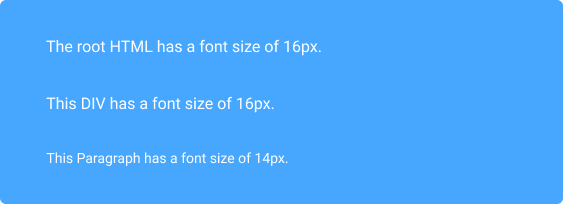
html { font-size: 100% } //usually this equals to 16px
div { Font-size: 16px; }
div>p { font-size: 14px; }
Here, you can notice that the font size is set in pixels(px) individually for each element, and they have no relation between each other.
Next, we’ll use the em unit for the same code segment.
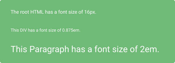
html { font-size: 100% }
div { Font-size: 0.875em; } //this equals to 14px
div>p { font-size: 2em; } // this equals to 28px
In this example, the difference between the px and em units is clear. The relativeness of the em unit is clear. Just by changing the font size of the container div, we can see that the paragraph font size updated accordingly.
Finally, using the rem unit.
html { font-size: 100% }
div { Font-size: 1rem; } //this equals to 16px
div>p { font-size: 1.5rem; } // this equals to 24px
When using the rem unit, it is clear that all font sizes are related to the root font size. Both div and the paragraph font sizes are related to the root, despite the div being the parent of the paragraph.
Conclusion
There are no right or wrong units. It all depends on your skill level, project type and size and personal preference.
If you would like to have complete control over the font size, the pixel unit is for you. If you would like a little bit more flexibility when manipulating the web page than the em or rem units are the best choices. Either way, the best result will be achieved when the units are fully understood.
We hope this article has helped and you learned something new today.
Check out other detailed articles related to CSS properties such as this one: CSS Positions, SASS and LESS Nesting.
Originally published at Kolosek blog.


Top comments (2)
Is there any clear fomula for relative values like: font-size: larger; or font-size: smaller; ? For example can I say: larger = +X% or smaller = -X% ? I am looking for the number of X?
Why deelopers are using larger and smaller? For example in this website: spanishclub.se/cheese they have several H2 in description section, they make the first one larger? is there any reason they do that?
It will be a good way to keep people calm and happy. It will also help them to build their own homes. This is because they can design the house they want, and then when it's finished, they can move in. I also think that this project will help everyone to have more job opportunities. Because if there are more houses being built, then it means more people who need jobs to help them and theaureview.com/books/top-10-books... to build these houses. So, I think that this project will be very successful in helping everyone to have more job opportunities.