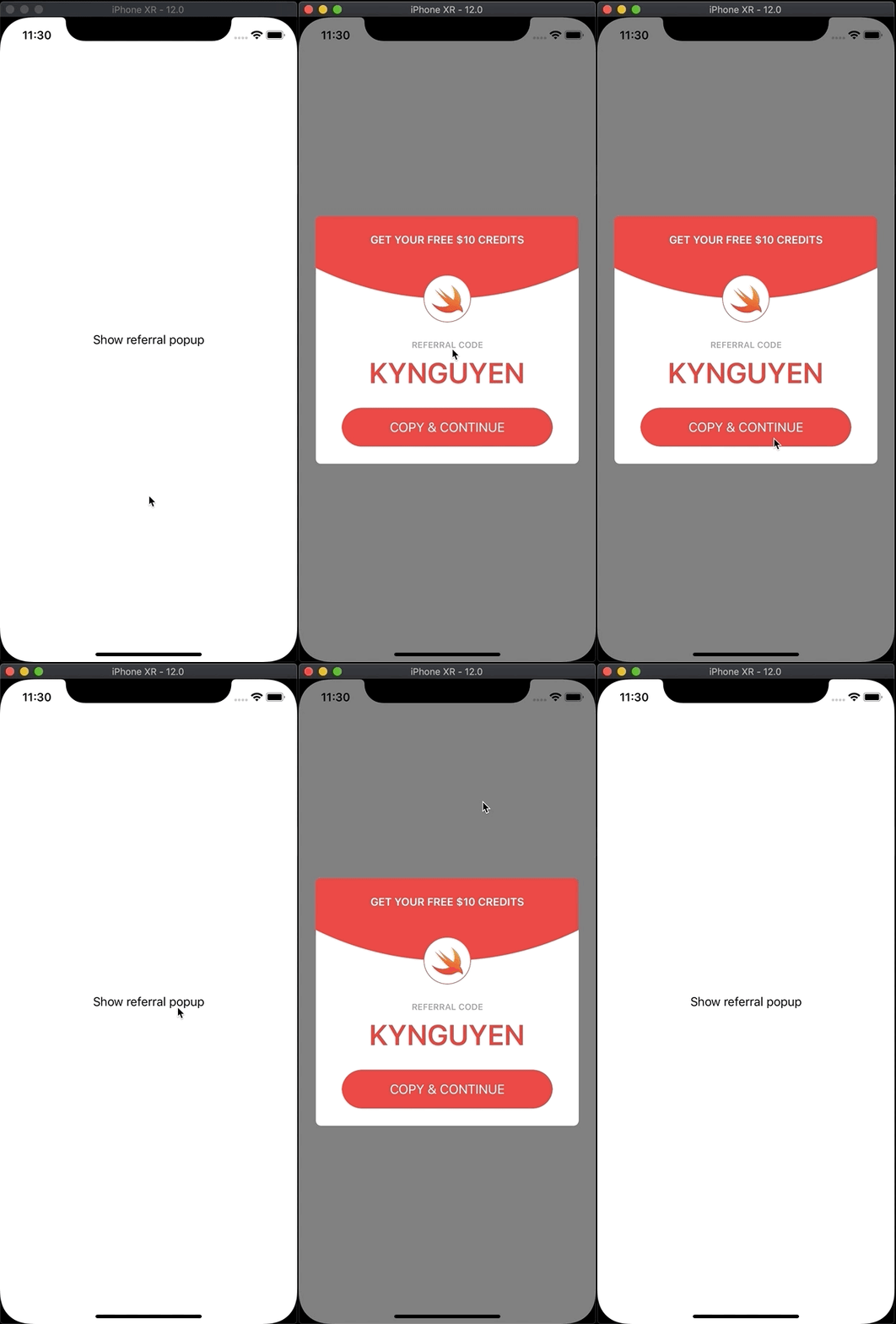
Popup is not the best choice to notify users. It takes the users’ attention, and need action to remove popup. Sometimes, popup is a good selection. It displays on the same view, not change eyesight.
Today, I will implement a popup, inspired by the design of Joseph Liu. Change something to make it simpler.
This is how it looks after coding.
Prepare project
- Create new
Single View Appproject - Add new file
ReferralPopup.swift
Define components
class ReferralPopup: knView {
    let blackView: UIButton = {
        let button = UIButton()
        button.translatesAutoresizingMaskIntoConstraints = false
        button.backgroundColor = UIColor.black.withAlphaComponent(0.5)
        return button
    }()
    let container: UIView = {
        let v = UIView()
        v.translatesAutoresizingMaskIntoConstraints = false
        v.backgroundColor = .white
        v.createRoundCorner(7)
        return v
    }()
    let okButton: UIButton = {
        let button = UIButton()
        button.translatesAutoresizingMaskIntoConstraints = false
        let color = UIColor.color(r: 241, g: 66, b: 70)
        button.backgroundColor = color
        button.setTitle("COPY & CONTINUE", for: .normal)
        button.backgroundColor = UIColor.color(r: 71, g: 204, b: 54)
        button.height(54)
        button.createRoundCorner(27)
        return button
    }()
}
blackViewis the transparent background cover the whole screen. We will dismiss the popup when it clicked. You can use UIView and add UIGestureRecognizer also.containeris the white background container. It’s the main view for popup.
Layout the container
The most important part is how to layout the container
override func setupView() {
    let color = UIColor.color(r: 241, g: 66, b: 70)

    let instruction = "GET YOUR FREE $10 CREDITS"
    let label = UIMaker.makeLabel(text: instruction,
                                  font: UIFont.boldSystemFont(ofSize: 15),
                                  color: .white,
                                  alignment: .center)

    let circle = UIMaker.makeView(background: color)
    let logo = UIMaker.makeImageView(image: UIImage(named: "swift"), contentMode: .scaleAspectFit)
    logo.backgroundColor = .white

    let codeTitle = UIMaker.makeLabel(text: "REFERRAL CODE",
                                      font: UIFont.boldSystemFont(ofSize: 12),
                                      color: UIColor.color(r: 155, g: 165, b: 172),
                                      alignment: .center)
    let codeLabel = UIMaker.makeLabel(text: "KYNGUYEN",
                                      font: UIFont.boldSystemFont(ofSize: 40),
                                      color: UIColor.color(r: 242, g: 64, b: 65),
                                      alignment: .center)


    container.addSubviews(views: circle, label, okButton, logo, codeTitle, codeLabel)

    // (1)
    label.top(toView: container, space: 24)
    label.horizontal(toView: container, space: 24)

    // (2)
    let edge: CGFloat = UIScreen.main.bounds.width * 2
    circle.square(edge: edge)
    circle.createRoundCorner(edge / 2)
    circle.centerX(toView: container)
    circle.bottom(toAnchor: logo.centerYAnchor)

    // (3)
    let logoEdge: CGFloat = 66
    logo.square(edge: logoEdge)
    logo.centerX(toView: circle)
    logo.verticalSpacing(toView: label, space: 40)
    logo.createRoundCorner(logoEdge / 2)
    logo.createBorder(1, color: color)

    // (4)
    codeTitle.centerX(toView: container)
    codeTitle.verticalSpacing(toView: logo, space: 24)

    // (5)
    codeLabel.centerX(toView: container)
    codeLabel.verticalSpacing(toView: codeTitle, space: 8)

    // (6)
    okButton.verticalSpacing(toView: codeLabel, space: 24)
    okButton.bottom(toView: container, space: -24)
    okButton.horizontal(toView: container, space: 36)
    okButton.createRoundCorner(28)

    okButton.addTarget(self, action: #selector(dismiss), for: .touchUpInside)
    blackView.addTarget(self, action: #selector(dismiss), for: .touchUpInside)
}
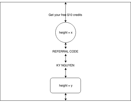
The sketch is like this
(1)
-
labelis the instruction label, created by my helperUIMaker. It is sticked to thecontainer's topAnchorwith 24px spacing. It should be sticked toleftandright, andtextAlignmentis center to prevent long text can break the UI.
Notes
-
top: layout theview1's topAnchorto theview2's topAnchor. -
horizontal: layout theview1's leftAnchortoview2's leftAnchorandview1's rightAnchortoview2's rightAnchor.
(2)
circleis the top curve. You can use an image instead. The circle haswidthandheightequal toUIScreen.main.bounds.width * 2. It is bigger than the view so we can put its lower edge overlay on thecontainer.Layout
circlehorizonal center to the view, so the circle looks balance. You can try align to left or right to see differences.The
circle’s bottom edge will align to thelogocenter. A little bit difficult to understand. Thelogois sticked to the top, andcircleis sticked to thelogo. I set thecirclesticked to thecontainer’s top, but the view can’t auto layout. This way,containercan easy auto layout, we don’t need to care thecontainer’s height.
Notes
-
square(value: CGFloat): set theview's widthequals toview's heightand equal tovalue -
centerX: stickview1's centerXAnchortoview2's centerXAnchor -
bottom: layoutview1's bottomAnchortoview2's bottomAnchor.
(3)
-
logohasverticalSpacingtolabeland has 40px spacing. It means thelogo’s top and thelabel’s bottom has 40px spacing.
Notes
-
verticalSpacing: layoutview1's topAnchortoview2's bottomAnchor
(4), (5)
- Same to
codeTitleandcodeLabel,verticalSpacingwill make a space between them.
(6)
-
okButtonhasverticalSpacingandbottom. So keep in mind, the view can automatically calculate the height of the view.
Display Popup
The popup is ready to display. Let’s display it.
func show(in view: UIView) {
    addSubviews(views: blackView, container)
    blackView.fill(toView: self)
    container.centerY(toView: self)
    container.horizontal(toView: self, space: 24)

    blackView.alpha = 0
    UIView.animate(withDuration: 0.1, animations:
        { [weak self] in self?.blackView.alpha = 1 })
    container.zoomIn(true)

    view.addSubviews(views: self)
    fill(toView: view)
}
We will display the popup inside the controller’s view. Rememeber 3 views:
blackView,container,self. We will addblackViewandcontainertoself. And we addselftocontainerView.view.zoomIn(true)will show the popup with a slight zoom animation.
Dismiss popup
Quite hard here for dismiss animation. The popup zooms in a little bit and zooms out to disappear.
@objc func dismiss() {
    let initialValue: CGFloat = 1
    let middleValue: CGFloat = 1.025
    let endValue: CGFloat = 0.001
    func fadeOutContainer() {
        UIView.animate(withDuration: 0.2, animations:
            { [weak self] in self?.container.alpha = 0 })
    }
    func zoomInContainer() {
        UIView.animate(withDuration: 0.05,
                       animations: { [weak self] in self?.container.scale(value: middleValue) })
    }
    func zoomOutContainer() {
        UIView.animate(withDuration: 0.3, delay: 0.05, options: .curveEaseIn,
                       animations:
            { [weak self] in
                self?.container.scale(value: endValue)
                self?.blackView.alpha = 0
            }, completion: { [weak self] _ in self?.removeFromSuperview() })
    }

    container.transform = container.transform.scaledBy(x: initialValue , y: initialValue)
    fadeOutContainer()
    zoomInContainer()
    zoomOutContainer()
}
Time to run
- Add a button to
ViewControllerand show the popup in the button event
@objc func showReferralPopup() {
    ReferralPopup().show(in: view)
}
Do it better
- You can add new class
Popupand move components, fullshowfunction, fulldismissfunction and emptysetupViewtoPopup. - The
ReferralPopupis inherited fromPopup. You can add new popup easily just set inherit fromPopupand layout your new view in itssetupView. - Full code can pull from my Github


Top comments (0)