Most frontend engineers just like me might have encountered this same problem where creating a gap between text and underline is a huge pain.
In this short article, I will share an effective CSS trick that can make this happen with no stress.
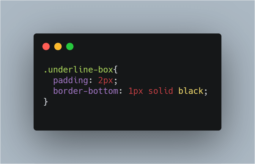
First, you create a div around that particular element you wish to place an underline.
After that, you proceed to style that particular div by giving it a padding and border-bottom value of your choice.
If you preview the output at this point, you will notice that the width of the underline spans across the width of it's parent container of which you wouldn't want that to happen. How do we make the underline the same width with the content? Boom! The Max-content value of the width property! Works like magic!
Although the CSS Working Group has published a draft for text decoration level 4 which would add a new property text-underline-offset (as well as text-decoration-thickness) to allow control over the exact placement of an underline.
As of this writing, it's an early-stage draft and has not been implemented by any browser. However, this trick is widely supported across all major browsers and also works perfectly with multiple text as well.
I hope you find this article helpful.


Top comments (1)
I used to add border-bottom inline elements