What is a custom storefront?
Building a custom Shopify storefront is a great business idea, and also marketing-wise.
Usually, when you open a shop in Shopify, you can have a default home page, product page, and other pages, but they are limited in functionalities, weak on SEO, and make your store look like thousands of other stores.
Ambitious webshops aim to deliver more customised and outstanding service, to look more serious, trustful and align better to meet the clients' expectations.
And to do so, they need to aim for having a custom experience. In other words, custom storefront – an out-of-the-box, bespoke eCommerce website, that is uniquely built with third-party technology and connected to an eCommerce platform, like Shopify.
Building it can lead to the conversion rate increase, thanks to incomparably better user experience and significantly better SEO results, in comparison with a standard Shopify store.
What is an eCommerce storefront?
To explain the concept more deeply, an eCommerce storefront is the visual layer of the online store which is responsible for displaying products as well as the other content. In other words, it’s what visitors see and interact with after entering the webshop.
Elements of eCommerce storefront:
- Homepage
- Product page
- Cart page
- Category page
- CMS text page (About us, Terms & Conditions)
Custom Storefront vs Traditional Storefront
In most online stores, a storefront is strongly linked with the back-end. Some may even say that they are like an inseparable couple. It means that if you want to change something on the front-end layer, it requires changes on the back-end and vice versa.
However, changing basic settings like theme colours or typography is perfectly safe, and it should be possible to do even without programming skills. However, more advanced customisation will require both front-end and back-end development skills.
The simplest example of the traditional eCommerce is an online store built with an open-source platform like WooCommerce or cloud-based one like Shopify.
However, in this case, the possibilities of customisation are very limited.
You can choose one of the free or premium themes and try to adapt them to your needs, but you probably won’t be able to achieve the desired result. Or at least you will have to make some compromises on functionalities, or performance.
And that’s one of the reasons – probably the main one – why some brands decided to look elsewhere for a more flexible and customisable solution. A solution that will make building a separate, custom storefront possible.
Why build a custom storefront for Shopify?
You already know the first reason to build a custom storefront – it will give you total freedom of designing an online experience for visitors.
But why would you even want to invest in doing so? Is it only about having an excellent looking web page that people will like?
Apparently, there’s much more behind having a great UX than just for the sake of the user's pleasure. In fact, It has more to do with avoiding a bad experience, than just having a good one, as a “good one” becomes a “standard” nowadays.
Let’s have a look at some stats and interesting insights:
- 88% of online consumers are less likely to return to a site after having a bad experience (source: UsabilityGeek).
- 70% of online businesses fail because of bad usability (source: Uxeria).
- 53% of mobile visitors will leave if the website doesn’t load in less than 3 seconds on mobile devices (source: Google).
- Google also provided a complimentary table with the probability of bounce. A bounce happens when someone visits the website but leaves before even interacting with it.
Custom storefront is much more than dry statistics – remember that its primary goal is to delight users and help you sell more. And through realising that goal, custom storefront brings many benefits apart from total design freedom mentioned above.
| Pros of building a custom Shopify storefront |
| Unique and delightful user experience |
| SEO-efficiency (i.e. ability to set custom URLs) |
| High performance and fast page loading |
| Works on any device |
| Unlimited customisation |
But it’s not all sunshine and rainbows. Building a custom storefront – like any other solution – has its flaws.
| Cons of building a custom Shopify storefront |
| Development |
| Development cost |
| Limited usage of plugins |
| Necessity of having a front-end developer |
| Before building custom storefront, you could do everything yourself in Shopify admin panel |
Best technologies to build a custom storefront
You can build two kinds of the custom storefront: static and dynamic.
If you want to use all the blessings and advantages of a customised storefront and your store has less than 200 products, we recommend you to build a static one.
We recommend working with technologies that are:
- Constantly improving and evolving
- Battle-tested
- Future-proof
- Supported by big brands
- Backed by a huge community
Two most popular technologies you can choose from are Gatsby and Next.js.
Static or dynamic?
However, if you make a lot of changes in your storefront or you need it to be truly dynamic and responsive for any other reason, you can keep it like that as well.
Other causes may be:
• No need for investing in additional development
• Faster time to market thanks to pre-made themes
• Low-cost business idea verification before investing more money
To stay truly dynamic, we recommend that you choose one of the following: Liquid or React.
Gatsby
Gatsby is a free and open-source framework based on React that helps developers build blazing-fast websites and apps.
It’s the most loved static site generator by developers as it uses the latest technology stack and is supported by excellent documentation. Gatsby has been made for both the online business advantages, as well as the ultimate development experience that combines the best features of React and GraphQL.
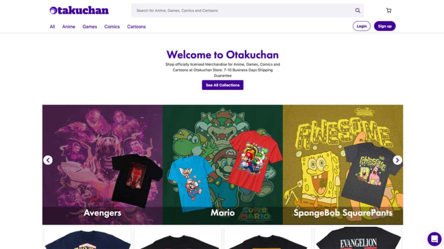
It can also be used for creating fast and custom storefronts. The most recent example is the work we did for Otakuchan (case study is available here).
Why use Gatsby?
Apart from the reasons mentioned above, Gatsby is the right choice because it is:
- Super-fast
- Extremely SEO-friendly
- Delivering supreme user experience
- Totally safe
- Easy to scale
- Futuristic
Next.js
Next.js is a JavaScript framework that enables you to build server-side rendering and static web applications with React.
Thanks to Next.js, you can build super-fast websites without compromising your designs or functionalities.
It is widely used by the biggest and most popular companies all over the world (such as Netflix, Uber, Starbucks, Twitch, and much much more) and considered as one of the fastest-growing React frameworks, perfect to work with static sites.
Why use Next.js?
Next is a good choice because of:
- Super speed
- Fast Refresh
- Unlimited experience customisation
- Time-saving
The best thing about Next.js is that it’s a hybrid of static and dynamic technologies.
What it means is that you can create static pages that will send a change request automatically in a specific timeframe. In other words, you can build static pages that behave like dynamic ones, from time to time.
Liquid by Shopify

Liquid is an open-source template language written in Ruby by Shopify. It’s the core of all Shopify themes which developers use to load dynamic content to the online store pages. Liquid is available to all interested parties on GitHub for free.
What is a template language?
If you are a web designer or developer, you can use a template language to build websites combining static content and dynamic content. While static content stays the same on multiple pages, dynamic content changes from one page to another.
Thanks to Liquid, it’s possible to re-use the static elements of the layout, while populating the page with dynamic content straight from a Shopify store at the same time.
Although it doesn’t give you as much development freedom as using Gatsby or Next, you can build a custom Shopify theme with HTML (static elements) and Liquid (dynamic elements). Therefore, your online store may stand out from the competition.
Why use Liquid?
There are a few benefits of using Liquid to build a custom theme (not storefront!):
- Your online store will look more professional
- Your design will be unique
- The store can work in the way you want it
- Higher performance
- Possibility to build sales funnels that increase conversions
Additional resources
- The Shopify Cheat Sheet
- Shopify Design Tutorials on Youtube
React
React.js is so far the hottest and the most wanted JavaScript library, that enables you to build performant and user-friendly interfaces.
Many big names (Netflix, Uber, Airbnb, and more…) chose it, as it was easy to pick up, more convenient to operate with and gave them a lot of freedom in the interface execution. By that, they could deliver totally outstanding and customised interfaces.
After a while, React.js has been gaining more and more contributors, fans, and users. This is why it is still at the top of most loved and wanted frameworks to work with.
Today, it is the most recognisable frontend framework that enables not only React developers themselves, but also business people and marketers, to fulfil their demanding objectives. React also makes building custom storefront possible while staying dynamic at the same time.
Why use React?
Using React means getting such benefits as:
- Development efficiency
- Native-like user experience
- Faster time to market
- Huge scalability
- Stability and maturity
- Great community and support
Building custom Shopify storefront step-by-step
If you want to hire a developer or agency to build a custom storefront, here is the list of steps we recommend you to discuss during the discovery phase and follow along the development process.
This will ensure that you will remember about all the necessary steps so your storefront will work perfectly as desired.
- Create information architecture
- Prepare UI and UX designs
- Front-end development
- Create Storefront API
- Integrate your custom storefront with Shopify through API
- SEO optimisation
- Speed optimisation
- Security optimisation
- Final release
How to execute the development process?
Now, if you do like to go a similar way, and build an outstanding customised storefront, below, you can find the ways of doing it.
They all depend on your business size, internal company abilities, as well as the budget you can invest.
- In-house development team – it’s the best long-term solution while building a custom Shopify storefront (yet also the most expensive one). The best because your online store will be of the highest priority for the hired team, so implementation of changes happens fast in such cases. It is also considered as the most expensive way because you have to pay a monthly salary for one or more developers regardless of the work you have for them.
- Outsourcing – it’s the best choice when you have a list of changes, money to pay for them but no in-house development team. What you need to do is prepare such a list of desired changes and choose the right development team out of available Gatsby, Next.js, or JAMStack agencies. It depends on which technology seems to be the best choice for you.
- Augmentation team – it’s a great option when you already have your development team, but they are occupied with something else, so you need help from outside. Such help will assist you with a particular project temporarily until it’s finished. It means no long-term commitment while getting expertise and time boost.
- Freelancers – Sometimes there is no need to hire the whole development team because the number of fixes or updates is low. Therefore, you can hire a freelancer to do the job, and you can find the right person on such portals as UpWork or Toptal.
Real-life example: Otakuchan
Few words about the project
In short, Otakuchan.com is an online store created for otakus – fans of Anime, Games, Comics and Cartoons. The idea behind it was simple – to create a single and exceptional spot for all of them.
Otakuchan wanted to move away from WordPress and use modern web technology to achieve a truly outstanding speed and SEO results, which is extremely important in the highly competitive eCommerce world.
To give their website a performance and user experience boost, they decided to use Gatsby JS as a technology, also for their custom Shopify storefront.
Besides that, they also wanted to give it a new look and feel, as well as a few new functionalities to make the buying experience even more pleasant and effective.
What steps we had to take
Step 1: Reframe the interface
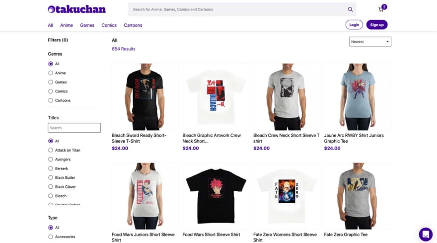
In the beginning, we had to prepare the User Interface for new functionalities and improvements, like sorting and filtering. We were also updating the entire Header section in both web and mobile versions.
Step 2: Improve the app performance
We decided to do all the sorting (by product add date, title, price, etc.) on the Client Side, so all the information gathered from the server (product data, etc.) was appearing in a flash.
Then we built, one by one, pages for each and every filter, category, and product.
Step 3: Enhance user experience with new design
Otakuchan is working on Shopify, and all the frontend customisation was a double challenge, as Shopify prefers clients to use their internal solutions.
After receiving a new look and feel designs from Otakuchan, Daniel – our Gatsby developer – has been working on the entire interface rebuild. Designs were also prepared with further app scalability and improvements in mind, and that led to the final step.
Step 4: Add new functionalities
As the last step, we’ve built and added a few new functionalities, for example:
- Registration
- Login & Orders History
- New Mobile Menu
- Sorting & Filtering
- Web and Mobile Header Update
One of the “standing out” functionalities was the Cart. Instead of making it on a separate page, we made it sliding from the right, so you could walk around the shop, add products, and see what's going on in the cart in “live” mode.
What was the outcome?
After all the improvements from the UI reframe, through designs into scaling the app with new functionalities, we’ve arrived with the brand new website ready to be used by the first anime fans.
Thanks to Netlify Deployment we could save additional money.
What technologies did we use?
- Gatsby JS
- Headless Shopify
- Netlify
- React Router
- React Toastify
- JAM Stack eCommerce


Top comments (0)