Current web development is revolving around responsiveness when it comes to supporting multiple form factors.
Though the hardware tech is also pacing itself forward we can see huge variety of handheld devices as they are portable and powerful.
Current Challenge
But this brings a huge dilemma in front of Frontend developers (a.k.a web developers).
How did we NOT handle hover in mobile/handheld/touch-enabled devices?
With Responsive Media Queries and adding touch event handlers. On smaller devices don't add hover CSS and add touch handlers to see additional content.
And it worked great for the following reasons:
- Small form factor meant touch
- Bigger screens always come with mouse support
But nowadays, we have:
- Huge tablets in both categories of portable & large screenScreens are like a desktop but you can use these like tablets, which means you won't have access to Mouse or precise control of the pointer
- Hover on tablet-y desktops (or desktop-y tablets 🤷♂️)
The good old mouse interactions are no longer available on such devices. Interactions like:
- hover
- right-click
Solution
CSS3 have now covered this corner now with pointer media queries. It allows you to write CSS for the following values:
- pointer: coarse
- pointer: fine
- pointer: none
Let's take a look at an example use of the above media queries:
<button
  data-title="Get the best offers!"
  data-help="Call 1800-00-00-123456!"
>
  Subscribe
</button>
button {
  color: #333;
  font-size: 1.3rem;
  padding: 2rem;
  background-color: #eee;
  border: 1px solid #ddd;
  position: relative;
  transition: all ease 200ms;
}

@media (pointer: fine) {
  button:hover {
    color: #fff;
    border-color: #000;
    background-color: #333;
  }
  button:hover:after {
    top: 90%;
    background: #aaa;
    border-radius: 0.25rem;
    content: attr(data-title);
    position: absolute;
    font-size: 0.7rem;
    padding: 0.5rem 0.8rem;
    width: max(100%, 200px);
    max-width: max-content;
  }
}

@media (pointer: coarse) {
  button:after {
    content: attr(data-title);
    display: block;
    font-size: 0.75rem;
  }
  button:hover {
    color: #ddd;
    border-color: #aaa;
    background-color: #999;
  }
}
See the Pen
Untitled by Pankaj Patel (@pankajpatel)
on CodePen.
And you can also detect if no pointing is present with the device; like in following example:
@media (pointer: none) {
  button:before, button:after {
    display: block;
    font-size: 0.75rem;
  }
  button:after {
    content: attr(data-title);
  }
  button:before {
    content: attr(data-help);
  }
}
Hover in JS?
In our Desktop WebApps, we tend to add much interaction on Hover, But if we want the same apps to be usable on Touch devices, our JS-based interactions seem to have rendered useless.
We usually leave the hover events in place and attach extra handlers like touch-&-hold or similar.
But I think that it is not the best way, we should add hover interactions only when we know that hover is possible and the same for touch events.
For this, we have an all-around solution that allows us to run a CSS media query and see if the operation matched or not.
Yes we are talking about window.matchMedia
You can use matchMedia function to see if the window is under any responsive breakpoint or not:
console.log(
  window.matchMedia('(max-width: 768px)')
);
// { matches: false, media: "(max-width: 768px)", ... }
Now we can use a similar matchMedia query to determine the pointer support. For example:
document.addEventListener('DOMContentLoaded', () => {
  const pointerFineSupported = window.matchMedia('(pointer: fine)').matches

  if (pointerFineSupported) {
    document.querySelector('a')?.addEventListener('hover', (e) => {
      // load the linked content optimistically before click
    })
    document.querySelector('image')?.addEventListener('mouseenter', (e) => {
      // show the related caption
    })
    document.querySelector('image')?.addEventListener('mouseleave', (e) => {
      // hide the related caption
    })
  }
});
Similarly, we can attach Touch Events like touchstart and touchend when the pointer: coarse is available
document.addEventListener('DOMContentLoaded', () => {
  const touchSupported = window.matchMedia('(pointer: coarse)').matches

  if (touchSupported) {
    document.querySelector('image')?.addEventListener('touchstart', (e) => {
      // show the related caption
    })
    document.querySelector('image')?.addEventListener('touchend', (e) => {
      // hide the related caption
    })
  }
});
Let's put the above JS snippet to use and make something UX improvements where we have used the pointer media queries to optimize the page navigation.
The prime difference between the two is:
const pointerFineSupported = window.matchMedia('(pointer: fine)').matches;

if (pointerFineSupported) {
  document.querySelectorAll('[data-prefetch]').forEach(el => {
    el.addEventListener('mouseenter', (e) => {
      const routeName = el.getAttribute('href').replace('#', '');
      !routes[routeName].content && fetchTemplateForRoute(routes[routeName]);
    })
  })
}
Repo: https://github.com/time2hack/pointer-events
Demo without optimization: https://time2hack.github.io/pointer-events/
Demo with optimization: https://time2hack.github.io/pointer-events/index2.html
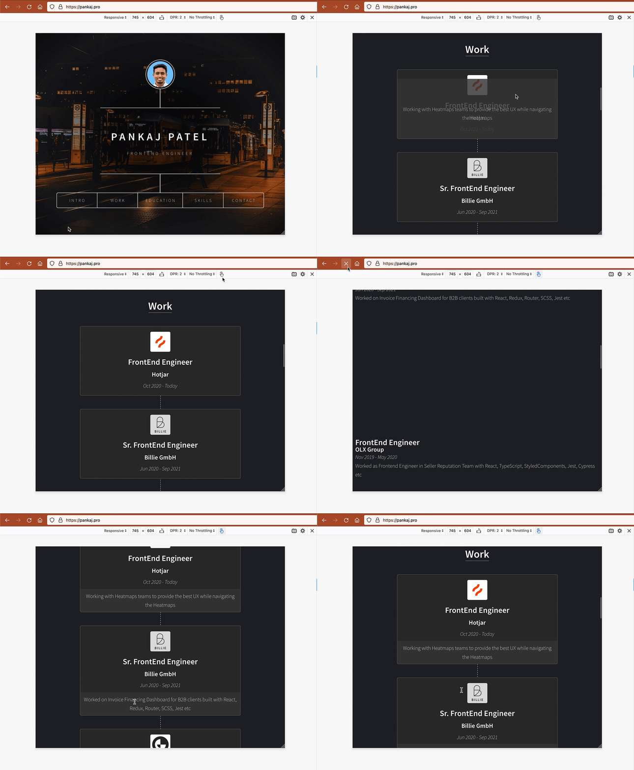
In my portfolio website; I have also used the pointer media queries in CSS to show some information that is visible on hover if you are using a desktop with a mouse to visit it.
Here is the rough outline of the Styled Component for the Card handing pointer media query:
import styled from "styled-components";

export const ImageContainer = styled.div`
  ...
  & img { ... }
`;

export const Description = styled.div` ... `;

export const Article = styled.article`
  ...

  ${ImageContainer} { ... }

  &:hover {
    & ${Description} { ... }
  }

  @media (pointer: coarse) {
    ...

    ${Description} { ... }
  }
`;
You can see the full file here: https://github.com/pankajpatel/pankajpatel.github.io/blob/master/components%2Fstyled%2FArticle.ts
Conclusion
Pointer media queries can help you tailor the UX for devices that have capabilities, like
- Prefetch content on hover for mouse
- Slide interaction for list items on touch devices
- etc.
What are you going to optimize?
Let me know through comments 💬 or on Twitter at @heypankaj_ and/or @time2hack
If you find this article helpful, please share it with others 🗣
Subscribe to the blog to receive new posts right to your inbox.


Top comments (2)
Interesting approach! Usually, @media:hover is enough for most of my cases. While I use @media:pointer to make everything bigger on touch devices, not for applying hover-effect. But this area of interest is quite confusing for me. What if the user's using a touch devices with a mouse as the primary input? Then I found that this article is worth a read: css-tricks.com/interaction-media-f...
This is very interesting as I got to know about hover media queries for first time.
And probably, hover media query would have been the better for the content of this article.
And I’m also baffled with similar questions. The article you shared is great read to think deeply in this direction.