Originally published in the Propeller Health Tech Blog.
When the front-end team at Propeller Health recently set out to make our websites accessible, I thought I was in familiar territory. I’m a fan of semantic html, alt tags and input labels, I’m proud of my perfect scores on Lighthouse accessibility audits and I’m fluent in aria attributes.
But I learned pretty quickly that web accessibility is more complicated than I’d thought. To make our site friendly to all users, the team had to start asking new questions. Does it work without a mouse or when the screen is zoomed to 300%? Is the structure of information clear to assistive technologies? Can all users navigate, find content and determine where they are?
The last question raised a particularly tricky problem for us. We work on a single-page React application that involves a “multi-page” form. A user fills out some form fields, clicks “next”, sees a new view with new form fields, fills them out, and clicks “next” again. How would we keep users of screen readers oriented when the page content changed without a browser refresh?
The Problem
In a server-rendered website, each time the page changes, the browser refreshes. The old page is gone, and screen readers start reading the new page from the top. The first thing the screen reader articulates is the page title in the HTML header. This lets the user know immediately where they are. If they are in the right place, they can start tabbing forward to explore the page.
Single page applications don’t work the same way. When the page changes, the browser does not refresh and the screen reader doesn’t know that anything has happened. The focus doesn’t automatically move to the top of the screen. There is nothing to orient the reader.
Our Solution
At the time of this writing, there was no standard, codified way to make single page applications navigable by screen readers. Nor could we find any well-tested NPM package that would solve the problem for us. So we rolled our own solution. It’s not perfect, but it works.
Our solution was inspired by a pattern employed in server-rendered websites called a “skip link” (and by Mary Sutton’s discussion of skip links in her Frontend Masters course ). The goal of the skip link is to give users of screen readers a way to skip past the top navigation that is usually found at the beginning of every web page. Without a skip link, these users have to wade through many links, icons, and search boxes on every page before they can get to the page’s main content.
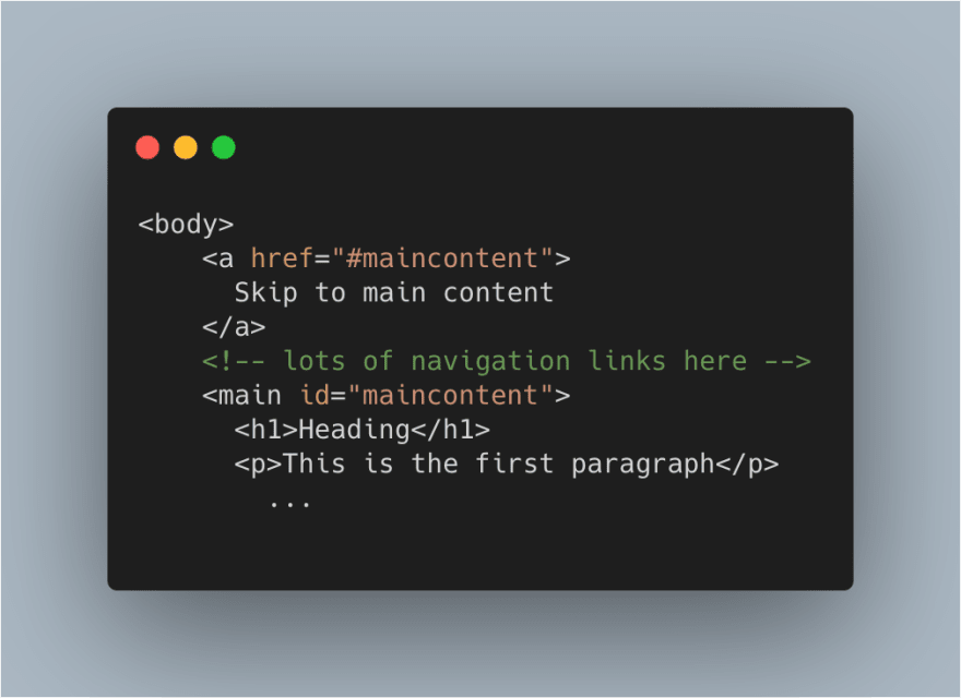
The skip link is generally the first item on a page. When the user clicks the skip link they are brought to the main section of the page.
In HTML, it would look something like this:
We repurposed the skip-link pattern as a way to let users know when the content of our single page application had changed. It’s implemented as a lightweight component that wraps each of our page-level components. The component moves the focus to the top of the page and prompts the screen reader to say the page title, imitating what would happen when the browser refreshes. Here’s more or less the whole thing:
We create a ref to the skip link and move focus to the link as soon as the component has loaded. The screen reader reads the link, which includes the title of the page and a message about skipping to the main content. This way, the user knows what page they are on and what to do to move forward.
There are likely better implementations out there (share yours in the comments!). We hoped that by following the skip-link pattern ours would at least be familiar and easy to understand.
We at Propeller and the frontend community at large have more work to do to make our single page applications accessible to everyone. Our recent accessibility initiative has increased our empathy for users who use the web differently than we do. We embrace the challenge.


Top comments (0)