We’re excited to announce a number of improvements in HTTPie for Web & Desktop, and HTTPie for Terminal 3.0. Check out what's new 👇
HTTPie for Web & Desktop
✋ Refined cursor system
You may have already noticed that we obsess over user experience in places where humans meet APIs. And we like to simplify things, a lot.
This time, we focused on simplifying feedback mechanisms in HTTPie for Web & Desktop and completely revamped its cursor system.
Pointer cursors were invented to indicate links on the Web. It is tempting to adopt them for all active elements in apps that use web technologies, like we initially did. However, after a thorough research, we decided to say goodbye to pointer cursors.
We continue to use them for elements that are actual web links. But just like modern native apps, you’ll now see subtle hover effects and regular cursors for all other active UI elements instead. This makes the UI feel quieter and the experience more pleasant. Very HTTPie.
🍎 Custom title bar on macOS
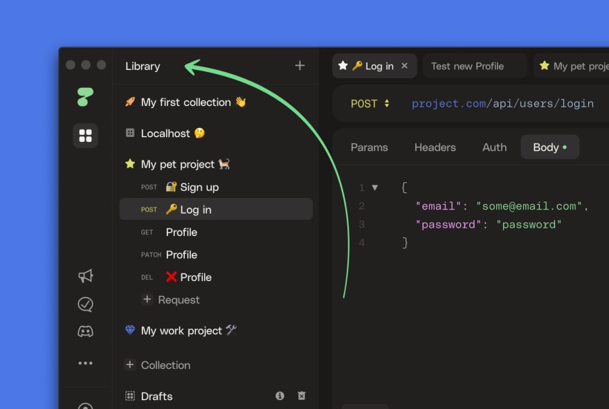
Speaking of design: we—and our beta users—didn’t like the default title bar in the desktop app. It wasted space and didn’t fit our custom design – the entire window should blend in with the app’s personality. And now, starting with macOS, it does:
If you’re on Windows or Linux, fear not. Your app window will get a facelift in a future release as well.
🪄 Prettify JSON
To ensure the body of your request is humanly readable and navigable, you can now use the prettify feature. It will automatically format your code so that your brain’s free to do other things:
Just look for the wand icon at the bottom of the code editor 🪄
This feature is available for JSON now, and we’ll be adding support for other formats in future releases.
💟 More collection icons
Collection icons have become a second nature to our users. We thought it was time to add 8 more of them. Check them out!
✨ Improvements
- There are many other small UI improvements to make the experience more coherent. How many can you spot?
- You can now edit the name and icon of a collection inline from its tab. Simply click on these elements.
- If you click on the collection icon in a request tab, it will now take you to its collection tab.
- Keyboard-mainly user? You don’t need to leave your keys anymore when navigating dialogs. Enter-to-submit now works for all off them.
- Have you named a request but, now you’d like to have the dynamic URL-based name back instead? Just clear it in the edit dialog.
🪲 Fixes
- The context menu in tabs doesn’t work in a moody way anymore.
- Hopefully, you never noticed but extremely long collection names caused minor layout issues. Those issues were fixed and there’s now a limit for collection and request names. Hopefully, you won’t reach that limit either.
- Expand/collapse icons would disappear from the response if you edited the body of the request. Now they don’t.
HTTPie for Terminal
In every other changelog so far, we posted the ongoing improvements to the development version of HTTPie for Terminal.
Today, we are thrilled to announce that those developments were wrapped up into the final 3.0 release! It includes:
- 🌲 Nested JSON
- 🔌 Plugin Manager
- ⏱️ Response Metrics
- 🚀 Speed-ups
- 🎨 Improved UI/UX
- 🙌 And much more! We have a long separate post covering this best-ever release, check it out! 👉 What’s new in HTTPie for Terminal 3.0 →
Happy testing, and see you next week!
- 💁🏻♀️ If you’re not on the private beta yet, you can join the waitlist here.
- 👉 You can also follow @httpie and join our Discord community.
- 👩💻 We’re looking for new colleagues in engineering and design roles.
Originally published on HTTPie blog.


Top comments (0)