In this series, we show you how we use Figma - the end to end design platform for teams - for our UX, UI, and developer processes when building the platformOS Design System.
In this three-part series
Part 1 The UX process
The strategic reasons for building a Design System and how it overlaps with our vision for the platformOS Partner Portal.
Learn about the reasons for using Figma for our Design workflow.
We introduce the UX processes and how Figma brings together the information architecture (IA), screen flows, wireframing, prototyping, and usability testing in one place.
Part 2 The UI process
Why we chose Figma to create our Design System. We discuss Figma’s Team Libraries, the collaboration between designers, teams, and the client, and we walk you through our UI processes using this tool.
Part 3 The developer process
We describe developer handoff via Figma and the implementation of the Design System.
Why build a Design System?
You have probably heard and read about Design Systems as a best practice to follow for a while now. We dived deep into this method early on to explore if it’s the right technique for us to use in our upcoming projects.
First, we identified the main benefits of building a Design System:
Increased efficiency:
By building reusable components you don’t need to create similar components from scratch every time. Components become part of a system of items where each item serves a different purpose.Better consistent:
When you build a component you use a set of principles and rules that makes the whole system consistent.Better communication:
Creating a unified Design System will speed up the design process while also helping to build bridges amongst team members. As Inès Serizer states, UXers have to serve all of the users. Not just those who are buying the product, but also the team within the organization.Easier asset and code management:
Time invested in creating and maintaining the system pays off in the form of a clean codebase and easy to manage design assets. When a team decides to update certain elements this process makes it fast and easy by its structure.Common truth:
The Design System works as a knowledge base that makes it easy to learn, collaborate, or share. Of course, this also means that the Design System should be easily accessible to all team members.Increased development speed:
If you follow all the rules it helps the company to build products faster at scale.
Brad Frost, the author of Atomic Design, summarized the strategic benefits of Design Systems with one great example: On the way, every organization realizes that bulldozing their entire website and replacing it with a New-And-Shiny website every three to eight years isn’t (and never was) an optimal solution. So you’ll need to find an adaptive system that is efficient and scalable and can evolve with time.
Our vision
Our goal was to redesign all platformOS related sites including the marketing site, the documentation site, our work-in-progress Community site and the platformOS Partner Portal - an online interface where our Partners can create, manage, and configure sites built with platformOS. In the case of the Partner Portal, we ship new features and updates often. It became obvious that in the long run we need a Design System to iteratively improve the experience. It made it possible to better address user feedback and keep up with the ever-shifting web landscape. Our teams could adopt new parts of the system as they became available, which felt less daunting and disruptive. We wanted to make onboarding easier for new team members, too. Besides, this way we could provide a comprehensive, easy to use resource for the platformOS target audience; developers and Web Agencies like you!
Why do we use Figma?
Our main goal was to find a tool that brings together all UX/UI related tasks in one place efficiently by making it possible to involve all the members of a cross-functional team.
In the next paragraphs, we introduce how we adapted Figma to each step of our UX design process:
- Workshops
- UX Design and Prototyping
- Testing
Workshops in the Ideation phase
At the beginning of each project, we need to develop a common understanding between team members/stakeholders/users/etc. to clearly see what the problems are that we are solving with our product. After this, we can use several workshop methods to gather more data and clarify the vision. Depending on the type of workshop we are running, there are different goals and different kinds of UX deliverables to produce. So it was important to select a tool that was flexible enough to organize a large amount of information in different ways. Besides other great tools like Miro and Mural, we found that Figma can also work as a workshop tool. It provides templates to speed up the preparation part and the number of templates is continuously growing.
Because we work as a fully remote team, we wanted to find a tool that can be used by people with less design experience. Figma provided a collaboration space where users could join one file via a link. Users can also see and observe each other when they are in the same file and edit the objects together in real-time. You don’t need to worry about losing items because you can revert to previous versions at any time.
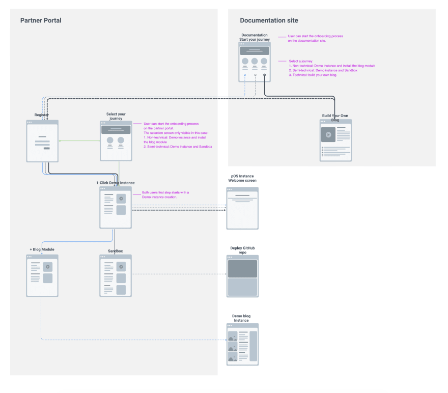
During this phase, we validated personas and persona needs, then mapped out their journeys, created a content inventory, a sitemap, and planned the task and screen flows.
UX Design and the Prototyping phase
In this phase, we created the low and high fidelity wireframe iterations and the prototypes for the testing phase.
All of these actions are highly cooperative tasks so we’d like to highlight some features related to collaboration. As it’s easy to invite users to Figma you can gather feedback fast in many ways: via comments or shadowing another user in a call and iterating on the plans together.
Being fully remote, our main goal is to reduce friction in our design processes. Help everyone to gather the same knowledge easily and share feedback fast. With a peer review process, we can keep everyone up-to-date and create a Design System that can scale to the project needs.
As Figma files are easy to share it makes the whole system more inclusive to non- designers. It helps the collaboration between different teams and stakeholders. This cooperation is at the heart of a good Design System and also a key factor for distributed teams.
It’s useful that we can set roles easily. By default, a viewer can view, comment, share, and copy. If you have a confidential project there is an option to prevent copying in the PRO version.
Our main goal was to build a consistent and usable Design System. Therefore we iterated and tested as much as possible to keep the items simple but still include all the necessary components. With a good component library, it’s possible to keep the delivery process and modifications fast. It also means that after the sketching round we can build high fidelity wireframes.
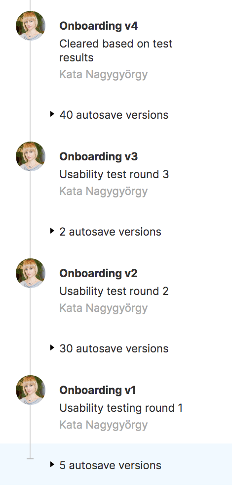
Version control is a simple but powerful functionality of Figma. Before using Figma, it was hard to follow file versions between team members. And we had to figure out a sync process to share them and be sure that it's the right version. It was time-consuming. With this web-based tool, it’s easy to follow the file versions as it constantly saves. We only name and add notes to the important stages of the design process. It can help to check a specific stage and compare the difference between the tested versions. We can even revert to that version. Following a version control system like Git in design is a fast and safe option.
Figma also has plenty of integrations with other tools to keep the design process easily in the loop, just like Jira, Zeplin, Dropbox, Slack.
Testing phase
In the testing phase, we create prototypes from the UX design plans and test them with our target audience. Figma is perfect for creating basic prototypes that you can easily integrate into specific testing tools.
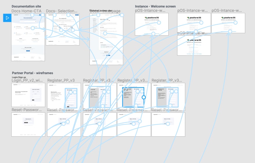
We created interactive prototypes by linking objects to artboards. This process is fast and you can already use it for testing. With integrations, you can further specify the details in the prototype like animated transitions, micro-interactions, scroll-based effects, and more. We only use these when it comes to interaction testing so we can identify the best version.
Usability testing is a smooth process with Figma. We use the prototype link and add it to the preferred tools. We used lookback.io for remote moderated usability tests and playbookUX for remote unmoderated usability tests.
In some cases, we even iterate or fix some items between testing rounds. The cloud-based background helps a lot, as it’s always up to date and you don’t need to change anything in the usability test manual.
After the testing rounds, we create test reports of the results. Keeping this report in Figma is beneficial because the old and the new wireframe or design versions can live close to each other. At the same time, you can see the reasons behind the changes. Non-designers like other team members, stakeholders, or a client team also prefer it as they don’t need to keep in mind where to find what — they only check Figma and can see all elements of the design process there. The result is less confusion and easier collaboration.
Conclusion
By including all the relevant information, you can create a single source of truth for your UX and design processes. The platformOS team found that Figma is a great fit to be this source of truth for our projects. We hope you found these Figma highlights from a UX process point of view helpful. Stay tuned for part 2 of our series, where we explore the design process.


Top comments (0)