An unknown unknown is something you don’t know you don’t know. When you’re just starting out with web development there are many unknown unknowns. You don’t know enough about what’s possible to know what the right way to do things is. Accessibility is one of them.
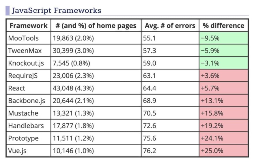
This image recently got shared on Twitter:

(source: https://webaim.org/projects/million/#frameworks)_
The general consensus was “React and Vue developers should do better!” and while I don’t disagree, I don’t think that’s the story this table tells.
I don’t think the accessibility spectrum maps to which framework you use in any meaningful way (Or, to put it more eloquently: React didn’t use a <button>, you did.)
I think it maps much more significantly to your experience level as a web developer in general.
So we’ll move away from frameworks for the rest of this article but let me add one remark: I don’t think it’s unreasonable to say that frameworks that make it easy for people to get started, will attract people that are just getting started.
The starting developer experience
When you start out it’s you, notepad and a browser against the world. You open up that notepad, and you type
<div onclick="alert('hello world');">Click me!</div>
You fire up your browser, you click your div and …it works! It just works! Awesome. You open up the devtools. No errors. Well done! Clearly you did a good job. On to the next thing.
And that’s a problem. For all sorts of reasons, both legitimate and, as always, weird browser legacy reasons, a clickable div will mostly work. Well enough to fool someone starting out anyway.
If everything works, how would they know it kinda doesn’t? We know there are issues because of experience. You can only make so many clickable divs before someone tells you, or you read somewhere, that you should use a button instead.
Waiting for that to happen is probably not the most optimal strategy to improve the knowledge of accessibility among web developers.
What are browsers doing?
Why aren’t browsers telling that new developer opening the devtools “Instead of using a div, maybe you want to use a button. Here’s a handy link explaining why”?
I don’t mean in Webhint or the accessibility panel or some other web extension. Remember, they don’t know they don’t know, so they definitely will not search for it.
If we want people to get serious about accessibility, we need to push it on to them in the places they’ll look. Not three tabs down or behind a configuration button or when you hover over an element for longer than 3 seconds. It needs to be right there when they open devtools.
Obviously, this is something I’m working on with Polypane.
Furthermore we could envision a browser that is much stricter when developing. Modern browsers need to accurately render pages that are over 2 decades old and that comes with a lot of caveats.
But what if they don’t?
What if you can configure your browser to warn about or even block anything that’s not compliant with modern standards, accessibility standards included? Here’s some of the things they could do: (I’ve tweeted about this before)
- Color contrast doesn’t meet the minimum? Your browser increases it automatically until it does.
- Focus styles? You can style them, but if you turn them off or style them in such a way that they don’t contrast enough with the regular style, then your browser will compensate for that or ignore your styling.
- Images won’t show if they don’t have an alt attribute.
- onClick handlers now no longer work on all elements, but the elements that they do work on will need to be vastly improved, at least to the point where they have equivalent functionality compared to native buttons (things like buttons-in-buttons, buttons with secondary option etc).
Then there’s also the issue that new developers might be writing HTML the right way, using the elements in the way they’re intended to be used and, surprise! Their site is still inaccessible because the browser implementation of those elements is inaccessible. If browsers don’t even implements the HTML standard in an accessible way, then how can you expect a single web developer to magically get it right?
Are our accessibility efforts effective?
I think the biggest issue with accessibility is that, while the knowledge is out there, it’s very difficult to find the right information, and practically impossible if you don’t know you’re looking for that information.
So we need better ways to reach developers. We need to reach them where they are, and in a way that makes it actionable to them. I think that place is in the browser. The browser is the only non-optional part in a developers technology stack.
Accessibility is, for all intents and purposes, duct-taped onto the web. We need to make it a first class citizen in browsers. Until we do, we’ll keep wondering why developers aren’t making accessible websites.
Oh, and we also need to stop telling people that divs can be used as buttons*. Good job there, WAI-ARIA.
- This uses the chrome link-to-text feature. If you use another browser, go to the role description property and scroll down to example 27.


Top comments (1)
Great post, thanks! It's always great to hear from other devs who are committed to accessibility :)