Astro 3.0 was released recently, and one of the headlining features is their support for the View Transitions API. View Transitions are a surprisingly simple way to create animations across pages.
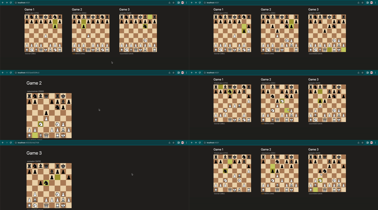
In this post, we’re going to build the frontend for an application I use to store chess games. Here’s a preview:
You can see the transition between pages includes moving both the name and board from its location in the list to its location on the more detailed page. This transition also works in reverse when I go back.
Setting up our project with Astro and Tailwind
Our application will have two pages, a / route which displays all our games, and a /[gameId] route, which displays one single game with more detail.
We’ll assume that you already have an Astro project set up, or you can follow the getting started guide here. We also use Tailwind for styling our project.
First, let’s just render the name of each game and see if we can get it to move. We’re going to hardcode the games, but if you want to learn how to fetch them instead, check out this guide.
---
import Layout from '../layouts/Layout.astro';

// TODO: fetch these instead of hardcoding them
const lichessGames = [
    {id: "10ICdkcd", name: "Game 1"},
    {id: "awEG0Kc2", name: "Game 2"},
    {id: "5zVaZ7G9", name: "Game 3"},
]
---

<Layout title="Chess Games">
    <main>
        <div class="mx-auto max-w-6xl grid grid-cols-3 p-4 gap-4">
            {lichessGames.map(game=> (
                <a href={`/${game.id}`}>
                    <h1 class="text-white text-2xl">{game.name}</h1>
                </a>
            ))}
        </div>
    </main>
</Layout>
Simple enough! Now, let’s create our [slug].astro file which will (eventually) render the page in more detail.
---
import Layout from "../layouts/Layout.astro";

// TODO: fetch the game instead of hardcoding them
const lichessGames = [
    {id: "10ICdkcd", name: "Game 1"},
    {id: "awEG0Kc2", name: "Game 2"},
    {id: "5zVaZ7G9", name: "Game 3"},
]

const { slug } = Astro.params;
const game = lichessGames.find((game) => game.id === slug);
if (!game) return Astro.redirect("/404");
---
<Layout title=`${game.id} - Chess Games`>
    <main class="max-w-6xl mx-auto p-8">
        <div class="flex items-center justify-between mb-8 mt-2">
            <h1 class="text-white text-4xl">{game.name}</h1>
        </div>
    </main>
</Layout>
When we click on the game names in the list view, we see… well, exactly what you’d expect:
How very 2023 circa a few months ago. Where’s the pizzaz? Where’s the flair?
A simple example of the View Transitions API
To use View Transitions we first need to enable it. We can do this by going to our shared Layout.astro file, importing ViewTransitions, and adding it to our head
---
import { ViewTransitions } from 'astro:transitions';

//...
---

...
  <head>
    ...
        <ViewTransitions />
    </head>
If we go back to our application for a second, you’ll notice a difference already in the transitions between pages.
It now has a subtle fade when you go from one page to the next. You can actually change this as well. If we go in and add the transition:animate directive, we can change the animation from fading to sliding:
<body transition:animate="slide">
    <slot />
</body>
Sliding is a little intense for this application, so we’ll remove that and stick with the default for now.
The next thing we want to do, is we want to tell the browser that “Game 1” on the list page and “Game 1” on the detail page are the same element (same for Game 2 and Game 3). To do this, we’ll use the transition:name directive and give the element a name based on the game’s ID.
In our index.astro file, we’ll update the header:
<h1 class="text-white text-2xl"
    transition:name=`game ${game.id} text`>
    {game.name}
</h1>
We’ll do the same in our [slug].astro file:
<h1 class="text-white text-4xl"
    transition:name=`game ${game.id} text`>
    {game.name}
</h1>
And now, when we navigate between pages, we can see the browser does it’s best to interpolate between where the element was before and where it is now:
Text is a little challenging, though, especially text that changes size. Let’s add in an image which will make the whole thing look cleaner.
If you’ve never used it before, Lichess is a free, open-source chess server. They provide a really amazing API, a full dump of all games played, a way to export games as GIFs, and so much more.
We’ll use Lichess to display a GIF of our game, making sure to include the transition:name directive:
<a href={`/${game.id}`}>
    <h1 class="text-white text-2xl" transition:name=`game ${game.id} text`>{game.name}</h1>
    <Image transition:name=`game ${game.id}`
           src={`https://lichess1.org/game/export/gif/white/${game.id}.gif?theme=brown&piece=cburnet`}
           alt="Lichess game"
           width={300}
           height={350}
    />
</a>
And then we’ll add the same image to our [slug].astro file:
<div class="grid grid-cols-1 md:grid-cols-2">
    <Image transition:name={`game ${game.id}`}
           src={`https://lichess1.org/game/export/gif/white/${game.id}.gif?theme=brown&piece=cburnet`}
           alt="Lichess game"
           width={360}
           height={420}
    />
</div>
Which leaves us with a really smooth transition between pages:
Note that for stateful elements (like Videos), you’ll also need to include the transition:persist directive.
But that’s really it! In the end, all we had to do was enable ViewTransitions, give our elements a unique name on each page, and the rest was taken care of for us.
Draw the rest of the owl
At the risk of being a little too “draw the rest of the owl” - the rest of the application isn’t that relevant for ViewTransitions. I added a few buttons like:
<button class="rounded-md px-3 py-2 text-sm font-semibold text-white bg-white/25 hover:bg-gray-300/25">
    Analyze
</button>
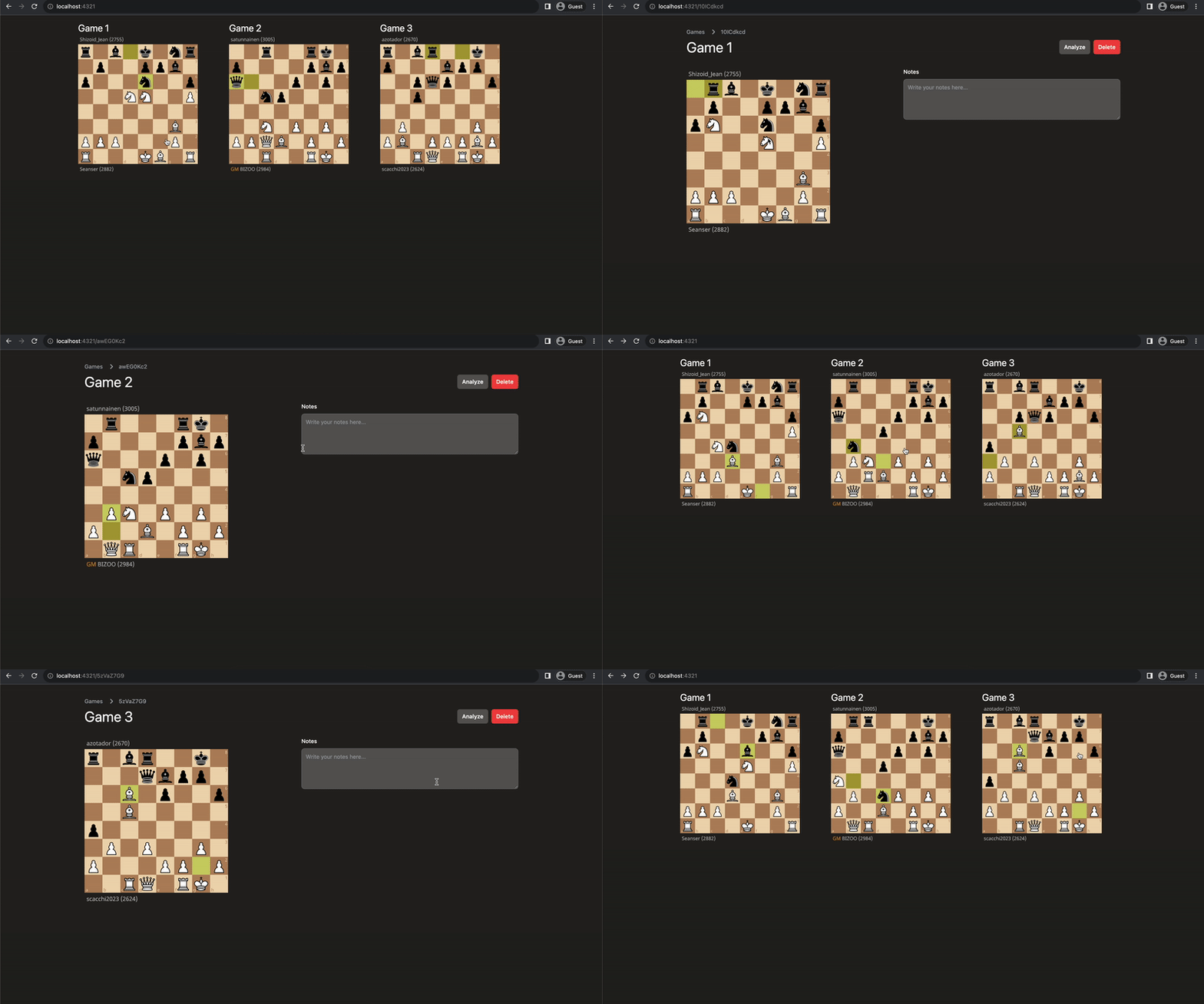
which I used to open a new window with Lichess’ analysis board. The final result looks like this:
Summary
The View Transitions API in Astro is surprisingly straightforward for how great the transitions themselves look. It can be pretty quickly adopted into blogs, e-commerce stores, media libraries, or really any application that includes a list view and a detailed view.


Top comments (0)