What can sell the product? Idea? Fair price? Impressive numbers? Well, all these sound good. However, let us be honest. When it comes to a cruel world of the cut-throat competition, these aspects fade in comparison to what a good advertisement can do. Like it or not, people eat with their eyes. Nothing can change this. It is an axiom that is true for every product. The design work is no exception
Whatever application you are going to market, show to investors or just present to the online audience for self-promotion, it should have a “yummy” wrapping. Make sure your product gets the proper frame to stand out from the faceless crowd and avoid the risk of going unnoticed. And, there is no better way to do this than to use an iPhone mockup. There are several compelling reasons for that.
Name Speaks It All: iPhone Mockup Increases Credibility
I know, I know, there is a whole bunch of cell-phone manufacturers: Samsung, Huawei, Xiaomi, Google, even Nokia keeps its head above water. However, there is only one name to rule them all. Apple was and still is a synonym of perfection and advancement. It is also a symbol of prestige and luxury. Therefore, placing the design of your application inside iPhone mockup is like using the best fabric that everyone wants to have. Just take a gander at the homepage of Apple Store where iPhone mockups with dummy applications are featured.
Apple Store
Does not it look exclusive? You can feel authority and power. So why not to learn from the best? Use iPhone mockup to instill sense of refinement to your product display triggering customers' subconsciousness. Prove them that you are the right guy choosing quality over quantity.
One more thing…
Although Apple devices are expensive things, their highly realistic digital versions can be found almost free of charge. Consider iPhone XS/X/8 PSD Mockups. This pack has a free demo version. It contains high-resolution iPhone mockups that come in all manufacturer colors and various views. Each one is based on smart objects and boasts of 100% scalable vector graphics. You can use them to create stunning presentations that will exude authority on all fronts.
iPhone XS/X/8 PSD Mockups
Animated Workflow Ignites Interest
Another good reason to use an iPhone template is that it serves as a solid foundation for creating animated presentations. Fancy onboarding, grandiose demo, or just a short, interactive workflow are popular solutions for winning over clients these days.
First and foremost, they bridge the gap between the dev team that knows the application inside out and non-tech-savvy customers who want to enjoy the action. Secondly, they bring everything on the table saving clients from misinterpretations or wrong impressions. Finally, they let the users almost touch an app and feel its potential encouraging them to explore.
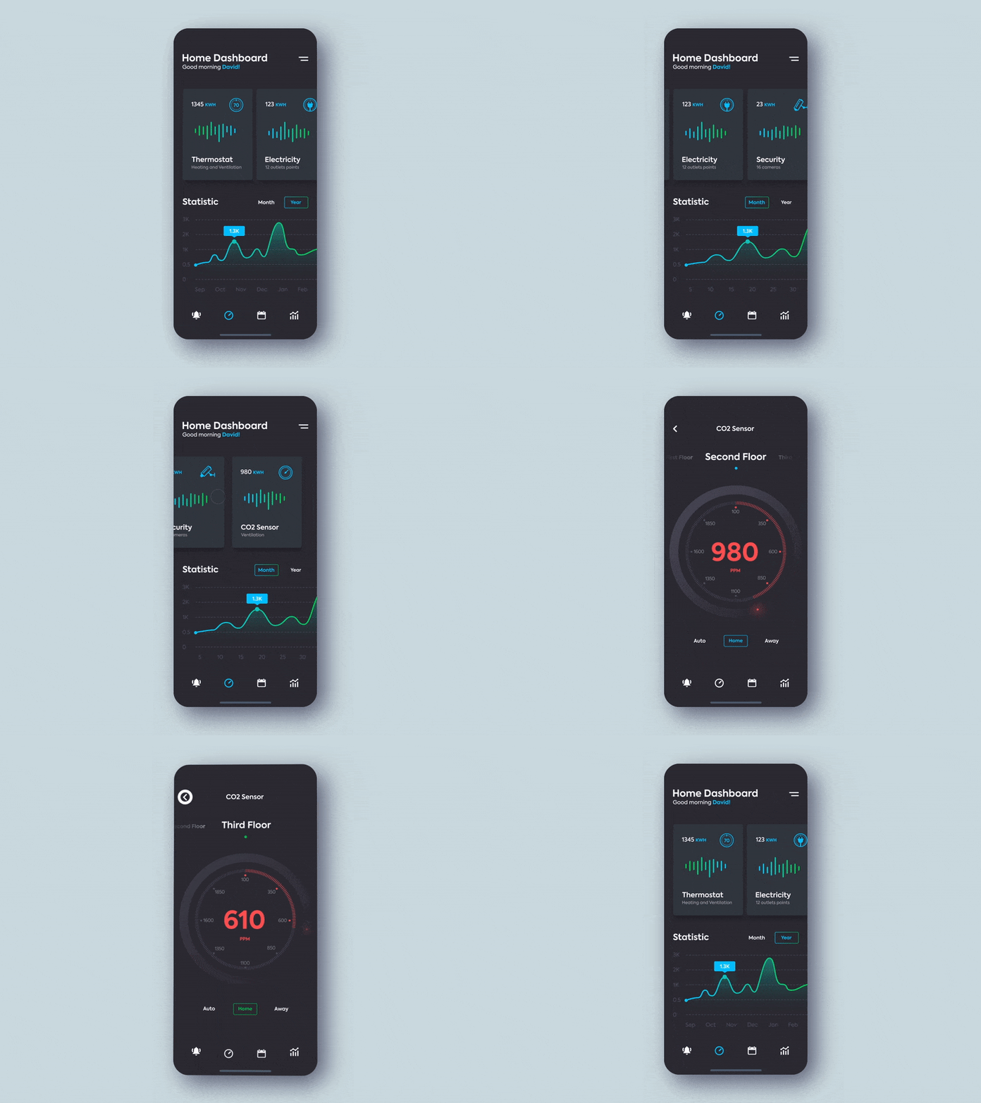
Consider Smart Home Controller as a point in case. The animation is based on several interactive screens that highlight the key moments of the application. It is looped, yet it feels natural. The team kills two birds with one stone: they demonstrate the baseline functions and at the same time command the attention with the beautiful UI design promising an eye-pleasing and beneficial user experience.
Smart Home Controller
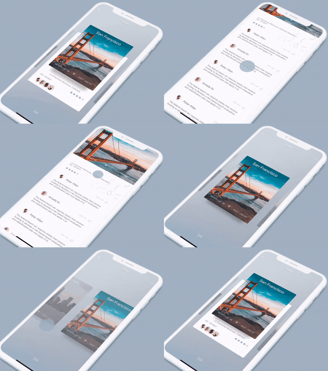
Here, you can see by yourself how the well-thought-out simulation drums up the interest. If you are ready to bring your presentation to life by creating one of those inspiring animations there are several fantastic freebies to kick off. For instance, Paper Onboarding Android Control is an ideal place for getting valid points and conduct some experiments.
Used for showcasing an onboarding process, it is based on three screens that are connected with each other through beautiful transitions. In a core, it is a simple slider written in Java. Nevertheless, it certainly makes an impression.
Paper Onboarding Android Control
The same goes to Optimized iOS Control by Ramotion. This is another fancy slider. This time, it is a SWIFT UI library that ships with essential IOS components and animations to make it easier to add some motion to your Apple-targeted concepts.
Optimized iOS Control by Ramotion
Realistic iPhone Mockup Makes Strong Impression
Although your application is a part of a digital world, however, in the end, it is going to live in the real one and interact with real people. Its natural habitat is our world inside a cell-phone. Therefore, using a realistic device mockup that looks exactly like one that we have in our pocket will be the best way to emphasize this fact.
The device mockup allows the clients not just to visualize but see the product with their own eyes. It blurs the line between the concept and the actual product making it familiar but not banal. It also heightens expectations, and ipso facto makes stronger impression than just a regular series of UI screenshots.
Just imagine how your design work will look placed inside one of the hand-crafted vigilantly-rendered Clay Devices Mockups featured below. They look so refined and polished that it is quite difficult to take eyes off them. You just want to touch the scene and interact with UI right now.
To enrich presentation and reinforce impression even more, you can also mix and match frontal, portrait and landscape views that are available in the package as well. Use the demo version to see it for yourself.
Conclusion
While we have highlighted three main reasons to use iPhone mockup in your creative process, actually there are many other valid points. For instance, highly realistic device mockups presented in ¾ angle help to build trust in a product since dimension in tandem with perspective add an extra level of legitimacy to the showcase. Cut a long story short, iPhone mockups are one of the best wrapping material for your product. They will convey the strong impression and certainly bring home the proper message.


Top comments (0)