Every creative team considers their design work a true diamond. It is based on a great idea, has a sophisticated design and well-thought-out user experience: a gemstone that deserves to be in a crown. However, how will your potential clients find out that it is a real pure carbon rock? After all the market is teeming with such kind of jewels. The answer is simple: you need to show it to them.
In the digital market world, there is no better way of revealing beauty, potential, and value of your application than to create a killing presentation. And, it is here where highly realistic iPhone mockups come in handy. There are three viable ways how to use them to present your design work efficiently. Let us consider them one by one.
Use iPhone Mockup to Create an Eye-Catching Display for Apple Store
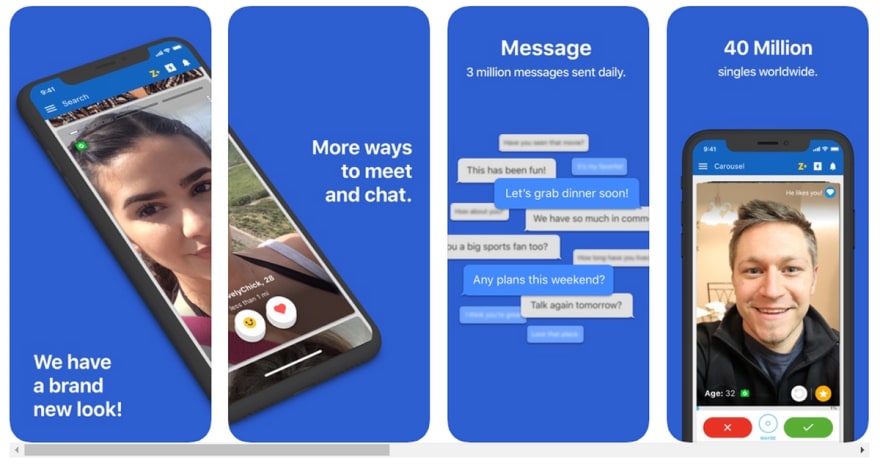
The Apple Store allows you to add not just description but also images. Use this to let your imagination run wild. Whatever you are planning to sell, you need to present it in the best light. Show the potential clients what is hidden inside. Choose the most impressive or valuable sections of a program to win customers over. While others will go for a basic display, you can create a unique exhibition by mixing and matching highly realistic device mockups. Consider Zoosk, a popular dating application, as a point in case.
Here the team has turned the first two available slots into one area recreating an intriguing mosaic-style showcase. They have demonstrated the application under the angle making the scene feel natural and unobtrusive. Using such a clever presentation, they were managed to ignite the interest and certainly stand out from the crowd.
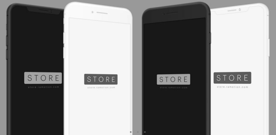
What’s more, you can easily re-create something alike. It is not rocket science. For instance, take one of the hand-crafted renderings from iPhone X/8 Clay Angled Mockups package that looks just awesome thanks to the sophisticated clay appearance. Quickly place UI screenshots inside using Smart Objects and play around with these four slots in the Apple Store to create a unique and alluring showcase.
Use Isometric View to Spice Things Up
Without doubt, the design work that is enclosed in the iPhone mockup displayed in the frontal view looks impressive; however, it certainly would not hurt to spice things up a little. For instance, you can play with an angle and make the perspective work for you, revealing its compelling charisma.
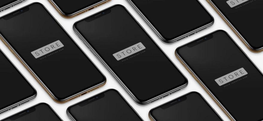
There are different ways to go with this solution, but one of the most promising and powerful is, of course, to adapt an isometric view to your needs. Not only will it help to separate the presentation from the competition with its exceptional look, but it will also lend credence to the idea. You can get extra points for believability, and ipso facto enhance the trustworthiness of the entire project. Consider using iPhone XS/X/8 PSD Mockups for that.
This pack includes a dozen of vigilantly rendered highly realistic iPhone gadgets. It covers three models: XS, X and 8. Each one is available in three finishing options (Space Gray, Silver, and Gold). You can choose the preferable isometric mockup (for example, one that is featured below; it looks incredibly organic), put inside several UI screens, and display it to your audience. Without much customization and almost in a wink, you will have a fantastic presentation. Thanks to its realistic view, it will feel inartificial and native easily luring potential clients in and encouraging them to play with the product.
Use Frontal View of iPhone Mockup to Create an Awe-Inspiring Walkthrough Animation
Well, it is time to push the boundaries. Let us ditch the static approaches and adopt one of those dynamic solutions that are so popular these days.
The deal is that everyone loves to see the real app. An interactive way to present the program to the audience is thriving these days. Every UI designer or creative team prefers to treat their potential customers or investors with some fancy presentations that are brought to life. Onboarding animations, interactive walkthroughs, and even a traditional horizontal slider that shows a series of UI screens in a loop are effective ways to make a statement as well as bring more focus to the product.
Consider Workout App by Vitaly Rubtsov that is a typical example where the artist has used animation to tout his product successfully. Instead of traditionally listing the UI screens, he has adopted an engaging storytelling approach. Using the traditional slider and small interactions, he has managed to bring everything to life and pull off quite an impressive presentation. It looks so natural that it feels like we are walking through the onboarding process by ourselves. Note, this is just a short animation, yet it stands far beyond the banality getting our attention without much effort.
Think of an animated mockup of your application as a traditional trailer for a movie. Do not intimidate the audience with technical aspects and data. Highlight essential functions, show the most important elements, thrill them with impressive design features, walk them through the main benefits by telling an appealing story, and just let them play. Use for that one of outstanding iPhone X Mockups that look classy and elegant. It will provide an exquisite underlay for the dynamic masterpiece adding extra points to the presentation.
Conclusion
Whether you are building a showcase for potential investors, Apple Store buyers, or just friends to get the reviews make it count. Tell them a story about your product using highly realistic assets. These handcrafted iPhone mockups give the presentation quality of being trusted and a feeling that you can experience the app right now. Mix and match different angles and views to show the product in the best possible light.


Top comments (0)