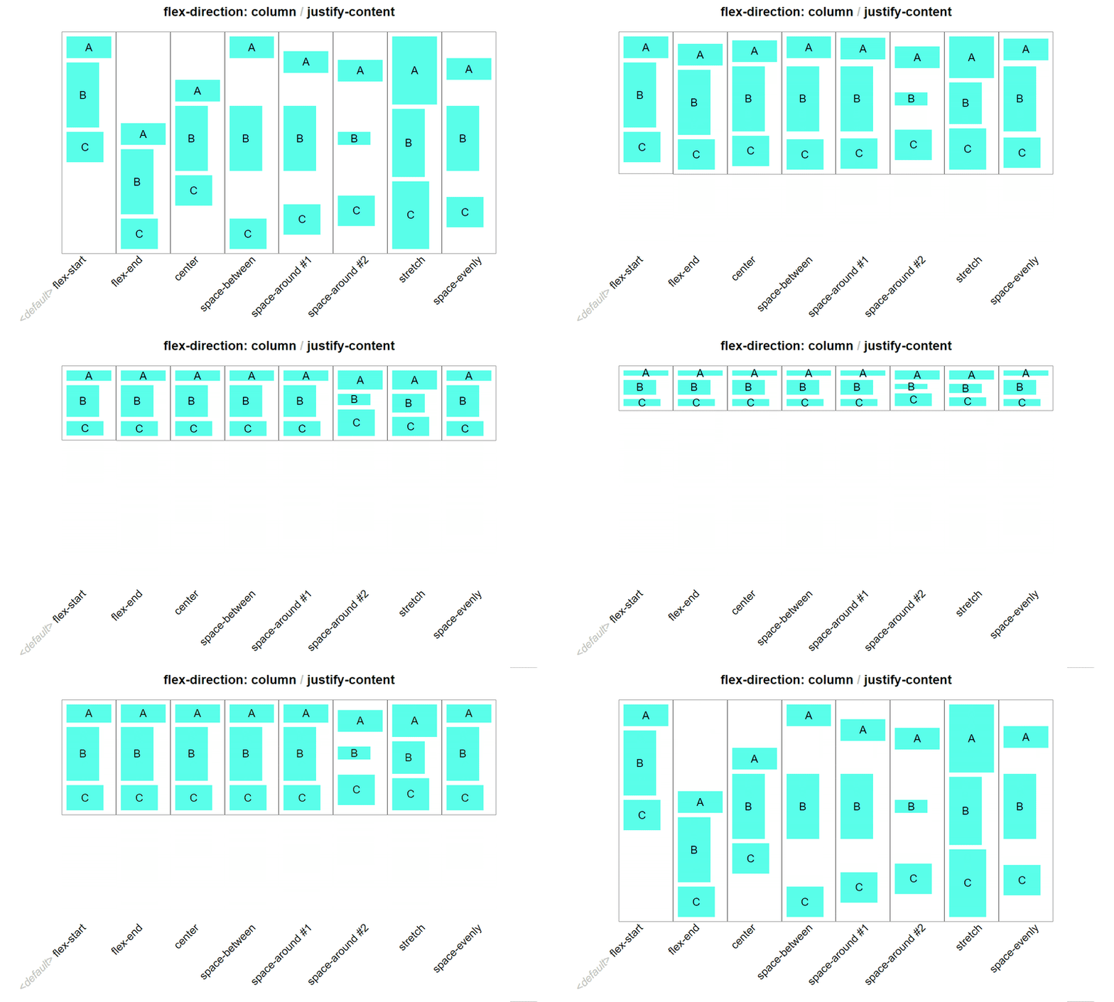
Welcome to the realm of web design wizardry, where the spells of CSS Grid and Flexbox converge to create enchanting layouts that captivate your users. In this magical journey, we'll delve deep into the arcane arts of CSS Grid, unraveling its potent powers for crafting responsive and visually stunning designs.
Unveiling the Power of CSS Grid
CSS Grid is the master architect of layouts, offering a two-dimensional grid system that transforms the way we structure web content. Imagine a grid as your canvas, where you can effortlessly position and size elements, creating intricate designs with ease.
.container {
  display: grid;
  grid-template-columns: repeat(3, 1fr);
  gap: 20px;
}

.item {
  grid-column: span 2;
}
Here, our incantation begins with display: grid, summoning the grid on our container. grid-template-columns orchestrates the columns, and gap introduces a harmonious spacing between elements. The grid-column spell then dictates the span of an element across columns.
Navigating Complex Grid Structures
Now, let's embark on a quest to create complex grid structures tailored to different use cases. Whether it's a magazine-style layout or a portfolio grid, CSS Grid weaves its magic seamlessly.
.magazine-layout {
  display: grid;
  grid-template-columns: 1fr 3fr;
  gap: 20px;
}

.portfolio-grid {
  display: grid;
  grid-template-columns: repeat(auto-fill, minmax(200px, 1fr));
  gap: 15px;
}
The magazine-layout grid showcases a two-column structure for a sleek reading experience, while the portfolio-grid dynamically adapts to various screen sizes, thanks to auto-fill and minmax.
Responsive Design Elegance
No spell is complete without the ability to shape-shift gracefully across devices. CSS Grid, with its responsive prowess, ensures your design remains captivating on screens of all sizes.
@media (max-width: 768px) {
  .container {
    grid-template-columns: 1fr;
  }
}
With a sprinkle of media queries, we command our grid to transition to a single column when the screen size is compact, ensuring a delightful experience on mobile devices.
Enhancing Mastery Through Games
What better way to refine your mastery than through the art of games? Challenge yourself with CSS Grid games like "Grid Garden" or "CSS Grid Layout by Example." These interactive experiences will hone your skills and transform learning into an adventure.
So, there you have it—CSS Grid and Flexbox, the dynamic duo in your toolkit for creating layouts that defy the ordinary. May your web designs be ever-responsive and visually enchanting.


Top comments (0)