So, you’ve come up with a beautiful, elegant, solid software design. But to move forward you have to get it approved. And to get it approved, you have to communicate it to others. Because, unfortunately, having the idea in your mind is not enough to get it built as you envisioned it. Getting your design across effectively is not a simple task, and many software engineers are not skilled at it. But as most skills, your skill at writing design documents can be improved, I hope this post helps you on your way.
As we write a design document we should keep two main concerns in mind:
Purpose
In my opinion these are the three objectives of a good design document:
- Get buy-in for the high-level architecture from relevant stakeholders (engineering managers, technical leaders, engineers from other relevant groups).
- Provide a blueprint for implementation.
- Provide documentation (for historical reference, onboarding etc.)
But most importantly: A design document may include a summary of requirements, if appropriate – but it should not read as a wishlist. Someone reading a design document should get a clear idea of what you are planning to do.

Audience
Who will be reading the design document:
- People who need to approve/provide feedback on the design.
- People who need to do the work outlined in the document.
- The author (you’re not going to remember why you did any of this in a couple of months).
In addition to their role, readers may have varying context on the design:
- Internal readers who already know the background whose memory just needs to be refreshed.
- External readers or newcomers who have no or close to no context and need a high level overview of what this document will cover.
When we write a design doc we need to keep the purpose and the different audiences in mind so we can write the right thing in the right place at the right level of detail.
Now that we know why we’re writing a design document and for who, let’s get into what it should include:
Intro
Before we do anything, we need to catch the very limited and easily distractible attention of the reader. They’ve just received some form of notification letting them know we’ve shared a document for review with them, they want to know what this is all about. If we don’t catch their attention they might move on to the next email in their inbox or the next notification. Don’t waste this precious area on technicalities, give them something interesting.
So, after the title – the first thing a design document should include is the relevant context and background information needed to understand the problem being solved: What are we trying to solve and why.
This should be a summary of what you want to achieve, not how you want to achieve it. A good way to check if your design works is to check if it actually achieves the objectives laid out in this section.
Make it short
One or two paragraphs.
And to the point
Think how you would explain the issue to your skip-level manager if you met them in the elevator. They have some context and technical know-how, but are not involved in the bits-and-bytes of the project.
Clear
Try to avoid unnecessary abbreviations and internal terms. Link to explanations of the terms used where possible.
Bullet points
You may use bullet points if that helps you clarify the problems or objective, but you don’t have to. If you’ve got more than 3 bullet points check yourself – are they really different objectives? If so, maybe you’re trying to achieve too much with a single design and this should be split into different features or components to be designed separately?
Tell me what you want
If you’re having trouble figuring out your objectives you can ask yourself: What value are you trying to deliver? Toyota’s 5 whys may also help you define what you’re really trying to achieve.
Outline
If there are a few main sections to the document, you can provide a high level outline at this point. Not every heading and subheading should be here, but links to the main sections can help the reader skip to the part that interests them. Remember, we’re trying to keep this short.
Technicalities
Now that you’ve got them hooked – add the bureaucratic bits about the approval process, things like:
- Document status: WIP / Under review / Approved / Implemented / Cancelled
- Author(s) / DRIs / Owners
- Last update date
- Requested review date
- Approvers list
Make your approver’s life easier:
- If they’ve been called in for a specific purpose, i.e. security or legal review, point them in the direction of the relevant section using a direct link. They shouldn’t have to read about your APIs if all they care about is the retention policy of your user’s information.
- Not everyone carries equal weight. Clearly mark which approvers are required and which are optional.
- Set a date for the review. People are busy, they have to prioritize their work. If you leave things open-ended and depend on people’s good will, they may not get around to reviewing your document. Be respectful, give them enough time to complete the review, but also feel free to nudge them as the deadline approaches. You may escalate or move ahead without their approval if they don’t provide timely feedback. The show must go on.

References
You can’t possibly include all the background and history of a given project in a single document. However, some of it may be necessary in order to understand the context and decisions being made in the design document. Add a section with relevant links to help your readers out. This may include:
- Requirements documents
- Related design documents
- Marketing or user research
- Meeting notes
- and more.
Use your discretion in deciding what’s important.
Glossary
Every domain has its own terms, language and acronyms. For anyone who’s been around for a while these terms are transparent, but for newcomers or readers from other groups – they might make your document impossible to read or understand. Therefore, including a glossary is extremely important. On the other hand, it may be long and redundant for readers who are already familiar with all the terms, and this area of the document is expensive real-estate.
An appropriate solution is to add a glossary as an appendix at the bottom of the document and link to it from here. Most of the time you’ll just be copy-pasting the glossary from one document to the next, so it’s not a big effort. If you happen to have your organizational act together and actually have a living, breathing glossary which is kept up to date you could link to that, but having a specific glossary with only the terms included in the document may be easier for the reader to handle. Remember, this is not for you – so do whatever you think is more convenient for the reader.
Non-goals / out of scope:
If there are similar or related issues you’ve decided not to address in this design, specify them here. Comments and questions like “why didn’t you handle X or Y” when you intentionally left them out can be distracting and annoying. Let’s not annoy the reader nor ourselves.
High level architecture
The next section should include a high level overview of the solution. This will normally include a diagram or flow chart with the main components of the design. You don’t have to use UML or precise annotations, no one remembers the rules of those anyway. It should provide the reader with a general understanding of what you want to implement and how the different pieces interact, without going into too much detail.
For example:
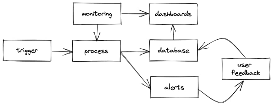
You may think your diagram is clear, but it is not self explanatory. After the diagram you should include a description of the different components and how they interact.
For (the same) example:
When trigger occurs, the process begins and the result is stored in the database. Alerts are generated and the user is notified. The user may then provide optional feedback, which is also stored in the database. The process health and quality is monitored and saved in the monitoring system. The process results, monitoring and user feedback are combined and displayed in internal dashboards.
Detailed design
The detailed design should explore the details of the components listed above.
If you find yourself adding top level headers that are not listed as a component in the high level architecture you should ask yourself if this is part of another component in which case it should be moved under that component, or if a component is missing from the high level architecture. You should always make sure the reader understands where the details fit in the big picture, otherwise they will get lost.
Details that are appropriate in this section:
- APIs
- Pseudo code
- Class structure
- Database schema
- Specific technology stacks
- And more
Decisions and tradeoffs
This section may include decisions that need to be made – for instance, choosing one technology stack over another, reusing existing components or writing new ones from scratch, some API or data model decisions etc.
Start with an overview of each alternative, but keep it focused. 3-4 paragraphs should be more than enough. If it gets too long, move the discussion to the end of the document as an appendix and include only the main points in this section. The detailed discussion is for you so you can justify your thought process and for nitpicking reviewers. Most readers don’t need to know. I usually put a big “STOP READING HERE” before that part or: “Unbaked thoughts, proceed with caution”.
After you’re done with the overview of the different options, summarize the pros/cons and tradeoffs in a table. Help your readers by deciding which option you prefer, but be open to changing your mind. If you didn’t want feedback you shouldn’t have asked in the first place.
Option #1
Overview of this option
Option #2
Overview of this option
Option #3
Overview of this option
Summary
| Option #1 | Option #2 💜 | Option #3 | |
|---|---|---|---|
| Criterion #1 | ⛔ reason | 🚧 reason | 🚧 reason |
| Criterion #2 | ❗ reason | ✅ reason | ❗ reason |
| Criterion #3 | ✅ reason | 🚧 reason | ❗ reason |
| Unacceptable risk | Best match for criteria | Not best at any criteria |
Each row contains a specific criteria and how that option measures up.
The final row of the table will include a summary of the tradeoffs for each option to enable the reviewers to make an informed decision. Remember, there is no guarantee for a right answer, there is only choosing between alternatives based on what you feel is most important. If the project is on a tight deadline – you may decide to choose an option based on what is fastest to develop, even if it’s not the best option based on other criteria. Perhaps you’ve promised your customers excellent performance and reliability and can’t compromise on quality. Highlight these considerations when you summarize each option.
I 💖 emoji
As you can see, I’ve filled the table with emoji. You don’t have to use them, but it gives a visual indicator which option is best and by which criteria. I specifically used different icons and didn’t rely on colors after being told red / orange / yellow / green circles were not helpful for color-blind folk. Learn from my mistakes and be inclusive from the get-go.
It’s best to include a legend below the table what each emoji means. At first you might want to include a detailed explanation:
⛔ blocker – can’t choose this option under any circumstance.
❗ serious issue – can choose this option but it has serious disadvantages compared to the other options or in general.
🚧 mild issue – can choose this option and has some acceptable disadvantages
✅ OK – no serious downside or the best option.
💜 Recommended option
But as people get used to the idea you might be able to limit it to a one-liner:
⛔ blocker | ❗ serious issue | 🚧 mild issue | ✅ OK | 💜 Recommended
Decision fatigue
It’s easy to leave all the decisions open for feedback and discussion, but to be honest – most issues are pretty straight forward. For these, write down your reasons for choosing whatever you think is best and keep the detailed discussion with pros and cons in the unbaked thoughts appendix for anyone who has doubts or questions.
If you keep too many things open two things will happen:
- You won’t be able to make any progress on your design until you get everyone’s approval on every small decision.
- People have opinions on everything, so you’ll end up wasting a lot of time discussing things that don’t matter much or are obviously the right way to go.
Therefore it’s best to limit the number of decisions you want to get feedback on to a few that are key decisions: those that deeply influence the design or will be difficult to change later (type 1).
Other stuff
Once the design details are covered, there are other concerns that need to be addressed. Some of these will be specific to your product, others are common across the industry. These should be included in your organization’s design document template so you don’t forget about them.
Common subjects included in this section are:
- Testing strategy
- Documentation
- Monitoring and analytics
- Performance and scale
- Legal & Security
- Product lifecycle concerns: e.g. what happens when a user joins/leaves, when a customer is upgraded/downgraded etc.
- Release plan: feature gating, A/B testing, migration etc.
- And more.
Much of this post is adapted from the design review process at both Dropbox and Google, with a few touches of my own. Thanks to the people who developed these processes and I had the good fortune to learn from. Also thanks to my mother, who at 10 years old made me write specifications for operating telephones as an exercise, and gave me my very first experience at writing tech specs.


Top comments (0)