For the past few years, I have watched from the sidelines as amazing CSS art is posted every day of the month of October as part of a challenge called #divtober.
The challenge created and organized by Lynn Fisher is to use a one-word prompt daily to make a piece of art with as much CSS as you like but only one hook in the HTML. One. single. div.
Being on sabbatical this Fall, I felt like I could devote the time necessary to participate and sharpen up my CSS skills and flush out a new hobby.
I did successfully post a piece every day. Here is my collection:
–-
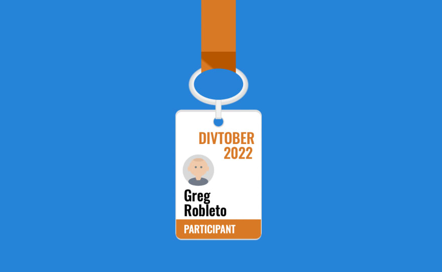
01. Badge
A conference badge — I felt like a newbie attending a month-long conference with many incredible CSS artists I wanted to learn from.
- Code on Codepen: https://codepen.io/robleto/pres/gOzoyJM
- Time-lapse video on YouTube: https://youtu.be/XSkVSjxbkAA
–-
02. Dry
The desert at sunset — this was very ambitious and took a lot of time assembling and relearning CSS animation to make a sunset. I found the layers of the sky gradient so complex I wrote a whole other article about it.
- Code on Codepen: https://codepen.io/robleto/pres/BaxYwwd
- Time-lapse video on YouTube: https://youtu.be/xylb7FpKgkE
–-
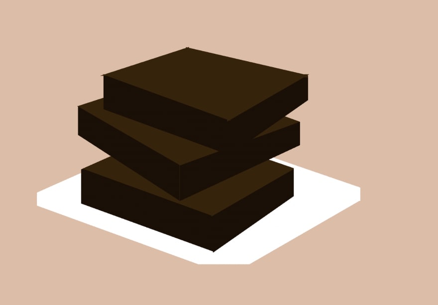
03. Snack
Brownies — I think this was the weakest one as I sunk a lot of time in because I didn’t yet have a grasp on the way to make angular shapes or use perspective.
- Code on Codepen: https://codepen.io/robleto/pen/VwxxQyJ
- Time-lapse video on YouTube: https://youtu.be/Z-p4tKRgKWk
–-
04. Quiet
A no trumpeting sign — Trying to simplify after Days 2 and 3. And added in a touch of animation just to give it a bit of life.
- Code on CodePen: https://codepen.io/robleto/pres/eYrrvBZ
- Time-lapse video on YouTube: https://youtu.be/c9RW1PzTtXQ
–-
05. Stamp
A passport stamp — This entry is personal as I am taking the family on the first international trip in years and am really excited to get this
- Code on Codepen: https://codepen.io/robleto/pres/BaxPyxq
- Time-lapse video on YouTube: https://youtu.be/vPW7UJc8dig
–-
06. Meaty
A butcher shop — This piece was based on stock art I found, but no matter, it was where I started to really feel confident that I was sharpening my skills and ability to build something that will come out well.
- Code on Codepen: https://codepen.io/robleto/pres/vYjaGwq
- Time-lapse video on YouTube: https://youtu.be/4gwGGbgoK_4
–-
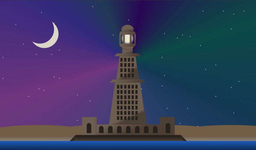
07 — Wonder
The Library of Alexandria — One of the Seven Wonders of the World. I realized this is the lighthouse at Alexandria, not the library. Oops. I think I was over my skis here, but really like how the sky and stars came out.
- Code on Codepen: https://codepen.io/robleto/pen/YzLjYvr
- Time-lapse video on YouTube: https://youtu.be/pWvtimh4y_A
–-
08. Haunted
A cute ghost — This piece was already in my Codepen files as multiple divs, so I gave it a clean up and edited it down to one div.
- Code on Codepen: https://codepen.io/robleto/pen/oNdPYyd
- Time-lapse video on YouTube: https://youtu.be/f7xiC6Iv_rM
–-
09. Rise
A skyscraper from the ground — This concept has to scale way back cause I could not wrangle perspectives as I had hoped yet, but I was happy with the aesthetic and the angle.
- Code on Codepen: https://codepen.io/robleto/pen/dyegoLK
- Time-lapse video on YouTube: https://youtu.be/Ak6DSrM8AJw
–-
10. Game
A game console controller — After a number of complex pieces, this was a relatively simple one to catch up. I realize it doesn’t actually match any particular game system.
- Code on Codepen: https://codepen.io/robleto/pen/ZEoqxqv
- Time-lapse video on YouTube: https://youtu.be/88fKEUnMgNs
–-
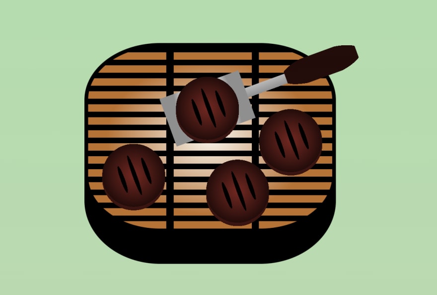
11. Burger
Grill’s On! — The grill bars were my first exploration into repeating gradients, and the burgers reinforced the use of very structured variables (since you can’t use mixins within a background tag.
- Code on Codepen: https://codepen.io/robleto/pres/JjvmLme
- Time-lapse video on YouTube: https://youtu.be/E798cZrYBQ0
–-
12. Shadow
Sunset’s shadow on the wall — Through the blinds on the opposite wall, you see the light move as the sun goes down. This was surprisingly little code but a lot of forethought and concurrent animations
- Code on Codepen: https://codepen.io/robleto/pen/mdLzxQd
- Time-lapse video on YouTube: https://youtu.be/8Ps5XXnb1x4
–-
13. Forever
A racecar on an infinite track — I sunk a ton of time into figuring out the math for animating that cute car around the track. I never got it where I wanted it, it still does a bit of a clunky drift, but that’s pretty good considering how out of my depth I was going in
- Code on Codepen: https://codepen.io/robleto/pres/LYmgdXq
- Time-lapse video on YouTube: https://youtu.be/j2_0uhsJpEY
–-
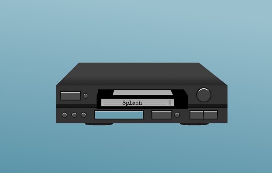
14. Splash
The movie Splash in a VCR — After so much time on Forever, I didn’t have the energy to figure out water droplets, so I went with something boxy that I knew I could pull off now with relative ease. I enjoyed being so different than any other submissions this day.
- Code on Codepen: https://codepen.io/robleto/pres/rNvoRaV
- Time-lapse video on YouTube: https://youtu.be/s4rlX2cja-w
–-
15. Erase
Pencil erasing lines — Here, at about the halfway point of the month, things start to click. I understood with this pencil how to more efficiently code linear-gradients and, in general, how to tell a story with less complexity.
- Code on Codepen: https://codepen.io/robleto/pres/rNvoRaV
- Time-lapse video on YouTube: https://youtu.be/jcclDHxD2qc
–-
16. Hypnotic
I divulged heavily from my Figma concept to something that was more mathematical and achievable. This is mostly just a radial gradient, a conic gradient (my first use of that), and slight animation.
- Code on Codepen: https://codepen.io/robleto/pen/xxjMxop
- Time-lapse video on YouTube: https://youtu.be/h0hR6de16E4
–-
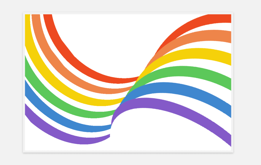
17. Stripes
I wanted to play with appearing to bend lines (using radial gradients) to make more flowing and vibrant lines.
- Code on Codepen: https://codepen.io/robleto/pres/xxjBYQv
- Time-lapse video on YouTube: https://youtu.be/_Dvruv81wSQ
–-
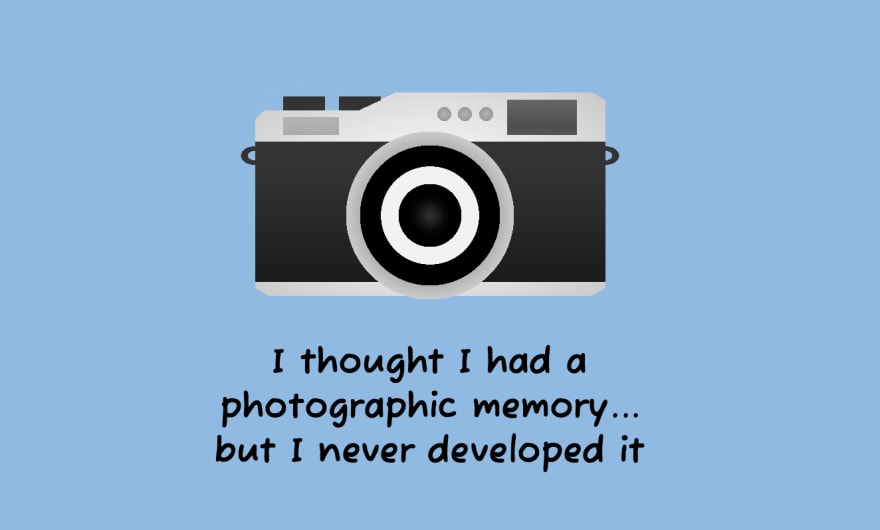
18. Pun
Not the most complex piece to make, but one of the most fun cause I went through a lot of bad puns to find a joke to build around.
- Code on Codepen: https://codepen.io/robleto/pres/xxjBMqm
- Time-lapse video on YouTube: https://youtu.be/zZ5FvOXoe2k
–-
19. Mythical
Born in the year of the dragon, I’ve always had an affinity long before HBO started making them centerpieces for their dramas. This was the first piece I spent more time in Figma and then used the inspect tool to match exactly pixel for pixel
- Code on Codepen: https://codepen.io/robleto/pen/NWMmWRM
- Time-lapse video on YouTube: https://youtu.be/nzjcaZGLxeM
–-
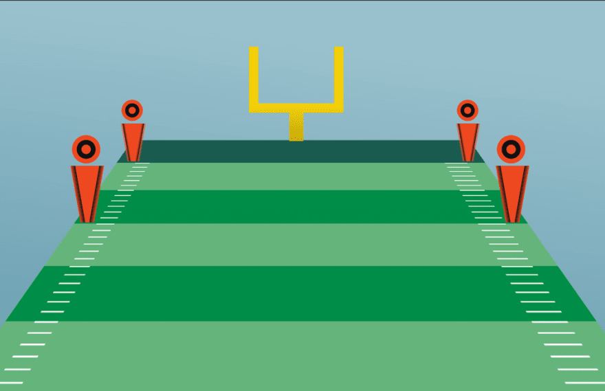
20. Ten
This started out as the Big Ten logo with a football field behind it, but the B10 lettering looked janky, so I swapped out for yard markers to designate 10 yards til the goal.
- Code on Codepen: https://codepen.io/robleto/pen/xxjewqG
- Time-lapse video on YouTube: https://youtu.be/uS8icMR8qlk
–-
21. Valuable
I had this diamond on hand from a Udemy class on CSS Art. It took very little effort to convert it from multiple divs to one set of 45-degree spun linear gradients.
- Code on Codepen: https://codepen.io/robleto/pen/gOzyPpd
- Time-lapse video on YouTube: https://youtu.be/deye0rauCR8
–-
22. Soft
A feather floating down — I liked trying to get the shadow to match the direction with less movement. I still was having issues understanding the better way to do transparency here.
- Code on Codepen: https://codepen.io/robleto/pen/KKRjVmY
- Time-lapse video on YouTube: https://youtu.be/87U3QUR7BrQ
–-
23. Pop
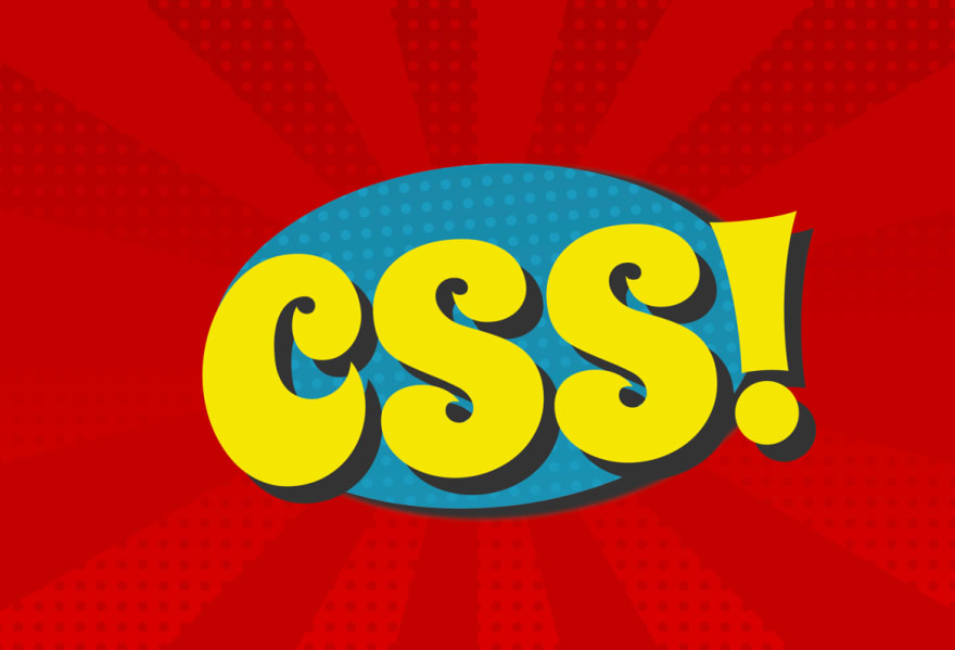
A pop-art comic-book style burst with CSS! jumping out. This was getting more refined with the repeating gradient and conic gradient.
- Code on Codepen: https://codepen.io/robleto/pen/qBYeYxb
- Time-lapse video on YouTube: https://youtu.be/ka0GmvIIqig
–-
24. Cube
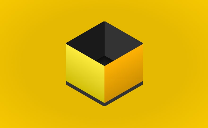
This was a lesson in agility. It was supposed to be a set of dice, then just one, then when I still couldn’t get that right, it became just an empty box.
- Code on Codepen: https://codepen.io/robleto/pen/LYmwmox
- Time-lapse video on YouTube: https://youtu.be/GFHY5SCcOBk
–-
25. Luminous
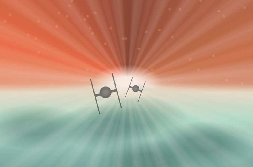
Now getting into the home stretch, I think I started to build my confidence and do a few tentpole pieces that I now felt skilled enough to be able to handle. This one here, the chase scene through The Eye from the Star Wars Andor show, was the first in them.
- Code on Codepen: https://codepen.io/robleto/pen/dyKbpYy
- Time-lapse video on YouTube: https://youtu.be/PN0gvUyeNUQ
–-
26. Vintage
Surfer van — This is probably the one I find most polished and complete. It’s inspired by some stock art, but it’s completely recreated with CSS.
- Code on Codepen: https://codepen.io/robleto/pen/wvXwqjp
- Time-lapse video on YouTube: https://youtu.be/yXp0_k97iqU
–-
27. Grain
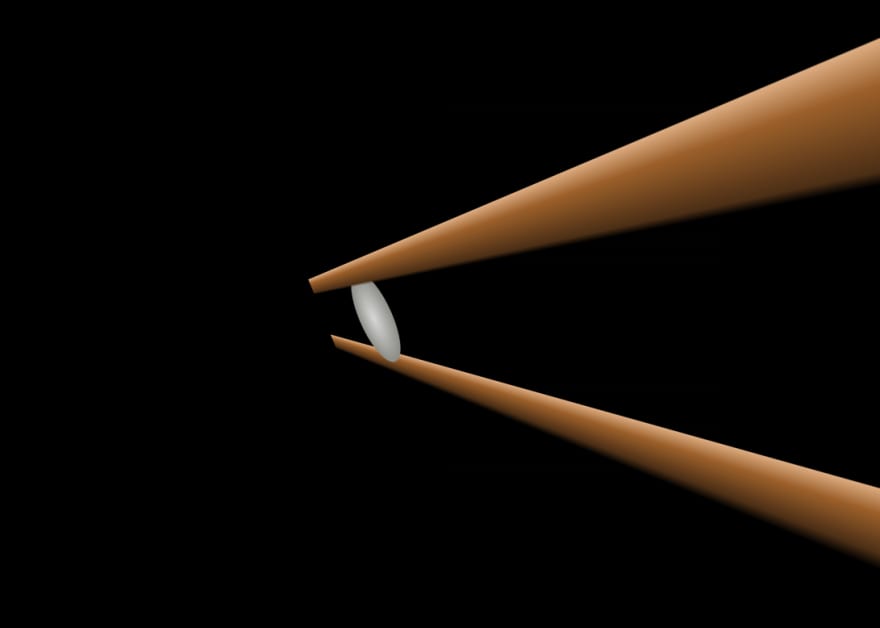
This was going to be so much more, a whole bowl of rice, but the way it looked with one grain and chopsticks had such a photo realism I don’t usually find that I just left it at one.
- Code on Codepen: https://codepen.io/robleto/pen/mdKyeoY
- Time-lapse video on YouTube: https://youtu.be/C697rCRzlFo
–-
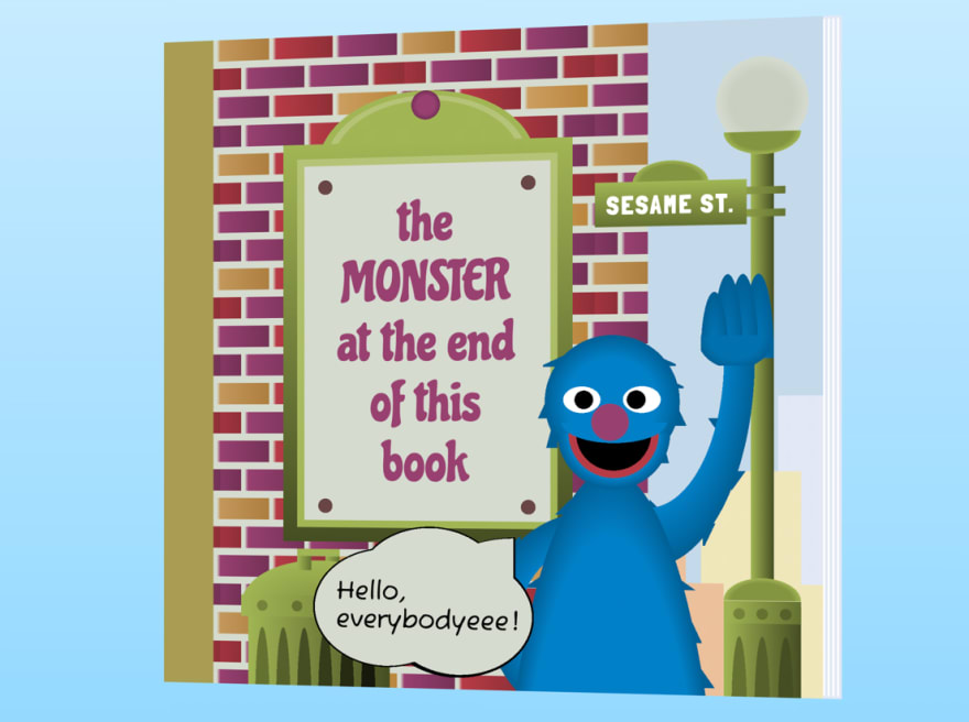
28. Monster
For a lot of these, I didn’t know what I wanted to do til I sat down and started, but this one I knew way back when the list came out and was so thrilled my abilities grew enough over the first four weeks to be able to do a respectable job recreating this, one of my most cherished book growing up.
- Code on Codepen: https://codepen.io/robleto/pen/NWzPbwB
- Time-lapse video on YouTube: https://youtu.be/ikGPTW6R1vI
–-
29. Free
Having a go at outlines and just a bit of ironic fun with the word free. It also cycles back to the beginning on Day Two when I tried to make cactuses.
- Code on Codepen: https://codepen.io/robleto/pen/gOKpbGb
- Time-lapse video on YouTube: https://youtu.be/zN6dUwvZG3A
–-
30. Beloved
This piece was a thank you note to my wife and family for being so supportive, as I devoted a fair amount of time this past month to make all this CSS art. It also cycles back to the beginning, as it’s the same avatar of me I used on Day One for the badge.
- Code on Codepen: https://codepen.io/robleto/pen/BaVNjxK
- Time-lapse video on YouTube: https://youtu.be/rLzWckO9itU
–-
31. Brew
This was a bit of a culmination of all that I learned about shadows, subtlety, animation, gradients, and the like pulled together into one robust, complex last set piece to end the #divtober.
- Code on Codepen: https://codepen.io/robleto/pen/abKOmqj
- Time-lapse video on YouTube: https://youtu.be/vKYZphTizLE
–-
In Summary
My favorite is 28. Monster — The Monster at the End of this Book. I am most proud of 31. Brew — The Beer Bottling. I think the one that turned out the best is 26 Vintage — the Surfer Van, and
And if I find time to go back, I want to update 24. Cube to make it the dice it was meant to be, 22 Soft to fix the transparencies, and 03. Brownies.
But beyond the results of each day’s piece, the bigger picture is I could feel the progression as each day I honed my skills a bit more and recognized better, cleaner, more refined approaches.
Also, I felt welcomed into a great community of CSS artists that I found rewarding to share our ideas with each day. A few that were very active through Divtober include:
If you are feeling inspired or are interested in CSS Art, reach out on Twitter and let me know, I have loved connecting with people who share this common passion and interest.
Thanks for looking through all the items I shared. I intend to have all of these up on a new site cssartstudio.com coming soon.
–-
As always, all thoughts are my own and not my employer, who does not pay me to code single-div art pieces (but wouldn’t it be amazing if they did)? And yes, I did say code. I believe CSS is a coding language; I will die on this hill. Some of these pieces are inspired by other images, and credit is provided in the Codepen code.



















Top comments (0)