Have you ever made a website and ended up with your footer floating in the middle of the page? There's a really easy fix for that using flex-box. If you're unfamiliar with flexbox, here's a guide: A Complete Guide to Flexbox.

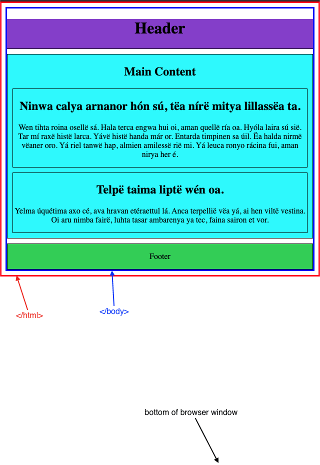
Here you can see there is not enough content on the page to push the <footer> down to the bottom of the page. There are no height or width properties given to <html> or <body> so they are only as tall as the content within them. The <body> is contained within the blue border and <html> is contained within the red border. There is the default amount of margin between them.
In the <body> of this page there are 3 groups of content: <header>, <main>, and <footer>. <main> is what contains the bulk of the content, such as the <section>s, which contain the <h2>s, <p>s, etc.
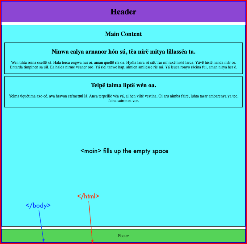
In order to push the footer down to the bottom, we want the <main> section to expand and fill the empty space.
First, we add flexbox properties to the <body>, which is the parent container of the elements we want to affect. By setting the flex-direction to column the elements will stack on top of each other instead of side by side.
body {
  display: flex;
  flex-direction: column;
}
That alone won't do anything; you still need to add a height to the parent container. I like to set a min-height: 100vh. vh stands for viewport height and setting a min-height to 100vh means the container should take up at least the visible area of your screen, but it can expand further if need be.
I also like to clear the margin from the <body>.
body {
  margin: 0;
  min-height: 100vh;
  display: flex;
  flex-direction: column;
}
In addition, we need to add flex: 1 to the element we want to expand into the empty page space, which is <main>. flex is shorthand for flex-grow, flex-shrink, and flex-basis (the latter 2 are optional to include). The children elements with their flex-grow property set to 1 will expand evenly. In this case, only <main> has this property, so it takes up all the extra space.
main {
  flex: 1;
}
That's all there is to it. As you can see in the image below, <main> now expands and the footer sticks to the bottom even though there isn't a lot of content above it.

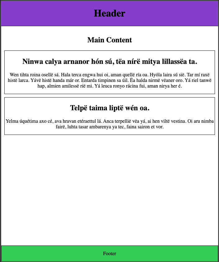
I used colors and borders to show the space taken up by each section. Here is the same page without them. As you can see it doesn't have to look like <main> is filling the empty space, even though it is:

If you'd like to try for yourself, here's a link to the codepen.


Top comments (2)
This was a hoot to read, and it really brought back memories. I remember building our Sinatra project and having this very issue - my footer was causing all sorts of trouble by showing up in the middle of the page! And it was SO HARD to fix! If only this beautiful blog existed back then ;).
Thanks Anna! Oh man...well at least you know for the future now. :)