I won third place at IEEEmadC 2017 (Mobile Applications Development Contest) among equally great 40+ apps developed by students all around the world. It was a amazing experience that made me open my mind to new ways of seeing things and to my skills as a developer.
Here are three things that I believe made my app be chosen among so many interesting and really good applications from students all over the globe and that I'm sure can make your app do it too.
1. Choose an idea that is useful for your own life and for others around you.
The first phase of the contest was the idea phase. More than 200 groups submitted amazing ideas and I was one of them. But just like most people, I had many ideas that I thought were great, how could I choose just one and focus on that?
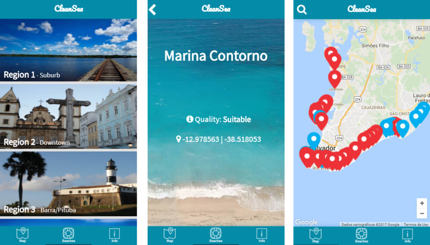
Here in my city we have many beautiful beaches and we are mainly known as a touristic city of Brazil. But most of the year our beaches are polluted because the majority of our rivers received sewer waters for a long time and as every river ends up on the ocean, the beaches became dirty. The bright side is that the beaches are perfectly suitable on the summer, but when it rains and mostly on other seasons every beach becomes unsuitable with sewer water.
Some people just ignore this fact and keep going to the beach risking getting many diseases from the high level of Escherichia coli in the waters. Others just avoid the beach and loses one of the most amazing things our city provides, (we have really beautiful warm beaches), and there are some people that just don’t know about that, mostly tourists from other countries. Something common about these three kind of people is that most of them doesn’t know that our government measures the level of Escherichia coli in our beaches and post it on the internet weekly.
When I discovered that the idea just popped: an app that returned that information to the public, making the knowledge of clean beaches more open to populaton and tourists.
That’s the idea I knew would not only help me but others as well.
When the first phase ended I received an email telling me that my idea was one among of 40+ of the selected. It was an exciting sensation: I was about to compete with more than 40 groups of people from around the world and all I had was an idea.
2. Choose your tools wisely and go for what you already know.
The second phase was development and my idea had to become an app in three months, I didn’t have a group and I had to choose how I would build my app.
The first thing I thought was that since it’s a mobile application competition I should build my app with Java for Android or Swift for iOS. But I didn’t know any of them the only thing I had was sparse knowledge from what I studied in some classes of Java and I never really did anything with swift. I was tempted to learn one of them for the competition but I had a really short time. So I took the smart decision: to use what I already know. I’m a web developer intern and my main language is javascript so I decided to use a hybrid platform built on cordova. And it worked. On the first two months I had built almost everything from the front end and some of the back end just using javascript. The fact that I was confortable with the language helped me in every aspect.
I know that running from something new sounds awful for developers like us, but I believe it’s about knowing the right time to discover something new and the right time to use what you are comfortable with. A teacher once told me that most of people fails at some objectives because at the most crutial time they decide to try something new instead of what they already know. In the end of the competition I was glad that I listened to those words.
3. Your app is for humans not machines: don’t underestimate design.
My app was almost complete, and I decided to ask my friends what they thought about it. Most of them didn’t liked, and I was less than one month from the competition deadline.
With all of my front completed and most of my back end done, I started to show people my app and asked what they thought of it. To my surprise they didn’t like. It was - in their words - ‘ugly’ and they couldn’t understand how to use it. I was frustrated: I built an app that I thought was good, but if people couldn’t understand how to use it and they didn’t like it, it was worth almost nothing...
So I took the decision to study a little about design – something I thought my entire life that was unnecessary and superfluous – and use what I learn to improve my app so people can be interested to use it. Since I never had classes in my university about design, the internet was my best friend and I started my journey on something I never studied before.
Design is a universe of it’s own. There are so many fields and theories that you can’t possible learn everything in a such short amount of time. So I decided to focus on two things, user experience and color theory. After some study and a lot of trial and error, I’ve finally reached something that people started to compliment: it wasn't ugly anymore and everyone could understand how to use it.
It blew my mind.
To me that was the part that changed my way of seeing things. Design is something really important and it should be taken seriously, after all it’s about how users interact with what we create, and users are the most important piece to every system. Without users there is no application. This competition changed forever my idea about design, and it’s something I will carry with me on every project I’m a part of.
At the end of the judging phase, I received another email, this time telling me that my app had won the third place, the Computer Society Special Award. I was really happy, because not only I felt like my efforts leaded me to something great, but because I was one person when I entered the competition, and I was another completely different person when it ended.
These are the three things that I think made my app become third place at IEEEmadC 2017. What really made the judges like my app only they will know, but I do believe that these three things made a difference and I wanted to share it with people. This experience changed a lot of things for me, and I hope I was able to share this feeling.
I would like to thank IEEE for the opportunity and for making so many students come together to build great things, to all the judges for the hard part in choosing only three among so many good apps and to my girlfriend and friends that helped me so much with the design part.


Top comments (4)
Great tips & congrats!
Your final version looks really impressive! Could you please elaborate on how you learned to design like that within a month?
Thanks!! As I said I'm not a designer, so it's all about the knowledge I gained based on my researches. About The map: I changed it using material design, flat colors and less detailed stuff. For the name on the top I used a little typography study that says some titles must be different from the rest of the app content. The user experience helped me to put my important information centered, simple, and as large as possible to people understand. But what I think is most important is that I read articles saying to always use references. I downloaded A LOT of random beautiful apps and saw what I liked in most of them and them adapted something from each one. I learned that every good design is born out of references. Also a gray background is better than a colorful one, it's better to let the details be responsible for the colors. All that came from Google, YouTube and from very harsh critics on my layouts
Great app!
Parabéns pelo trabalho.