The UX/UI tool I'll be taking a look at is Figma, which is marketed as a "collaborative interface design tool". Considering there are multiple other design and prototyping applications out there, I chose Figma primarily based on a quick search, which yielded thousands of positive user responses from the design community. I did find other design tools appealing, such as Adobe XD and Sketch, but Figma seemed to have a more devoted fan base supported by a plethora of easily available content such as documentation and tutorials. Coming from a developer point of view, I feel as though examining Figma and the UX/UI design process will better prepare me to have a more streamlined and flexible relationship with a design team, before injecting their design with code from the front-end.
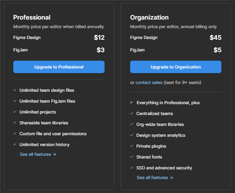
At a quick glance it's immediately obvious that Figma's main emphasis is collaboration. It's primary user interface is browser based and allows for a live and simultaneous multi-user work environment. Users can also choose a desktop application for windows and mac, although the desktop applications also require internet access. The built-in online/cloud nature of Figma allows for large teams to always be in sync with a project, and files never need to be sent manually or stored else-where for access. Users can also drop comments directly into a design project for instant feedback and communication. A free account is simple enough to set-up, just go to the Figma website and login either manually or using your google account. A free account is allowed up to 3 working files before you're forced to purchase a premium subscription plan. These are set-up for either individuals using the application or entire organizations, and can range from $12 to $45 per month for the design plans. But, if all you need from Figma is its whiteboarding/presentation/planning capabilities, there are cheaper plans available (aka FigJam) ranging from $3 to $5 per month as seen below:
Figma has an important role in the UX/UI process. It can create rapid and high-res prototypes of applications and websites, and can also include some interactivity. While the prototype you create is merely a loose mock-up of the finished product, it's still capable of going to peers, developers, or clients for testing. This means before the user puts a ton of work into a full scale application, they can get important and instantaneous feedback from their presentation prototype. So before moving forward, and stepping outside the scope of the design stages in the creation process, important information can be collected. At this point, if changes to the design need to be made, they can be made really quickly in Figma, until a desirable response is received, and then coding / development will pick up the project from here. The passing off stage between the designer and developer can be a complicated one. But luckily applications, like Figma and others, can assist and ease some of the struggles of this process, and create a more desirable work flow.
When first starting a new design draft in Figma, it can be a bit intimidating. You are immediately greeted with a rather blank and minimal user interface with a simple iconographic tool bar (as seen above), but once you get past this part, the software really begins to open up. It appears the first step in designing your prototype is selecting a frame size. This can be done by simply drag and dropping out your custom frame size, or selecting from the frame size presets that Figma provides. These include mobile phone screen sizes, tablets, or desktop sizes, among many others. Once your frame size is selected you can begin to work with primitive shapes, and lay out the foundations of your design. In the small time I played around with the shapes in my workspace, I noticed subtle snapping, locking, and spacing assistance that Figma provides to speed up the design process. Here is a quick submission form mock-up I created:
Adding text components to your design is also done with ease. Simply selecting the text editor and creating your text box area allows you to play and experiment with many different text styles and font combinations. Similarly to the shapes discussed above, Figma provides "smart" guides for snapping and aligning your text quickly and easily. Another plus, is that Figma comes preloaded with Google Fonts, as well as allowing you to import any locally stored fonts from your personal computer. I was pleasantly surprised seeing Roboto set as my default font upon start up. Here are a few text styles I played with:
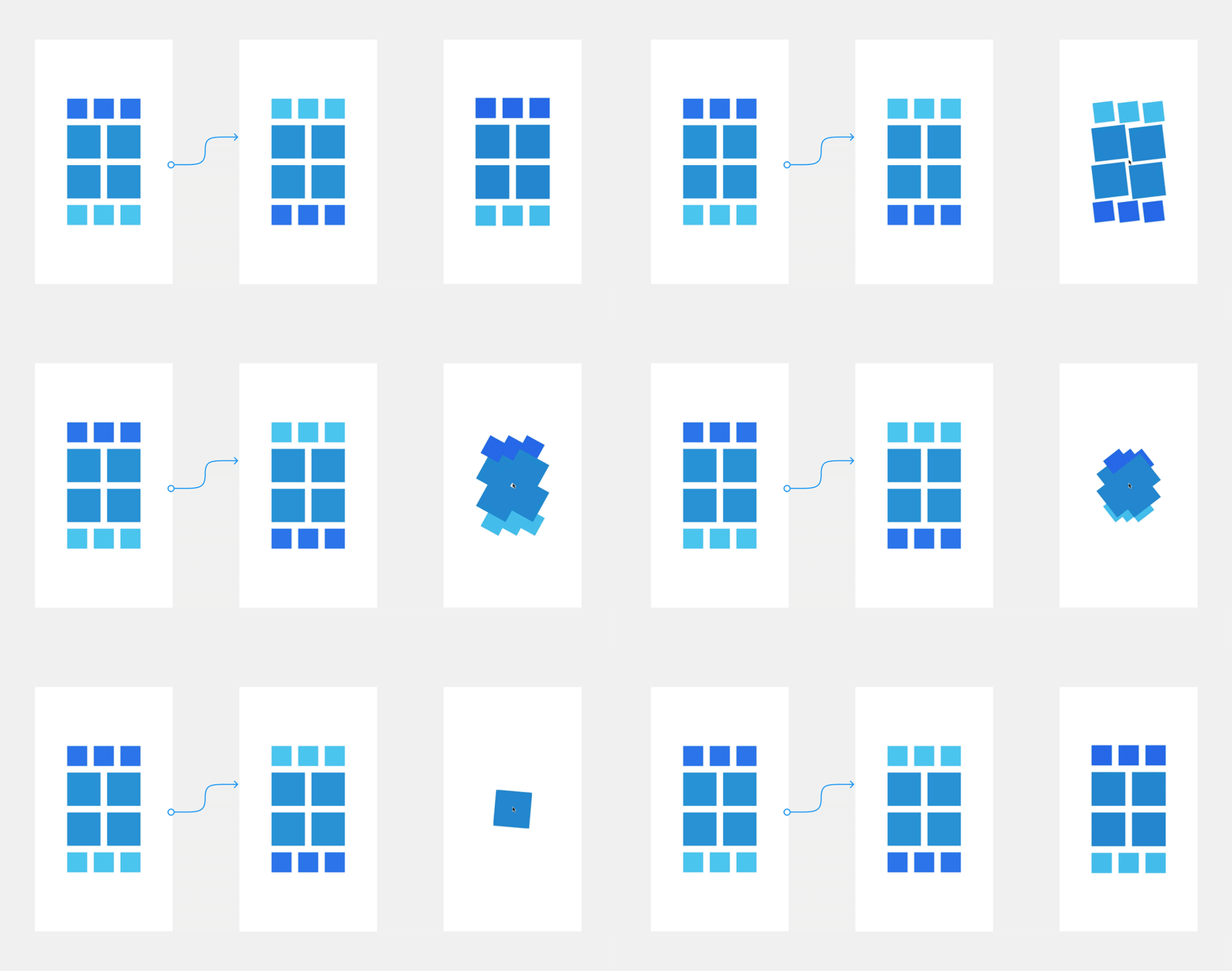
I'm just barely scratching the surface here, there are tons of features that Figma can provide including: creating animations for rollover or onclick events, transition animations between frames or slides (as seen below), and even plug-ins which can help generate rough code based on your design. In conclusion I think Figma is a pretty fantastic design tool. It's ease of use, combined with a highly collaborative work environment makes for a powerful and communicative application that can assist in translating design into an interactive finished product. I hope this soft introduction was helpful and hopefully sheds some light on the UX/UI process. Happy designing.
Resources:


Top comments (0)