Visualizing desired steps distribution — using the central limit theorem
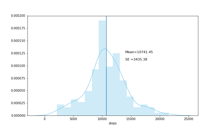
Last week when I took a look at my steps data I noticed that the data was very spread out.
Though I felt relatively satisfied with the average steps I was running in a day, the data was too spread out — i.e. Standard Deviation(σ) was 3435.38. This suggested that 68% of the steps data was in between 7305.65 and 14177.25 steps. I had even got days where the total number of steps were well below 5000, and therefore I wanted to get my data to mimic a distribution where the standard deviation would be lower meaning that the steps data would not be as spread out as it currently is.
As suggested by the central limit theorem, I decided to take 5(N = 5) independent random samples from the steps dataset. I would repeat this process 5 times (iter = 5), to begin with, therefore giving me a 5 dataset with 5 independent random samples in each set. Next, I would find the mean of each 5 independent random datasets, and finally, I would find out the mean of means. I would then run the same experiment two more times, but this time increasing random samples to 20 (N = 20) and then to 100 (N = 100)
Defining the Functions
def random_steps_array(name_of_array, n , iterations):
    for i in range(iterations):
        name_of_array.append(df.steps.sample(n, random_state = i,
                              replace = True))

def sample_means(name_of_array, sample_mean):
    for i in range(len(name_of_array)):
        sample_mean.append(name_of_array[i].mean())
The random_steps_array function would handle the random sampling and the iterations, and the sample_means array would take mean of the random samples.
Experimenting with 5 iterations where N = 5, 20,100
i. At N = 5
array_5 = []
mean_array\_5 = []
random_steps_array(array_5, 5, 5)
sample_means(array_5, mean_array_5 )
The random samples of 5 independent random variables were stored in the array_5 means of the random variables were stored in mean_array_5
With only five iterations of 5 independent random samples, the mean of sample means was a bit further away from the actual mean of 10741.45. However, the taken the distribution was now less spread out and the standard error of the mean or (a.k.a. the standard deviation of the sampling distribution of the sample means — (S.E) was 1650.
ii. At N = 20
The mean of the sample means was much closer to the actual mean when I ran 20 iterations for a random sample size of 5 elements.
Already when the number of iterations increased I have a larger set of random samples. Thus giving me a mean that was getting closer to my actual mean, and the standard error of the mean (SE) was down to 561.72. Ideally, this is the kind of visualization I would like to have of my dataset where the data is not very spread out.
iii. At N = 100
Finally, at N = 100 the graph was even less spread out with the standard error of the mean (SE) at 259.27.
The spread was almost similar to at what the dataset was doing at 20 iterations, but the mean of sample means(10838.78) was much closer to the actual mean of 10741.45.
With the following experiment, I was thus able to visualize my desired graph, also I got some working knowledge with the central limit theorem.


Top comments (0)