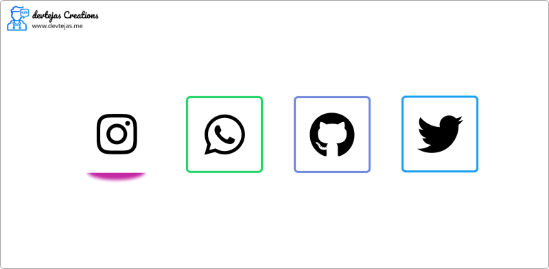
In this post, we are going to code social media buttons with a cool hover effect and add them to your website hosted on any platform like blogger, WordPress etc. The buttons will show up as given in the demo below.
Read the full post and follow the tutorial carefully to make the same effect and then you can embed it on your own website by just adding the code. If you don't want to read the full tutorial the full code is available to download at the end.
Introduction
Before starting to code the widget just know some things and get some resources which we will need to make this happen.
Why we need this?
Nowadays, all internet surfers prefer a website with a good and managed layout, which looks beautiful. The contents and widgets with some cool CSS effects and animation help us to drive more visitors to our site increasing both the traffic and revenue if any. Thus we try to add minimal but good looking widgets to our site and hence this post.
Resources we will need
We are going to code this as a static website page thus we must need the following tools:
- A good code editor (Sublime, vscode etc.)
- two files to store the code. some_name.html and some_name.css. These two files will save the HTML and CSS code separately and we will just link the CSS stylesheet to our HTML file.
- We are going to use font-awesome icons in this tutorial so just add their stylesheet to your HTML code. refer to the tutorial below to do this.
The code
Now you know why we need this and what we need for this. Let's start coding.
Adding the resources
Now as I mentioned above the resources we are going to need for making this widget, here we will see how to add them to our code.
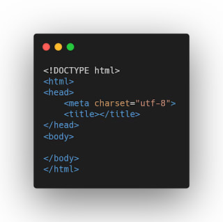
First, make two files name them some_name.html and some_name.css open both the files in a good editor and add the following code to the some_name.html. Sublime or other good editors do it automatically when you start typing just press enter when a suggestion pops up.
Now, in between your <head> and </head> tags add the following code.
<head>
    <title>Social Icons Hover Effect</title>
    <link rel="stylesheet" type="text/css" href="some_name.css"/>
    <link rel="stylesheet" href="https://cdnjs.cloudflare.com/ajax/libs/font-awesome/5.15.3/css/all.min.css"/>
</head>
Here the https://cdnjs.cloudflare.com/ajax/libs/font-awesome/5.15.3/css/all.min.css line adds the font-awesome icons to our code and now we can use them.
Hence all the dependencies or resources are added and now add some HTML code given below. Now your some_name.html should look something like the given below.
some_name.html
<!DOCTYPE html>
<html>
<head>
    <title>Social Icons Hover Effect</title>
    <link rel="stylesheet" type="text/css" href="some_name.css"/>
    <link rel="stylesheet" href="https://cdnjs.cloudflare.com/ajax/libs/font-awesome/5.15.3/css/all.min.css"/>
</head>
<body>
    <a href="#"><i class="fab fa-instagram fa-2x"></i></a>
    <a href="#"><i class="fab fa-whatsapp fa-2x"></i></a>
    <a href="#"><i class="fab fa-twitter fa-2x"></i></a>
    <a href="#"><i class="fab fa-github fa-2x"></i></a>
</body>
</html>
here in the above code, the fab fa-instagram fa-2x adds the icon for the corresponding social media.
Now let's start coding the CSS code
CSS and the hover effect
First, we will add the CSS code for the body of our webpage
*{
    margin: 0;
    padding: 0;
    box-sizing: border-box;
}
body{
    display: flex;
    justify-content: center;
    align-items: center;
    height: 100vh;
}
a{
    position: relative;
    width: 60px;
    height: 60px;
    background: #ffffff;
    color: #242424;
    display: flex;
    justify-content: center;
    align-items: center;
    text-decoration: none;
    margin: 1em;
    border-radius: 15%;
    transition: all .4s;
}
Now the icons will be in the centre of your screen aligned in a manner. Use the following code to add the square boxes with colourful borders. Add this code just below the above one.
a::before{
    content: '';
    position: absolute;
    top: 0;
    left: 0;
    width: 100%;
    height: 100%;
    background: #c32aa3;
    border-radius: 15%;
    transform: scale(1.1);
    z-index: -1;
    transition: all .4s;
}
a:nth-child(1)::before{
    background: #c32aa3;
}
a:nth-child(2)::before{
    background: #25d366;
}
a:nth-child(3)::before{
    background: #1da1f2;
}
a:nth-child(4)::before{
    background: #7289da;
}
Try running your code in a browser and check it's working or not.
After the above code, add the following one to simulate the CSS effect in your webpage.
a:hover::before{
    transform: translateY(10px) scaleX(0.6) scaleY(0.8);
    filter: blur(10px);
}

a:hover::nth-child(1){
    color: #c32aa3;
    text-shadow: 0 0 30px #c32aa3;
}

a:hover::nth-child(2){
    color: #25d366;
    text-shadow: 0 0 30px #25d366;
}

a:hover::nth-child(3){
    color: #1da1f2;
    text-shadow: 0 0 30px #1da1f2;
}

a:hover::nth-child(4){
    color: #7289da;
    text-shadow: 0 0 30px #7289da;
}
Now your CSS hover effect for social media buttons is ready and you can add this to your website's HTML code or as a widget.
Wrapping Up
Now your code is ready and you can modify it more with your choice to make it more beautiful and if you find a good idea don't forget to share it in the comments so everyone will think about it including me.
Tips
Follow these tips to do more customizations,
- try changing the social media icons. If you want to use any other icons you can but don't forget to add the icons accent colour in the CSS code for the box around it or it will not look good.
- try to add some more effects and animations. You can add another effect like changing the icon colour on hover or adding animated icons. that's your choice.
- Support me on buy me a coffee.


Top comments (0)