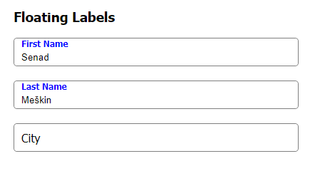
Have you ever wondered how they create those floating label forms? If you did then this is the blog post for you.
I'm going to show you how to create it using simple HTML and CSS.
If you like video more, then you can watch it on my YouTube channel -> Floating Labels in HTML form
We are gonna start with an empty index.html file:
<!DOCTYPE html>
<html lang="en">
<head>
    <meta charset="UTF-8">
    <meta http-equiv="X-UA-Compatible" content="IE=edge">
    <meta name="viewport" content="width=device-width, initial-scale=1.0">
    <title>Floating Labels</title>
</head>
<body>
</body>
</html>
Now, I'm gonna add form with one field and one label in it:
<form>
    <h3>Floating Labels</h3>
    <div>
        <input type="text" id="firstName" />
        <label for="firstName">First Name</label>
    </div>
</form>
To make this work we need to add a label after the input field because that is the only way we can select it when the status of the field changes (e.g. focus, placeholder-shown).
Preview of our form:
Now, we are going to style a container of the field and that is the div inside the form. First, I will create a new file called floatingLabels.css and link it to our index.html file
floatingLabels.css
* {
    /*box-sizing will tell browser how to measure
      width of an element and in our case
      it will be from border to border.
    */
    box-sizing: border-box;
}
body, html {
    margin:0px; /*reseting default margin to 0*/
    padding: 0px; /*reseting default padding to 0*/
}
form {
    padding: 20px;
}
To link it into our index.html we need to add link into our HTML file header:
<link rel="stylesheet" href="floatingLabels.css" />
Now, we are gonna style the container by adding a height, border, and border-radius:
form > div {
    height: 40px;
    border: 1px solid gray;
    border-radius: 5px;
}
> selector will apply CSS only to the direct descendent of the FORM element.
Next, We will add some style to our input field
form > div > input {
    width: 100%;
    height: 100%;
    padding-top: 20px;
    padding-left: 10px;
}
Preview of our form
To move our label over the field we need to make its position absolute and style it to our needs:
form > div > input + label {
    position: absolute;
    height: 100%;
    line-height: 40px;
    width: 100%;
    left: 10px;
    top: 0px;
    transition: 0.15ms; /*to make smooth any style transtion*/
    pointer-events: none; /*disable the pointer events*/
}
At this moment I've changed the font of the page to be
Tahoma, If you want to do the same add to your body selectorfont-family: Tahoma;
We need to update the position of the container to relative to avoid our label floating beyond the border of the container.
form > div {
    height: 40px;
    border: 1px solid gray;
    border-radius: 5px;

    /*new code */
    min-width: 400px; /*just for nicer look*/
    position: relative;
   /*end of new code*/
}
Now, once the field is focused we need to move our label up, change its font color to blue and make it bold.
form > div > input:focus + label  {
    font-weight: bold;
    font-size: 12px;
    line-height: 14px;
    color: blue;
}
The next thing we need to do is to keep our label above the field when there is text in it, otherwise, the text of our label and text from the input will overlap:

To do so we will use selector :placeholder-shown of the input field to style the label that comes after it. But because we need our label to stay at the top only when the placeholder is not visible we will use CSS function to negate :placeholder-shown result
form > div > input:not(:placeholder-shown) + label  {
    font-weight: bold;
    font-size: 12px;
    line-height: 14px;
    color: blue;
}
Once we are out of the field, and there is text inside it, our label will stay at the top of the field:

And that is basically it, all we need to do now is to add placeholder to our field which will have a value of one space placeholder=" ", remove outline of the field, border of the field, make div's overflowing content hidden to make our form look even nicer.
Index.html
 <!DOCTYPE html>
<html lang="en">

<head>
    <meta charset="UTF-8">
    <meta http-equiv="X-UA-Compatible" content="IE=edge">
    <meta name="viewport" content="width=device-width, initial-scale=1.0">
    <title>Floating Labels</title>
    <link rel="stylesheet" href="floatingLabels.css" />
</head>
<style>
    .container {
        display: flex;
        justify-content: center;
    }
</style>

<body>
    <div class="container">
        <form>
            <h3>Floating Labels</h3>
            <div>
                <input placeholder=" " type="text" id="firstName" name="firstName" autocomplete="off" />
                <label for="firstName">First Name</label>
            </div>
            <div>
                <input placeholder=" " type="text" id="lastName" name="lastName" autocomplete="off" />
                <label for="lastName">Last Name</label>
            </div>
            <div>
                <input placeholder=" " type="text" id="city" name="city" autocomplete="off" />
                <label for="city">City</label>
            </div>
        </form>
    </div>
</body>

</html>
floatingLabels.css
* {
    /*box-sizing will tell browser how to measure
      width of an element and in our case
      it will be from border to border.
    */
    box-sizing: border-box;
}
body, html {
    margin:0px; /*reseting default margin to 0*/
    padding: 0px; /*reseting default padding to 0*/
    font-family: Tahoma;
}

form {
    padding: 20px;
}

form > div {
    height: 40px;
    border: 1px solid gray;
    border-radius: 5px;
    min-width: 400px;
    position: relative;
    overflow: hidden;
    margin-bottom: 20px;
}
form > div:focus {
    outline: 0px;
}

form > div > input {
    width: 100%;
    height: 100%;
    padding-top: 15px;
    padding-left: 10px;
    border: 0px;
}

form > div > input + label {
    position: absolute;
    height: 100%;
    line-height: 40px;
    width: 100%;
    left: 10px;
    top: 0px;
    transition: 0.15ms;
    pointer-events: none;
}
form > div > input:focus + label,
form > div > input:not(:placeholder-shown) + label   {
    font-weight: bold;
    font-size: 12px;
    line-height: 14px;
    color: blue;
}


Top comments (0)