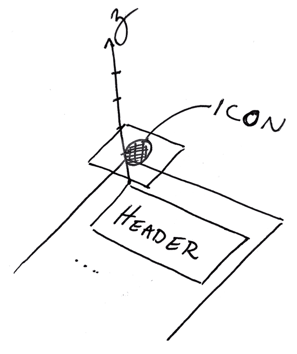
It was one of those light bulb moments when things finally clicked. My colleague was describing how to ensure that my elements weren’t bleeding through with a Z-index and suddenly, I realized that the index was referring to a third-dimension.
Organizing elements on the DOM has always been confusing to me - how different elements get pushed aside, stretched, sent to the next line, etc. And, each problem has multiple different strategies - so there’s no one way to get the effect you’re looking for.
In my case, I was working on a menu, that when clicked, would create a popup. 
The problem was that the elements behind (or what I assumed would be behind) the menu were bleeding through (see the blue dots? Yeah, you’re not supposed to see them).
The issue, it turns out was that the popup menu was positioned absolutely within the window (so that it wouldn’t move other things around when it was present), but it was the same Z-index (or lower) than the SVGs that constituted the blue dots. This meant that as far as the browser was concerned, it should show them!
Cue the lightbulb moment.
All we’re talking about is stacking different elements in a predictable way. Since at least one of them is positioned absolutely, they will not interact and push each other around. Which means that they’re like pieces of paper and can be stacked. If they have the same Z-index, which is on top is unpredictable.
This is because the Z-index refers to a Z axis!
I’d looked at a lot of different pages on Z-index, but for whatever reason, these two concepts never came together to click.
- Position absolute the element is not affected by (and won’t affect the position of) other elements
- Z-Index refers to the “height” of the element. The higher the index, the “closer” to the screen (aka the window through which we look at the DOM)
Once I saw Z-index as an axis in a three-dimensional coordinate system, visualizing the placement of the elements became much more intuitive.
Suddenly, the Z-index wasn’t magic. It was geometry. Demystifying it made it a tool I could use with confidence.


Top comments (5)
No, no, it's magic Stephen. Strange stuff indeed but hopefully your article helps me figure it out better too.
I was fine with z-index:9999999999999 !important.
😂All fine and dandy until you need to put something on top of that element!
P.S. I also found out that given the same Z-index, the element that's painted last will be on top (i.e. the one lower in the HTML) -- so I was encouraged to avoid Z-index if possible :)
I have z-index:99999999999999999 !important. for that (check my site, I am not kidding, the best-worst CSS ever).
The tip: I did not know that but it is really really handy to know years and years later. I wish I had known that before but I really really appreciate it now anyway, no kidding. Thanks (if you've seen my site you'll know why I am grateful).
Haha - just took a gander that made me chuckle :)
Glad to help!
Appreciated.
Spread the word, use 99999999 !important. It winds up so well. perfect filter. Rugged too.