This isn’t related to code or any other code-related aspect. It is just a fun article about customizing the look and feel of Android Studio IDE.
Let’s get started:
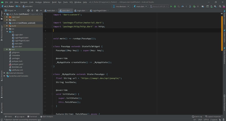
So if you have installed the latest version of Android Studio 4.0 (at the time of writing) you should have a UI which looks something like this:
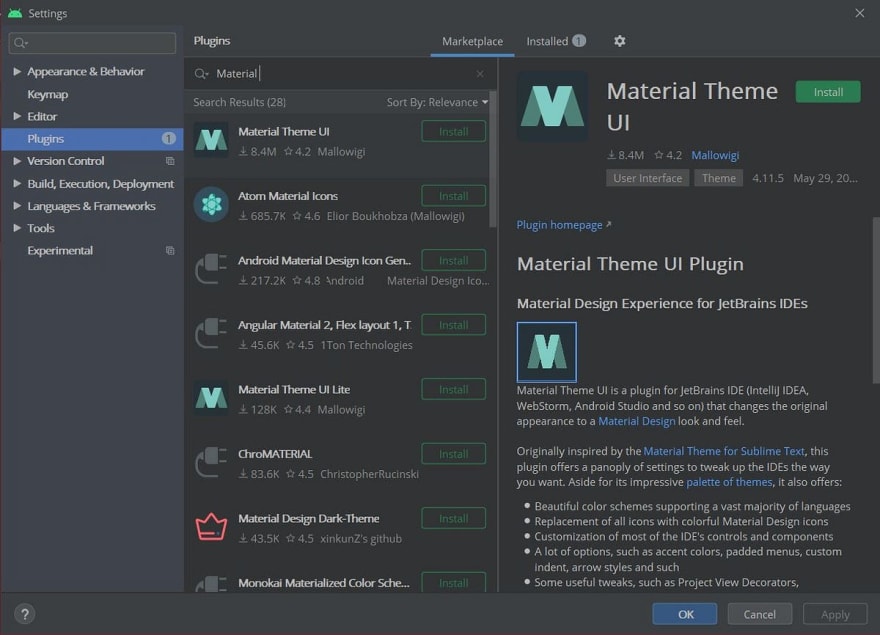
First let’s install the Material Theme UI Plugin
File -> Settings -> Plugins
Restart the IDE
After it has been restarted you should either have a theme already applied or a custom setup page depending on whether you have installed it previously or not. Don’t worry, I’m going to mention the theme options which will mostly end up to be dark themes.
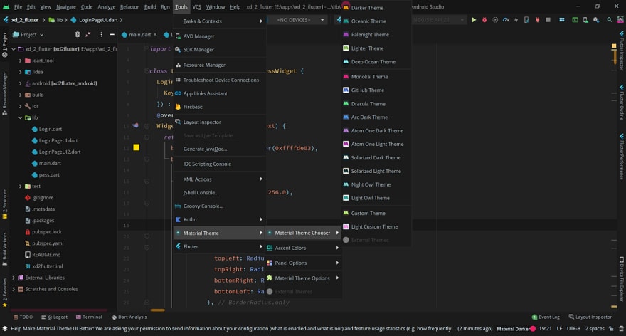
To choose a very dark theme go ahead in Tools -> Material Theme -> Material Theme Chooser -> Darker Theme
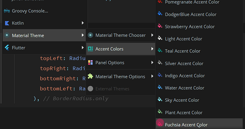
Similarly for the accent color too,
Tools -> Material Theme -> Accent Colors -> Fuschia Accent Color
Toggling Contrast On can amp up your color tones by a bit,
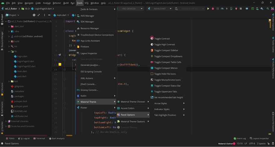
Tools -> Material Theme -> Panel Options-> Toggle Contrast
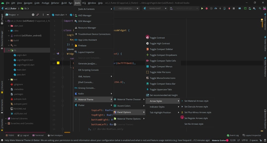
You can also change the arrow styles if you want from the panel,
Tools -> Material Theme -> Panel Options-> Arrow Styles
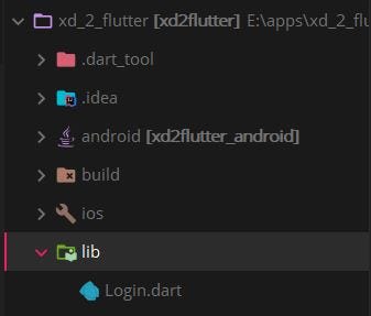
I use the Material Arrows styles which look like the ones below:
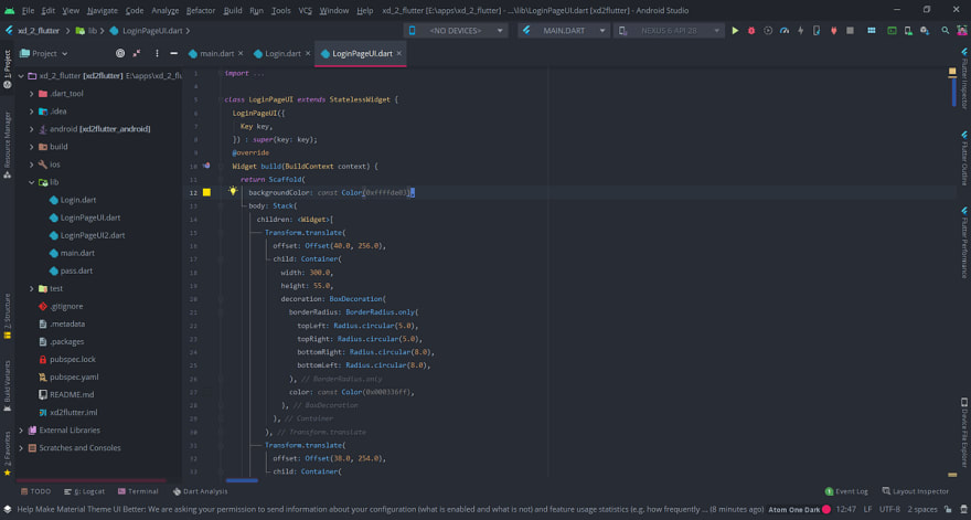
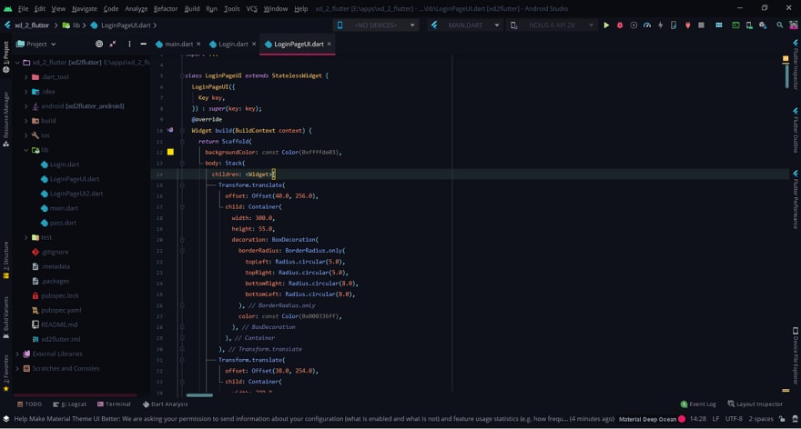
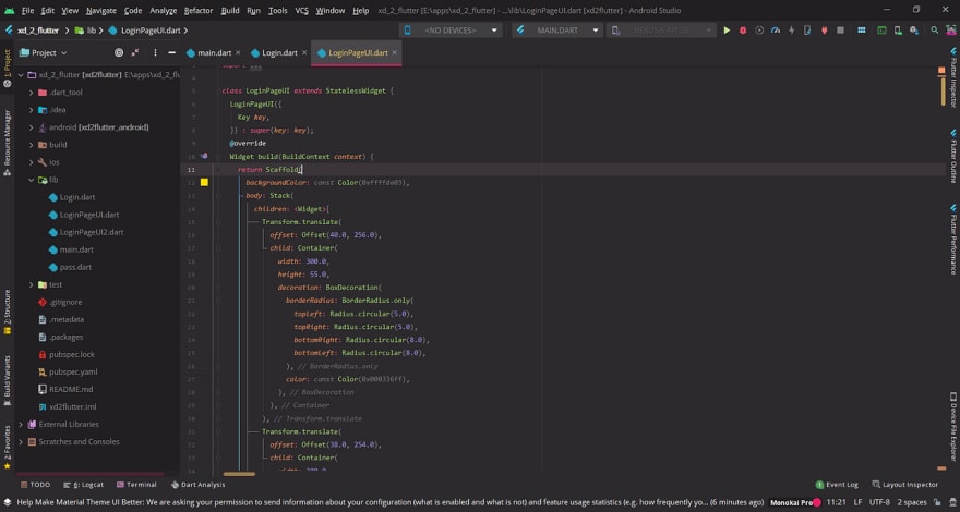
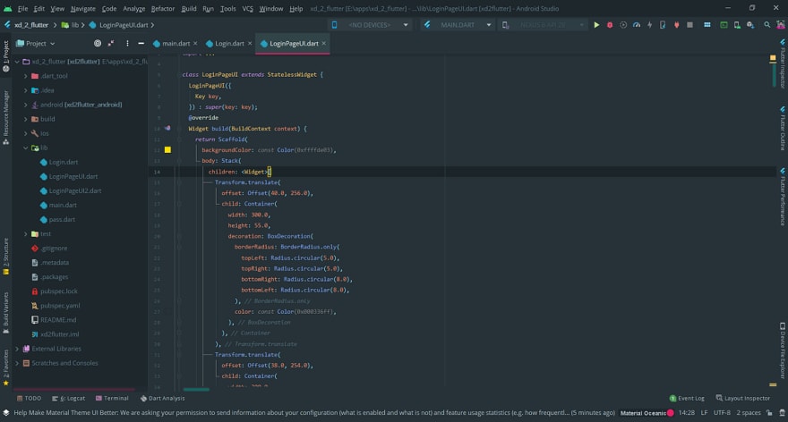
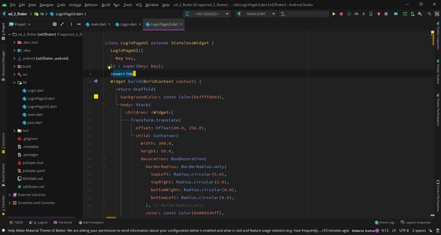
Below are some theme previews:




Top comments (0)