Hello world!
I’ll be sharing here an easy method I found on the internet to create a palate of harmonious colours with the HSV colour model. I’ll also explain the terms Hue, saturation and value based on my understanding as a beginner.
Choosing a good palate of colours was always a herculean task for me as I’m new to web designing. The colours would either look unpleasant or straight up hurt my eyes. Thus, I used online colour picking tools like Adobe Kuler and Paletton to create my colour scheme. I decided to stick with choosing from the traditional methods of creating the colour schemes and I refrained from creating a custom palate. But soon my curiosity kicked in and I started reading articles on web designing and app designing to find out how others created harmonious custom colour palates.
Using the HSV/HSB colour model
Most articles I read suggested to use the HSV colour model to create custom colour palates because It allows to choose colours as we perceive in real life. But each article defined these terms in a unique way which was confusing to me and took a bit of time to grab the idea. Among those articles Tyler Seitz's article Picking a Color Palette for Your Game's Artwork on tuts-plus stood out because of its easily understandable algorithmic approach in creating custom colour palates using the HSV model.
According to their article, an appealing colour palate can be created by equalizing two of the components in the HSV model. What is HSV model anyway?
According to Wikipedia,
HSV colour model was created to more closely align with the way human vision perceives colour-making attributes.
It has three components viz
1. Hue
According to Wikipedia, A hue is
the degree to which a stimulus can be described as similar to or different from stimuli that are described as red, green, blue, and yellow
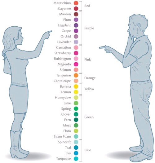
In other words, hue is how we identify colours in terms of red, blue, green and yellow. For example, we identify Rose, Hibiscus, Apple and tulip as red even though they don’t exactly have the same colour. And we identify the turquoise gem as greenish-blue colour not green or blue because it appears as a mix of both. This hilarious meme from imgur gives a clear picture ;) of how we perceive hues. 
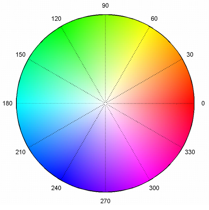
In HSV model, colours of each hue are arranged in a radial fasion and represented as degrees from 0° to 360°. Where Red has a hue value of 0 ° and going counter clockwise at 120° we have green and further at 240° we have blue. Going further we reach Red at 0°. 
2. Saturation
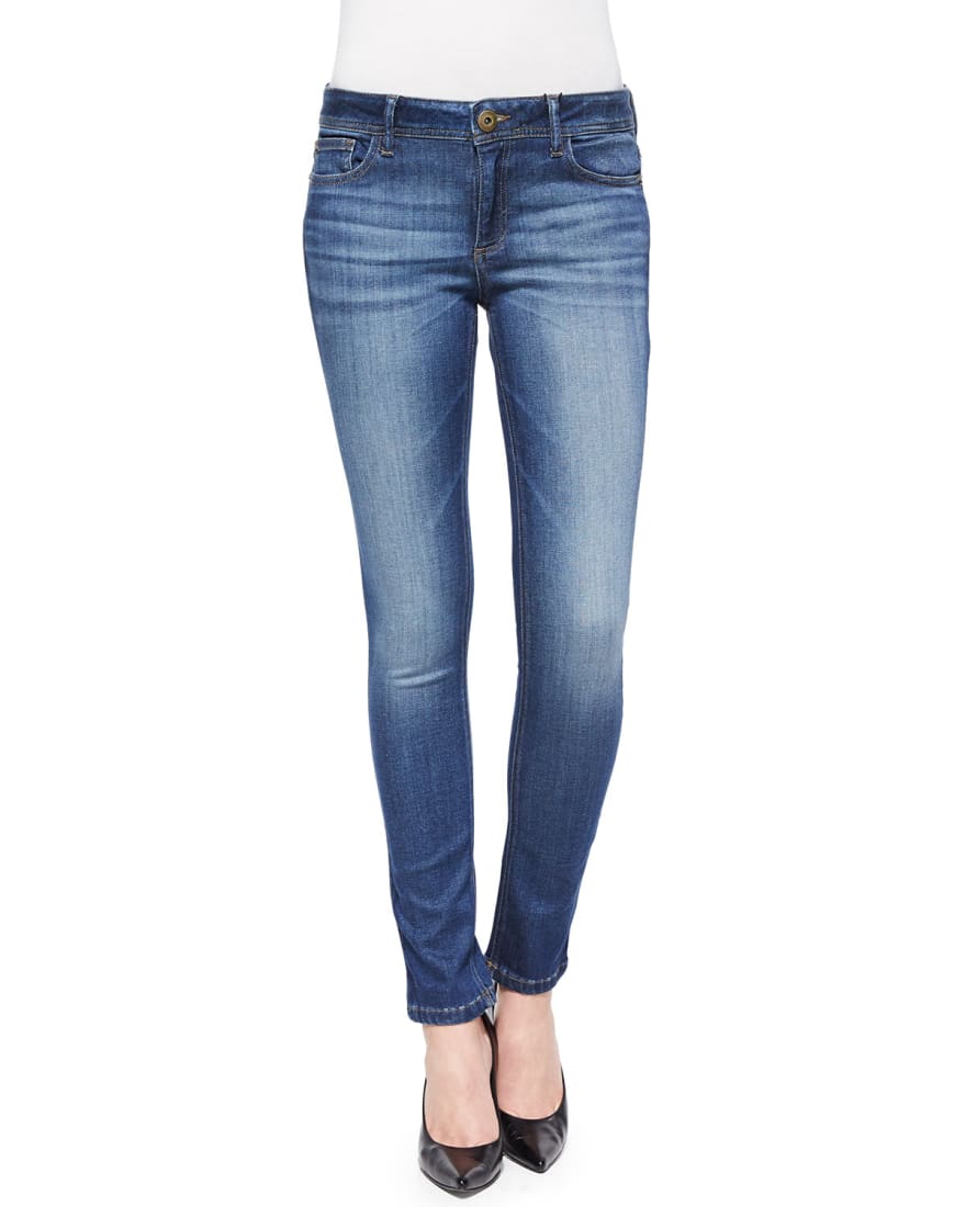
Saturation is the intensity of the colour with respect to the brightness of the light source. Saturation determines how vivid or how pale a colour appears in a light source. To put this in perspective, imagine how old clothes look faded when compared to new clothes in our wardrobe. The faded colour has less saturation whereas the vivid colours have high saturation. This image of faded jeans is the best representation for different saturations. 
Sometimes low saturated colours are called muted colours. In HSV model Saturation takes a value between 0% to 100%. Where 0% saturation makes the colour white and 100% saturation has maximum intensity.
3. Value
Value indicates how bright or how dark a colour is. When value component of a colour decreases it becomes darker and darker and eventually becomes black with the lowest brightness. On the other hand, increasing the value component makes the colour brighter. With the highest brightness, the colour is considered to be a pure colour when it’s fully saturated. In the real world, birghtness can be visualized as illuminated and shadow regions of objects in everyday life. The illuminated areas have high brightness and the part of objects in the shadows have low brightness. 
Algorithm to create a harmonious colour palate
Note: From this point onwards, I'll be using the term brightness to represent the Value component of HSV model because it's more easy to understand.
I find Tyler Seitz's algorithm easy and efficient in creating a custom colour palate. I’ll just re iterate their algorithm here.
To create a great colour palette, you need only follow this rule:
IF hues do not equal each other

THEN set saturations to match each other

AND set brightnesses to match each other

ELSE IF saturations do not equal each other

THEN set hues to match each other

AND set brightnesses to match each other

ELSE IF brightnesses do not equal each other

THEN set hues to equal each other

AND set saturations to equal each other
Shades, Tints and Tones
We can extend this algorithm to create shades, tints and tones of a particular hue
// SHADES

SELECT a Colour

Keep the Hue constant

THEN Change the Brightness in equal intervals

AND Keep the Saturation unchanged.
To create different shades of the colour red, I started with Brightness at 100% and reduced it by 12 equally. This would create 8 shades of the colour.  Different shades of red
// TINTS

SELECT a Colour

Keep the Hue constant

THEN Change the Saturation in equal intervals

AND Keep the Brightness unchanged.
Similarly, to create different tints, I start with 100% saturation and bring the it down by 12 evenly to get 8 separate tints. 
// TONES

SELECT a Colour

Keep the Hue constant

THEN Change the Brightness in equal intervals

AND Change the Saturation with the same interval.
And to create multiple tones, I would again start with 100% brightness and 100% saturation and reduce them both in counts of 12 to obtain 8 different tones. 
Conclusion
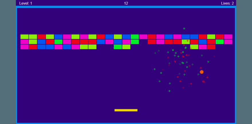
I used this algorithm to create a palate and it’s not bad for a first attempt. And This is how I implemented it.

References
- Color Theory for Designers: How To Create Your Own Color Schemes - https://www.smashingmagazine.com/2010/02/color-theory-for-designer-part-3-creating-your-own-color-palettes/
- Picking a Color Palette for Your Game’s Artwork - https://gamedevelopment.tutsplus.com/articles/picking-a-color-palette-for-your-games-artwork–gamedev-1174
- Color: HSB and tint-tone-shade - https://getpocket.com/a/read/1609347779
- HSV color model - https://en.wikipedia.org/wiki/HSL\_and\_HSV


Top comments (0)