
TL;DR: Syncfusion Flutter Charts widget introduced the new ROC and WMA indicators in the 2024 volume 2 release. The ROC helps identify trends and potential reversal points, while WMA is responsive to price changes. Both can be implemented directly or by linking a series name.
The Syncfusion Flutter Charts is a well-crafted charting widget for visualizing data. It contains a rich gallery of 30+ charts and graphs, ranging from line to financial charts, that cater to all charting scenarios.
In the latest 2024 volume 2 release, we’ve introduced the new Rate of Change (ROC) and Weighted Moving Average (WMA) indicators in the Flutter Charts. Let’s delve into their specifics!
Rate of Change (ROC) indicator
The Rate of Change (ROC is a momentum-based technical indicator that calculates the percentage difference between a current price and its price for a certain number of previous periods. The formula is as follows: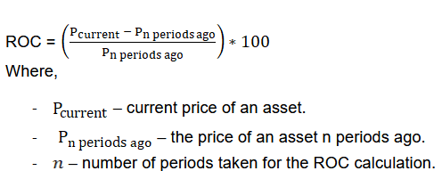
For instance, if an asset’s closing price today is $15, and 14 days ago it was $10, the 14-day ROC would be 50%, calculated using the formula:
((15 – 10) / 10) * 100.
The ROC has two signals:
- ROC signal line
- Centerline or baseline
The baseline of the Rate of Change indicator plays a critical role in identifying new trends. A rise of the ROC signal through the baseline into positive territory indicates a reversal to an uptrend, presenting buying opportunities. On the other hand, when the ROC drops through the baseline into negative territory, it signifies a shift to a downtrend, suggesting potential sell signals.
There are two methods to map the data source to the ROC indicator in our Flutter Charts.
Option 1: Directly map the data source into the indicator using the dataSource property. Refer to the following code example.
SfCartesianChart(
  primaryXAxis: const DateTimeAxis(),
  ...
  indicators: [
    RocIndicator<DataModel, DateTime>(
      dataSource: _dataSource,
      xValueMapper: (DataModel data, int index) => data.x,
      closeValueMapper: (DataModel data, int index) => data. Close,
    ),
  ],
)
Refer to the following image.

Option 2 : Assign a name to the series and map the data source from this series to the indicator. This is done by using the seriesName property.
SfCartesianChart(
  primaryXAxis: const DateTimeAxis(),
  ...
  series: <CartesianSeries<DataModel, DateTime>>[
    CandleSeries(
      name: 'Candle',
      dataSource: _cartesianSeriesData,
      xValueMapper: (DataModel data, int index) => data.x,
      highValueMapper: (DataModel data, int index) => data.high,
      lowValueMapper: (DataModel data, int index) => data.low,
      openValueMapper: (DataModel data, int index) => data.open,
      closeValueMapper: (DataModel data, int index) => data.close,
    ),
  ],
  indicators: [
    RocIndicator<DataModel, DateTime>(
      seriesName: 'Candle',
    ),
  ],
)
Refer to the following image.

Difference between momentum and rate of change (ROC) indicators
The momentum and the Rate of Change (ROC) are related indicators often yield similar results using the same n-period value. The significant difference between them is that the Rate of Change (ROC) indicator calculates change by taking the current price less the price n-periods earlier and then dividing it by the price n-periods earlier to express it as a percentage. The momentum indicator just multiplies the difference between prices by 100.
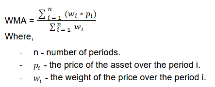
The Weighted Moving Average (WMA) smooths out price data and identifies trends. The WMA assigns greater weight to more recent periods, which allows it to react more quickly to price changes. The WMA formula is,
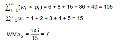
Let’s take the following data. Here, the period is 5.

Here, you can see the greater weight is assigned to the most recent price.
When the price crosses above the WMA, it might indicate a buying opportunity; when it crosses below, it might indicate a selling opportunity.
There are two ways to map the data source to the WMA indicator in our Flutter Charts.
Option 1 : Map the data source directly into the indicator using the dataSource property. Refer to the following code example.
SfCartesianChart(
  primaryXAxis: const DateTimeAxis(),
  ...
  indicators: [
    WMAIndicator<DataModel, DateTime>(
      dataSource: _dataSource,
      xValueMapper: (DataModel data, int index) => data.x,
      highValueMapper: (DataModel data, int index) => data.high,
      lowValueMapper: (DataModel data, int index) => data.low,
      openValueMapper: (DataModel data, int index) => data.open,
      closeValueMapper: (DataModel data, int index) => data. Close,
    ),
  ],
)
Refer to the following image.

Option 2 : Map the data source from a series by assigning a name to the series and then mapping that series name to the indicator using the seriesName property.
SfCartesianChart(
  primaryXAxis: const DateTimeAxis(),
  ...
  series: <CartesianSeries<DataModel, DateTime>>[
    CandleSeries(
      name: 'Candle',
      dataSource: _cartesianSeriesData,
      xValueMapper: (DataModel data, int index) => data.x,
      highValueMapper: (DataModel data, int index) => data.high,
      lowValueMapper: (DataModel data, int index) => data.low,
      openValueMapper: (DataModel data, int index) => data.open,
      closeValueMapper: (DataModel data, int index) => data.close,
    ),
  ],
  indicators: [
    WMAIndicator<DataModel, DateTime>(
      seriesName: 'Candle',
    ),
  ],
)
Refer to the following image.

Difference between the SMA and WMA indicators
The simple moving average (SMA) and weighted moving average (WMA) indicators are used to smooth out price data and identify trends. However, the difference is in how they treat the price while calculating the average value. The WMA assigns more weight to recent data points, making it more responsive to recent price changes than an SMA, which assigns equal weight to all price data.
Conclusion
Thanks for reading! You now comprehensively understand the new Rate of Change (ROC) and Weighted Moving Average (WMA) indicators of the Flutter Charts introduced in the 2024 volume 2 release. To explore all the updates in this release, refer to our release notes and What’s New pages. We encourage you to try our Flutter packages and share your feedback in the comments below.
You can also access our complete user guide and explore our Flutter project examples for more information. Additionally, you can discover our demo apps on various platforms, such as Google Play, the App Store, the Microsoft Store, the Snap Store, the App Center, and our website.
If you require a new widget in our Flutter framework or additional features in our existing widgets, please contact us via our support forums, support portal, or feedback portal. We are always delighted to assist you!


Top comments (0)