Humans have different kinds of senses, and visual sense is the most used and powerful sense among all. Since the digital world thrives highly on the visual sense,visual content consumption impacts all interactions on the digital world taking place through digital user interfaces (UIs) including the web and mobile device UIs.
Texts & Graphics in UI Design:
Fora UI designer, texts are a kind of content, which remains mostly informative, or instructional, and functional in some ways. Graphics UI elements serve navigational and functional purposes inmost cases while in some cases remain as layout components.
Images in UI Design:
Images are powerful enhancements of texts in one sense while decorative elements to grab the attention of users visually in another sense. Images could be informative and functional, as well as conceptual in addition. Images provide an opportunity to the graphics and UI designer, in particular, to translate the imagination of human beings to a visual landscape that others can see, feel, and grasp the idea behind it.
Animations in UI Design:
If you have a long story or big concept, or a function involves several steps, you have to create more than one image with a transit flow to realize on the digital landscape. In such cases, designers take the route of animation to depict those transits and create a live presentation.
Type of Animations
Based on the discussion above, we can outline two major types of animations, such as:
Functional Animation as a part of the functionalityin the UI design.
Conceptual Animation conveys a definitive idea before converting it into reality.
1 -Functional Animation
As its name suggests, it eases the functions of the applications denoted in the animation and improves the comprehensibility.Thus, it cuts the cognitive load a lot. It brings life into UI and helps in achieving certain goals, such as intuitive, responsive, and human-centered UI. Well-crafted animations are capable of meeting multiple functions, such as:
Giving Visual Feedback upon User Actions
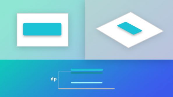
Buttons are interactive UI elements. We can animate buttons with subtle animation to establish it responsive upon a press/push.
Here,animation triggers only when a user takes action like pushing a button by a click or tap. Thus, animation simulates a button or control like UI elements tangible using visual and motion cues to bridge the gap.
Here,animation triggers only when a user takes action like pushing a button by a click or tap. Thus, animation simulates a button or control like UI elements tangible using visual and motion cues to bridge the gap.
Giving Visibility of System Status
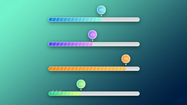
During interactions with the system, users always remain curious about the actions they have taken in the digital system. For example, data uploading or downloading actions. Such actions are time-consuming,and without passing the required time, users never see desired results at all.
Therefore,progress indicating bar animation helps designers to keep the users waiting in meaningful ways. Progress indicator bar displays the results like failure or success and also shows how many processes took place and what remains now. Of course, everything should be in nice and graceful ways.
Smoothing Status Changes
Screen flow is not always smooth. It often involves sudden or abrupt changes in the state of UIs during transitions. It creates distractions in user experiences (UX) and can confuse users to proceed further. To avoid all, designers should take soft these moments by adding some animations into the UI.
Animation can establish connections between altogether different states of UIs by simply acting as intermediaries between two opposite ends.
Ina music player app, when a user pushes the play button, a loading process takes place and screen changes from stop to play state. To give a perfect understanding of screen state changes, an isolated animation indicating the loading process introduced by the UI designer. Animation serves dual purposes, one to establish a connection between two screen states,and second to let users wait for the loading process.
Helping in Onboarding & Giving Visual Hints
Designers, sometimes, are experimental and try to introduce new features, interactions, or functionality in the UI design by going beyond conventions or design trends prevailing in the market. Though it is a good thing, capable of distracting user experiences.
To save from it, designers often take helpof some visual tips or hints and onboarding process using animation as a visualtool. User onboarding animations with flawless UX can leave tremendous impactson first-time users and capable ofengaging them with a unique or innovative UI design concept.
Visual tips also help repeating users to reveal progressive disclosure, mechanics, and supporting a new level of experiences.
2 -Conceptual Animation
It follows the principle of concept art in motion design. It conveys an idea before its actualization takes place. In UI design, conceptual animation meets in a variety of concepts for interactions, transitions, manipulation using controls, and marking the feedback from the system. Some animations are a good example of successful conceptual animations, such as
Scrolling a List of Items
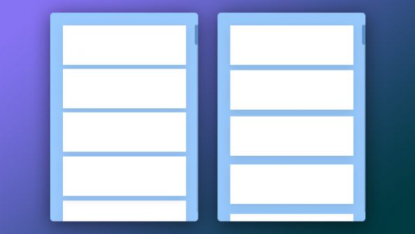
Here,animation displays the scrolling movement of a list of items in two variants.
The first variant mechanically moves the list of all items up while the second one simulates a little hold back of cards by a time delay and gaps between the cards. Therefore, the second variant looks alive and exhibits more air in the UI.
Transition– List to Item
In the real world, a user clicks or tap on an item in the list. The reaction comes like the opening of the screen of that particular item.
UI designer has simulated that concept in animation. The first variant shows a basic way of transit while the second one adds some dynamics in the display by additional movements of elements at the top.
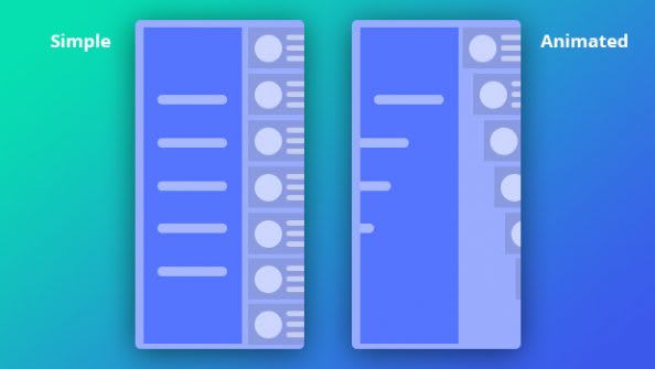
Opening Off-canvas Menu
Side menu or drawer menu is common in the modern mobile user interface designs. Conceptual animation designer has translated opening of it into two variants.
The first variant is simple while the second one is dynamic using a gradual flow of UI components simulating real-life phenomena.
Rules & Principles of Successful Animation in UI Designs
Some best practices by following rules and principles of animation can yield successful animation for your UI design projects. Let’s check some significant ones at a glance.
1 – Duration and speed of animation should slow so users can take notice of the changes in the states. Of course, it should not cause waiting.
2 – Collision or bouncing effect distracts the attention of users, so exclude it from your animation for UI designs.
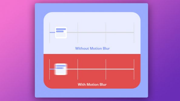
3 – Most of the modern mobile devices are unable to support simulation of motion blur effects of the objects in the animation.So, it is better to avoid it in your UI design.
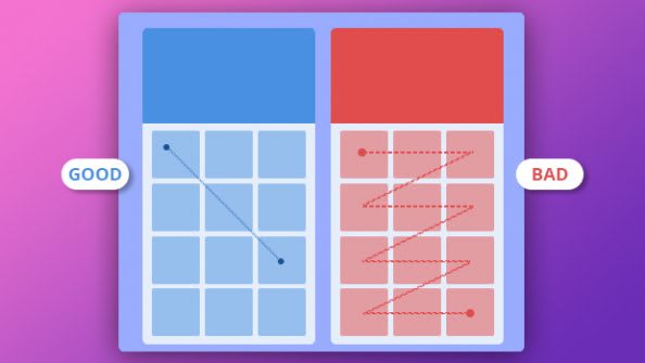
4 – UI designer should follow equal interaction rule. It means all UI object should follow one particular rule of appearance. For instance, one flow in one direction like top to bottom in the example below.
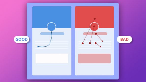
5 – UI designer should follow the law of subordinate interaction where a central object grabs the attention of users and rests of UI object follow it.
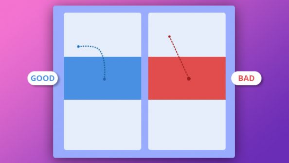
6 – In Material Design, if you want to make object transformation movement more natural, it should move along an arc-shaped path instead of a straight line. In other words, the object should transform its size dis proportionally.
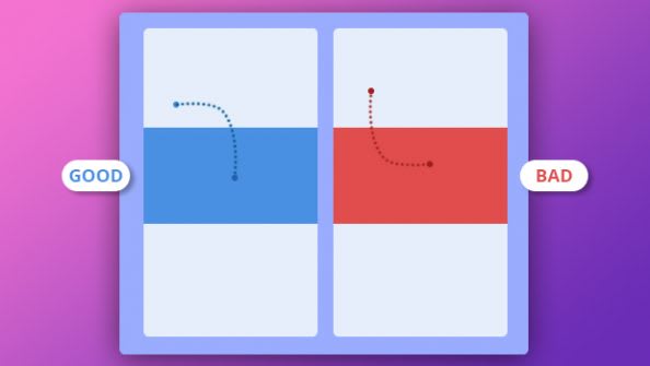
7 –The direction of arc for the transformation/movement of an object should coincide with the main direction axis of scrolling in the UI. So,in following image object goes the first to the right and then downward.
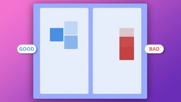
8 – If intersection occurs in the path of the moving objects, it distracts the UX. So, leave enough space for the movement whether by accelerating or slowing down the speed of some objects in UI design.
Conclusion:
We know the added advantages of animationsin the UI design for digital devices. Wealso come to know the different types of animations prevailing in the modern UIdesigns. There are certain rules for animation design, and by following it, we can achieve desired success in UI designs.
Now, the question is, who can help you to decide which animation type the best option for your UI design project is? How carefully implement rules of animation in your UI designs? If you strive for accurate answers and look for the right UI design team, SysBunny is an excellent place to get going in cost-effective ways. It has an impeccable team of UI designers to justify any scale of complexities in your user interface design project, be it for the web, mobiles, or even wearable, satisfactory results are a guarantee.







Top comments (0)