Recently, we have managed to customize the TalkJS default UI theme to make chat lookalikes like Uber, WhatsApp, LinkedIn, and other chats. In the following article, we will make the Booking.com chat using the TalkJS Chat API. We will show you how to create the blue and white theme of the booking.com chat.
Things To Do
Open the Theme Editor and create a new gif theme named “booking chat.” Now integrate this theme with the application to preview the theme changes. The users can also get an idea by following the starter guide and having an easy preview with an HTML page without application integration.
Below is the default theme of the TalkJS Chat:

Following is a complete summary of the changes that the user has to perform for making a chat like Booking.com:
- Change the header to dark blue and the header text to white.
- Remove the avatar from the header.
- Remove the search icon from the header.
- Change the font weight and family of the header text to normal and Arial, respectively.
- Remove the avatars from both sender and receiver chat.
- Remove the timestamp and message status from the chat.
- Change the chat background from the default white to any other color (as booking.com uses an image that Talk JS does not support yet).
- Change the alignment, styles, and padding of the messages.
- Change the client’s chat background to blue and the support agent’s chat to white.
- Change the format of the chat to make it look like the booking.com speech bubbles.
Layout
Chat panel
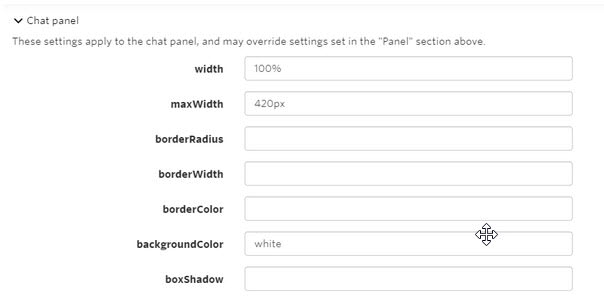
The initial step is to open the layout section from the Theme Editor and click on the Chat panel dropdown. The next thing is to change the background color to white.
Note: We are going for white colour for this tutorial, and the users can choose to set any color of their choice. Following is an image for the demo:
Message field area
In the layout section, open the message field area section and change the background color to white. Doing this will change the area’s colour around the message input field to match the background color. Below is the image to demonstrate it:
ChatHeader
The first top-level component to alter is the ChatHeader. Open the stylesheet of the ChatHeader section from the left menu. Change the header CSS with the following CSS to set the background color of the header to dark blue. This change makes it look like the header of Booking.com chat:
.header {
 display: flex;
 align-items: center;
 height: 4.5rem;
 background-color: #002F7D;
 flex-shrink: 0;
}
The next thing is to change the title colour to white, set the alignment of the title, and change its font size to make it more similar to the booking.com chat. Replace the title CSS with the following CSS to make these changes:
.title {
text-overflow: ellipsis;
overflow: hidden;
white-space: nowrap;
color: white;
font-size: 20px;
padding-left: 30px;
}
Moreover, remove the and class from the header as these are unnecessary. To make the chat look like booking.com, remove the following lines from the ChatHeader stylesheet:
Line 35 (the search box).
Line 36 (else condition).
Line 38 to 40 (image on the left side).
Line 45, line 49.
Line 51 to 57.
Line 88 to 93 (image CSS).
Line 101 to 104 (search action).
Line 119 to 156 (search code).
Following is the modified header after going through all the changes:

UserMessage
The following top-level component to alter is the UserMessage. The user has to open the UserMessage stylesheet to make changes according to the booking.com chat layout. The user has to modify line 54 like the following to hide the avatars:
<t:set showAvatars="{{true}}"/> to <t:set showAvatars="{{false}}"/>
Moreover, remove lines 58 to 62 in order to remove the avatar code from the file.
The next thing is to remove the timestamp and message delivery status/show status from the chat. Alter the MessageBody tag at line 73 to remove the following code from the file:
timestamp="{{ timestamp }}" floatTimestamp="auto" showStatus="{{ sender.isMe }}"
Another thing is to add the below CSS to in the file to add the triangle in order to customise the speech bubbles to make them look like booking.com chat bubbles:
Following is the CSS to alter the speech bubble by the sender:
.by-me .message:before {
 content: "";
 width: 0px;
 height: 0px;
 position: absolute;
 border-left: 10px solid #379EE0;
 border-right: 10px solid transparent;
 border-top: 10px solid transparent;
 border-bottom: 10px solid transparent;
 right: -20px;
 top: 40px;
}
Following is the CSS to alter the speech bubble by the receiver:
.by-other .message:before {
  content: "";
  width: 0px;
  height: 0px;
  position: absolute;
  border-right: 10px solid  #D3D3D3;
  border-left: 10px solid transparent;
  border-bottom: 10px solid transparent;
  border-top: 10px solid transparent;
  right: 189px;
  top: 30px;
}
Replace the .by-me .message CSS to change the background color, margins and borders to make it look like the booking.com chat:
.by-me .message {
   background-color: #379EE0;
   color: #fff;
   margin-right:20px;
   border-color:#379EE0;
}
Replace the .by-other .message CSS to alter the background color of the chat and the left margin:
.by-other .message {
   background-color: #D3D3D3;
    margin-left:20px;
}
The next thing to do is to replace the message CSS to align it with the speech bubble styling and the borders of the bubbles. Moreover, alter the font family, font-weight, and the font size of the chat to make it similar to the booking.com chat.
Note: Users can make the above changes in the Layout section by setting the font size and font family in the ChatPanel section.
.message {
  border-color: #E7ECEE;
 background-color: #E7ECEE;
 color: #111;
 padding: 20px;
 font-weight: 900;
 font-family: arial;
 position:relative;
  white-space: normal;
  border-radius: 0.5rem;
  border-width: 0px;
  border-style: solid;
  word-wrap: break-word;
  position: relative;
  display: inline-block;
  max-width: calc(100% - 15rem - 0.25rem - 0.25rem);
  font-size: 16px;
  font-weight:normal;
  padding: 0px;
}
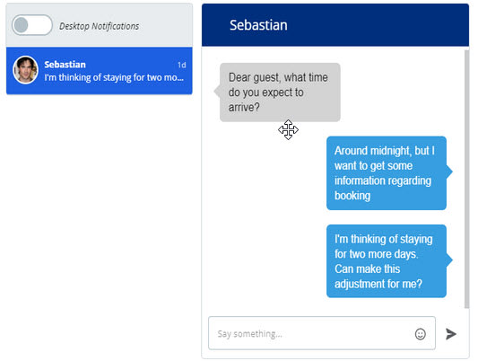
By performing all these changes and replacements, the chat now looks like this:

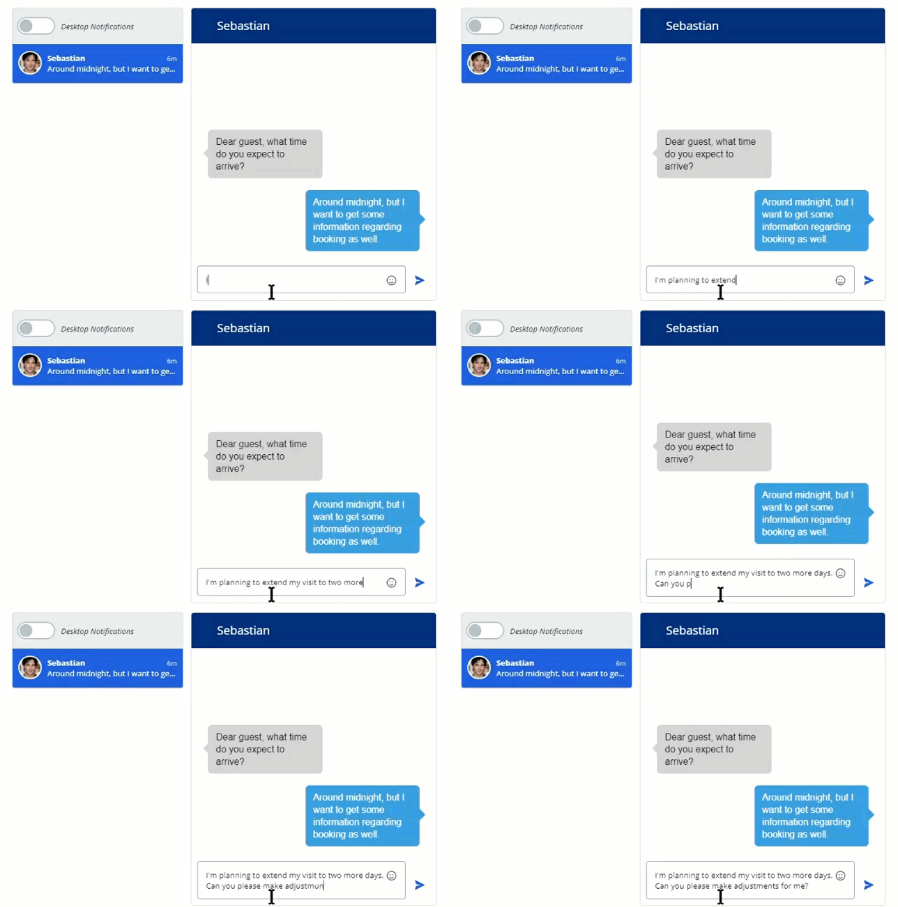
The below gif demonstrates the functional design of the booking chat:


Top comments (0)