Lately, we have used the Theme Editor of the TalkJS Chat API to develop some chat lookalikes like WhatsApp, Discord, UpWork, LinkedIn, and many more. This article implements a chat that looks like a chat between a rider and driver on the Uber application. We will implement the latest theme.
Things to do
Open the TalkJS Theme Editor and create a new theme named “rider-chat.” Integrate the theme with the application to view the theme changes.
Note: The users can follow the TalkJS starter guide to preview them on the HTML page without app integration.
The image shows the default theme of the TalkJS chat:

Following is a summary of the changes that the users need to make in order to achieve an Uber chat lookalike:
- Change the header color to black and the header text to white
- Change the chat’s font family to Arial (sans-serif)
- Remove the avatar and search icon from the header
- Remove the avatar from the right chat message (rider’s message)
- Change the alignment of the rider messages
- Remove the timestamp and message status from the chat
- Add message read status in the rider’s chat
- Change the rider’s chat background to blue
- Change the format of the chat to make it look like the Uber speech bubbles.
Layout
Chat panel
The very first thing to do is to set the background color by using the Theme Editor. Open the layout section through the left menu and select the Chat panel dropdown. Set the background color using the following color code as an example:
Message Field Area
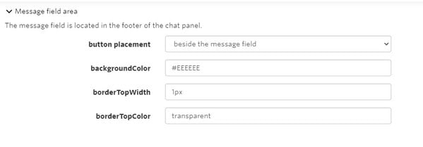
In the layout section, open the message field area section and change the background color to gray. Doing this will change the area’s colour around the message input field to match the background color. Below is the image to demonstrate it:

ChatHeader
The first section to alter is the ChatHeader. Open the stylesheet of the ChatHeader section from the left menu. Change the background color of the header to black by modifying its class, as in Uber.
Replace the header CCS with the following CSS to change the header background color:
.header {
 display: flex;
 align-items: center;
 height: 4.5rem;
 background-color: black;
 flex-shrink: 0;
}
The next thing is to change the title color in the title class to white. So the name of the user will appear white on the black background, like Uber. Moreover, replace the title’s CSS with the following code to change the color, font size, font family, margins, and padding:
.title {
 text-overflow: ellipsis;
 overflow: hidden;
 white-space: nowrap;
 color: white;
 font-family: arial;
 font-size: 20px;
 padding-left: 30px;
 margin-bottom: -60px;
}
Another thing to do here is remove the and class from the header. To make the chat look like Uber, remove line 35 (the search box), line 36 (else condition), line 38 to 40 (image on the left side), line 45, line 49, line 51 to 57, line 88 to 93 (image CSS), line 101 to 104 (search action), line 119 to 156 (search code).
Moreover, add the phone icon in the header by using the following code. Add the phone icon code after the div of the title class.
Note: The critical thing to notice here is that the TalkJS Chat API currently does not support the call feature. However, there is a way of using it by integrating with other call APIs like Daily. There is also an integration guide for the users to follow in such cases. Users can also add the SVG of icons to make the chat look more like Uber’s original chat.
<a class="clickable-phone-icn" href="#">
         <img class="phone-icon-img" src="https://icon-library.com/images/phone-icon-white-png/phone-icon-white-png-6.jpg" />
  </a>
Add the below CSS of phone icon for styling in header:
.phone-icon-img {
 max-width:7%;
 float:right;
 padding-top:30px;
}
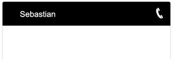
Below is the illustration of the modified header:

UserMessage
Open the UserMessage file and make the changes according to the Uber rider and driver chat layout. Replace line number 60 with the following code to remove the rider’s avatar from the chat:
<Avatar t:if="{{ sender.id != previousSenderId and sender.isMe == false}}"
The next thing is to remove the timestamp and message delivered status or show status from the chat. Remove the following code from the MessageBody tag at line 73:
timestamp="{{ timestamp }}" floatTimestamp="auto" showStatus="{{ sender.isMe }}"
Another thing is to replace the message CSS with the following CSS in order to change the font style:
.message {
   white-space: normal;
   overflow: hidden;
   border-radius: 1.5rem;
   border-width: 1px;
   border-style: solid;
   word-wrap: break-word;
   position: relative;
   display: inline-block;
   max-width: calc(100% - 6rem - 0.25rem - 0.25rem);
   border-color: #E7ECEE;
   background-color: #E7ECEE;
   color: #111;
   font-family: arial;
}
Furthermore, replace the .by-me .message CSS with the following CSS to change the message background color, chat bubble style and make it look more like Uber speech bubble:
.by-me .message {
   border-color: #1E60E1;
   background-color: #286EF0;
   color: #fff;
   /* Space between avatar and the message */
   margin-right: 0.25rem;
   border-radius: 40px 40px 0px 40px;
   padding-left: 1rem;
}
Replace the CSS class .by-other .message with the given CSS to change the background color and the chat bubble style for the driver:
.by-other .message {
   /* Space between avatar and the message */
   margin-left: 0.25rem;
   border-radius: 40px 40px 40px 0px;
   background-color:#E1DFE3;
}
Remove the following CSS class to align the chat:
.by-me.previous-same {
   /* Avatar width (see Avatar component) */
      padding-right: 3rem;
}
Moreover, add the following CSS code before the closing tag of the template, i.e., to display message read status. The users can customize to hide or display this div based on the message show status. However, for this article, the if condition displays the read status for all messages by the rider. Users can manipulate this if condition to get the results they want:
<div t:if="{{sender.isMe == true}}"
           class="read-msg">
           Read
   </div>
Add the following CSS of the message read status in the style section:
.read-msg {
   color: gray;
   margin-left: 368px;
}
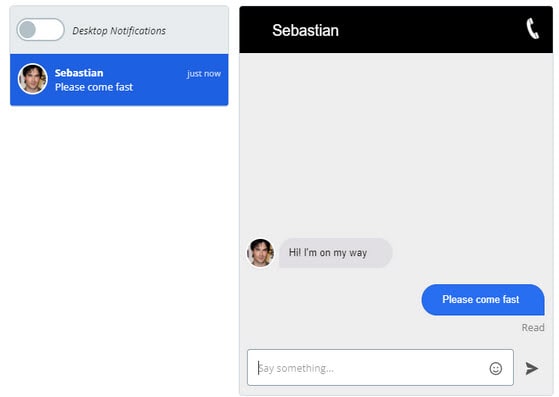
By performing all these changes and replacements, the chat now looks like this:

It is very similar to the original Uber chat between the rider and the driver, thanks to the Theme Editor by TalkJS. The users can develop many such themes with the flexible, easy-to-use interface and minimal coding requirement environment of TalkJS Chat API.
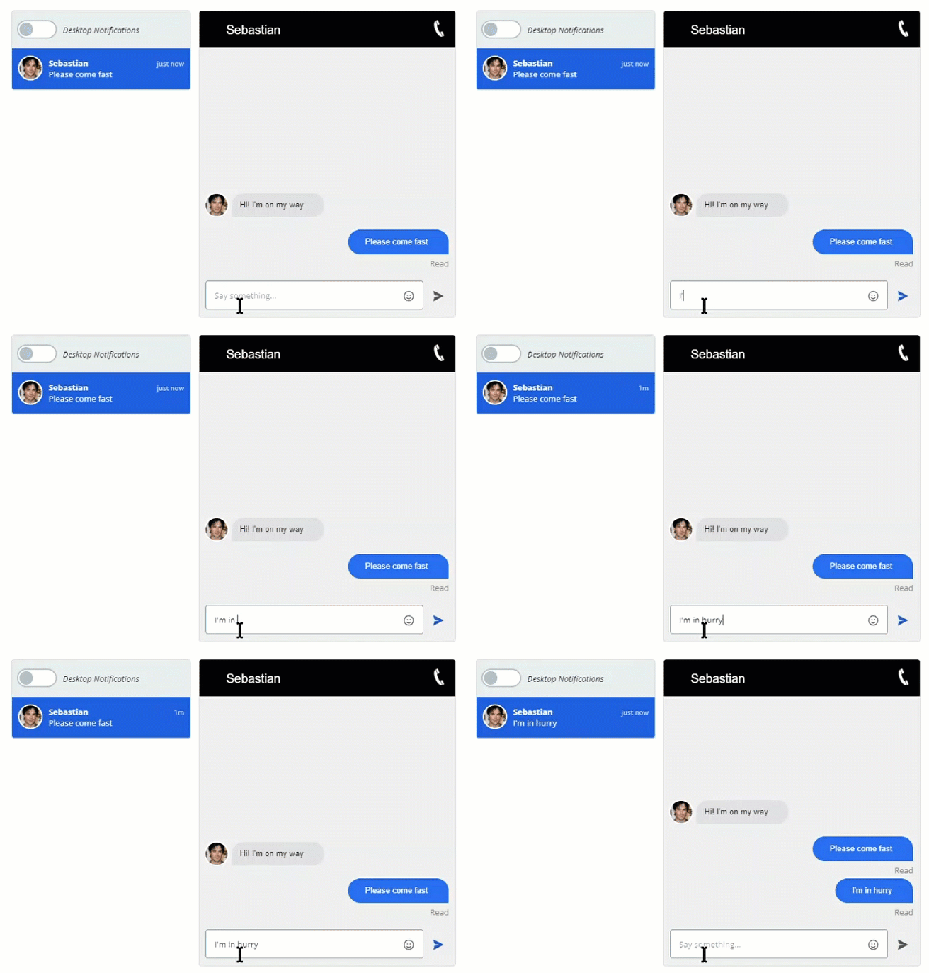
The below GIF demonstrates the functional design of the rider-driver chat:


Top comments (0)