A couple of weeks ago, I was almost giving up on Dev.to. I would open the app, scroll through the suggested posts, and sigh in dismay. I couldn't help but think aloud: My Dev.to feed sucks!
My feed was filled with posts of beginner articles in React, JS, etc. I'm not against beginner articles, but when you have read several of these, you can get bored pretty easily with suggestions to read more of the same.
However, something didn't make sense: I knew that there were people writing posts on advanced/intermediate topics. Why was I then only being shown the beginner topics? Sometimes I was lucky enough to stumble upon such an article, and I'd light up as my interest in the app got renewed. But these were just once-in-a-blue-moon occurrences.
How I Came Across The Solution By Accident
One evening, I opened the Dev.to app, and I immediately noticed how bright it was, in contrast to my other apps. For some reason, the app did not automatically activate dark mode after sunset. I went exploring in the app settings, and voila! Not only did I find the option to activate dark mode, but also an option to customize my feed.
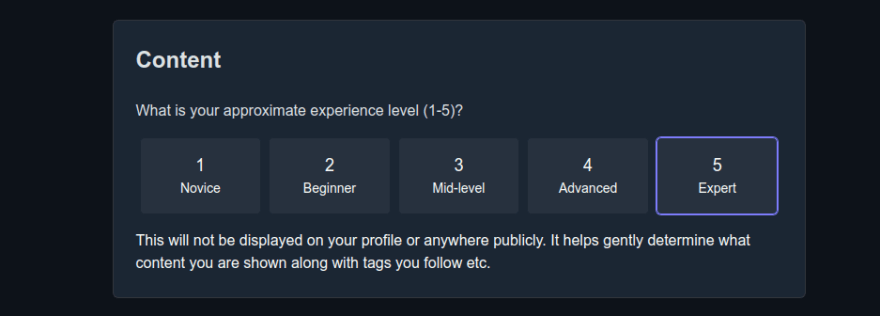
Hidden deep in the settings, is a section that asks you your experience level:
You can access this via this link. Just scroll to the bottom.
By default, no value was selected, and out of curiosity, I updated this to option 5 (Expert), just to see what would happen. I went back to my feed and forgot all about it.
I didn't notice until much later that my feed had greatly improved. I suddenly wanted to read and save every article on my feed. It only hit me later that the above change had somehow refreshed my feed experience (I guess the cache took a while to update).
There you have it! If your Dev.to feed sucks, don't despair. Just change your experience level and you will start seeing better content in no time.
Cheers!
PS - it still sucks that there is no auto dark mode to match the device preferences 😩. Dev.to, please do something about it! 😃


Top comments (3)
Thanks for sharing! Looking forward to when it goes live!
Really a great trick which even I missed! Thanks for sharing :)
Most welcome! I totally agree - it's a bit hidden, which makes it so easy to miss :)