Bootstrap 4 has introduced a new card component that replaces many old components in Bootstrap 3, and can be used to build modern style web layouts without re-inventing the well or being a CSS designer with deep CSS knowledge. Now and thanks to Bootstrap 4 you can, as a developer with small CSS knowledge, build modern and professional card-based layouts.
BS4 cards provide flexible containers for displaying a mix of content (text, images, links etc.) in a grouped way. They can be created by only adding a bunch of CSS classes to HTML markup and they can be easily styled and customized to present a new and distinguished look.
Cards are used to create advanced layouts such as Masonry. You'll find cards in many big web platforms such as e-commerce websites, analytics dashboards and blogs etc.
For Bootstrap users, Cards are a replacement for the popular components : panels, thumbnails and wells (all these can now be created with cards)
Before we start seeing how to create different card types. These are a summary of information about BS 4 Cards
- Cards are used to present a mix of content in an elegant and compact way
- Cards are built on top of Flexbox
- Cards have no margin by default
- Cards can be easily organized in groups, decks or Masonry columns
- Cards have a header, footer and 1 or more bodies
- Cards can be easily aligned and well mixed with the other Bootstrap components etc.
In this tutorial you will get introduced to the new card component then you will see different elements of a card and finally you will build an Masonry like layout using Cards and Card Columns
First start by creating an HTML file then copy the following starter template from the Bootstrap docs in the new file
<!doctype html>
<html lang="en">
  <head>
    <!-- Required meta tags -->
    <meta charset="utf-8">
    <meta name="viewport" content="width=device-width, initial-scale=1, shrink-to-fit=no">

    <!-- Bootstrap CSS -->
    <link rel="stylesheet" href="https://maxcdn.bootstrapcdn.com/bootstrap/4.0.0/css/bootstrap.min.css" integrity="sha384-Gn5384xqQ1aoWXA+058RXPxPg6fy4IWvTNh0E263XmFcJlSAwiGgFAW/dAiS6JXm" crossorigin="anonymous">

    <title>Bootstrap 4 Card Example</title>
  </head>
  <body>
    <div class="container">
    <!-- Our Simple Card Goes Here -->
    </div>

    <!-- Optional JavaScript -->
    <!-- jQuery first, then Popper.js, then Bootstrap JS -->
    <script src="https://code.jquery.com/jquery-3.2.1.slim.min.js" integrity="sha384-KJ3o2DKtIkvYIK3UENzmM7KCkRr/rE9/Qpg6aAZGJwFDMVNA/GpGFF93hXpG5KkN" crossorigin="anonymous"></script>
    <script src="https://cdnjs.cloudflare.com/ajax/libs/popper.js/1.12.9/umd/popper.min.js" integrity="sha384-ApNbgh9B+Y1QKtv3Rn7W3mgPxhU9K/ScQsAP7hUibX39j7fakFPskvXusvfa0b4Q" crossorigin="anonymous"></script>
    <script src="https://maxcdn.bootstrapcdn.com/bootstrap/4.0.0/js/bootstrap.min.js" integrity="sha384-JZR6Spejh4U02d8jOt6vLEHfe/JQGiRRSQQxSfFWpi1MquVdAyjUar5+76PVCmYl" crossorigin="anonymous"></script>
  </body>
</html>
Now let's start by creating a basic card. Add a <div> with the class .card to create the outer container of your card component
Next inside the outer container, add a header, card body and footer
You can add a header by either creating a <div> or <h*> heading element then add the .card-header class
You can create a card body by adding a .card-body class to a <div>
For the footer you need to add a <div> with the class .card-footer
<div class="card">
    <div class="card-header">
        Card Header
    </div>
    <div class="card-body">
        Card Body
    </div>
    <div class="card-footer">
        Card Footer
    </div>
</div>
Please note that you can add one or many card bodies to your card and you can also wrap the content inside the body in other tags such as <p>
<div class="card-body">
    <p>
        You can also add a second body
    </p>
</div>
Use a card body when you want to create a padded section within a card.
Using .card-img-top and card-img-bottom you create image caps which are images that exist on the top and bottom of the card body/bodies
<img class="card-img-top" src="https://source.unsplash.com/daily" alt="Card image top">
<div class="card-body"></div>

<img class="card-img-bottom" src="https://source.unsplash.com/daily" alt="Card image bottom">
You can see that the card component is taking the whole width of its container division but you can control the width with different means:
- using the
widthandmax-widthCSS properties
<div class="card" style="width:20rem;">...</div>
- using the Bootstrap 4 Grid
You can also set the height but in most cases the height needs to fit the vertical alignment of the card content so you'll rarely need to set it.
For adding content inside the card body you also have a bunch of classes (.card-title, .card-subtitle, .card-text) that make it easy to style different content types such as the card title, subtitle and text.
You can use standard HTML tags to style text within .card-text class
<div class="card-body">
         <h3 class="card-title">Card title</h3>
         <h4 class="card-subtitle">Card subtitle</h4>
          <p class="card-text">This is a card body 1</p></div>
Want to use the cap image as an overlay? you can simply switch the .card-body class with the .card-img-overlay class
<div class="card">

<img class="card-img-top" src="https://source.unsplash.com/daily?nature" alt="Card image top">
    <div class="card-img-overlay">
         <h3 class="card-title">Card 2 title</h3>
         <h4 class="card-subtitle">Card 2 subtitle</h4>
          <p class="card-text">This is a card 2 body </p>
    </div>
    </div>
You can add navigation tabs and pills to the header of your card using nav, nav-tabs|nav-pills, card-header-tabs| card-header-pill classes with <ul> tags
<div class="card-header">
                <ul class="nav nav-tabs card-header-tabs">
                        <li class="nav-item">
                            <a class="nav-link active" href="#">Tab 1</a>
                        </li>
                        <li class="nav-item">
                            <a class="nav-link" href="#">Tab 2</a>
                        </li>
                </ul>
            </div>
You can add links to card content using the .card-link class with an <a> element
<div class="card">

<img class="card-img-top" src="https://source.unsplash.com/daily?rock" alt="Card image top">
    <div class="card-img-overlay white">
         <h3 class="card-title">Card title</h3>
         <h4 class="card-subtitle">Card subtitle</h4>
          <p class="card-text">You can add links to card body</p>
                    <a href="#" class="card-link">Link 1</a>
                <a href="#" class="card-link">Link 2</a>
    </div>
    </div>
You can use list as body content. For example this is how you can create two stylish lists without any extra custom CSS
<div class="card text-primary border-primary">
  <ul class="list-group">
    <li class="list-group-item">Item 1</li>
    <li class="list-group-item">Item 2</li>
    <li class="list-group-item">Item 3</li>
  </ul>

    </div>
    <br>
  <div class="card text-primary border-primary">
    <div class="card-body">
      <h2 class="card-title"> My List</h2>
  <ul class="list-group list-group-flush">
    <li class="list-group-item">Item 1</li>
    <li class="list-group-item">Item 2</li>
    <li class="list-group-item">Item 3</li>
  </ul>
    </div>
How to Create Complex Card Based Layouts?
Singe cards are great way to display a mix of content but usually you need to display a collection of cards to build complex layouts such as Masonry like layouts.
Card Groups
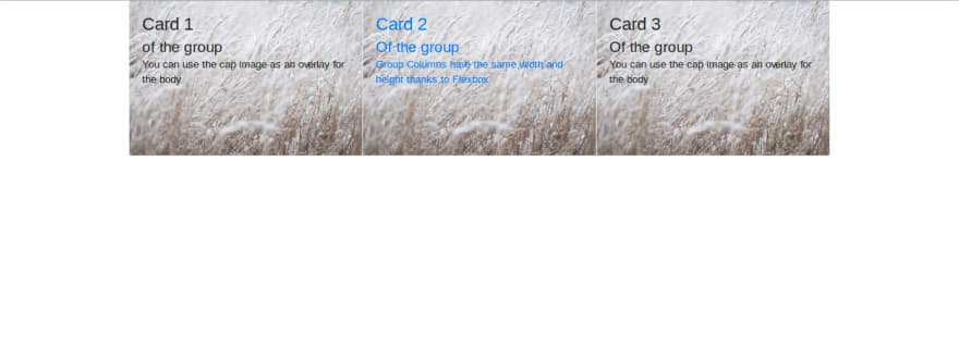
You can create a single unit of multiple cards using Cards. The columns of the unit will take the same width and height (this is achieved using Flexbox).
This is an example of a group of 3 cards 
See the Pen RQjNKr by Techiediaries (@techiediaries) on CodePen.
Card Decks
Card Decks are similar to Card Groups except that individual cards inside a deck are not attached
 See the Pen RQjNKr by Techiediaries (@techiediaries) on CodePen.
Card Columns
Cards Columns provides a grouping that organizes cards into a masonry like (Pinterest style) layout. You don't need to provide extra CSS or JavaScript/jQuery code just wrap your cards inside a <div> with .card-columns and Bootstrap 4 will present you with a Masonry layout. But keep in mind this is just CSS not JavaScript code involved so the masonry layout is simple, cards are ordered from top-left, bottom-right and there is no easy way to chage this behavior unless you are using to a Mosonry plugin.
See the following pen for an example
See the Pen Bootstrap 4 Masonry Layout by Techiediaries (@techiediaries) on CodePen.
Conclusion
Thanks to Bootstrap 4 you will no more be intimidated when you want to create modern style and card based layouts even if you are just starting with HTML and CSS or you are a developer with no extensive knowledge of CSS.


Top comments (0)