If you are like many others, you have repetitive tasks to complete. Whether it be grocery shopping once a month or completing chores throughout the week, often we find that without guidance, we could easily miss something or get distracted. Having the ability to mark something complete using a checkbox allows us to complete repetitive tasks quicker and with fewer mistakes.
Checkboxes are great to use for:
- Keeping up with daily tasks
- Subscribing to newsletters
- Adding toppings to an online order
- Completing online surveys
- Filling out job applications etc.,
As you can see, creating a checkbox is a common task but sometimes more complicated the more you customize it. But with this easy-to-follow guide, you will learn techniques to style a checkbox to look the way you desire!
This guide is written assuming you are familiar with HTML5. With that said, let's get started!
Create a Basic Checkbox using HTML
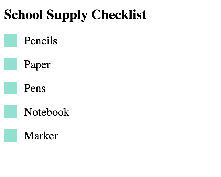
In this walkthrough, we'll create a list of school supplies we will need for our first day of class. By the completion of this guide, our checklist will look like this:
Label and Input Elements
In your HTML file, create a <label> tag and assign it a class name (ex: "container"). Nested inside the <label> tag, is an <input> tag assigned a type name of "checkbox". There is also a <span> tag assigned a class name of "checkmark". See the example below:
 <label class="container">Pencils
    <input type="checkbox">
    <span class="checkmark"></span>
  </label>
The <label class="container"> tag does not "necessarily" make physical changes to the code. The label element is used for assigning style to the code with CSS. Please note, if you create a checkbox without a label element, the checkbox will only trigger by specifically clicking on the checkbox rather than the text "Pencils" associated with it. Take a moment and test it for yourself.
The <input type="checkbox"> tag is assigned the type name "checkbox" because it is rendered by default and will give us the properties of a checked box when activated.
The <span class="checkmark"> tag is placed within the label element to style our checkmark with CSS once it is triggered.
The above code will output the following:

Putting the HTML All Together
Now that you can create a basic HTML checkbox, we can fill in the rest of our HTML file.
- Link the CSS stylesheet in the
<head>of the HTML template. - Add a
<div>tag for styling the area around the checkbox,<h2>heading tag for the title, and a few more school supplies to our HTML<body>. - Separate each
<label>tag using<br>in order to skip to the next line. See the example below: ```
<!DOCTYPE html>
School Supply Checklist
School Supply Checklist
Pencils
Paper
Pens
Notebook
Marker
## Styling the Checklist using CSS

You have now created multiple fully-functioning checkboxes. It is now time to add some style. In your CSS file (within the same folder as HTML), we will write code to format the HTML by customizing the checkboxes as creative as you like. Follow these simple steps and once you are comforter, feel free to adjust your code.
/* Step 1: Customize the label (the area around the checklist) */
.container {
display: block;
position: relative;
padding-left: 35px;
cursor: pointer;
font-size: 20px;
}
/* Step 2: Remove the default checkboxes so that we can create our own */
.container input {
position: absolute;
opacity: 0;
cursor: pointer;
height: 0;
width: 0;
}
/* Step 3: Create a custom checkbox */
.checkmark {
position: absolute;
top: 0;
left: 0;
height: 22px;
width: 22px;
background-color: #79e3d0;
}
/* Step 4: When hovering, add a background color */
.container:hover input ~ .checkmark {
background-color: #c8e9e3;
}
/* Step 5: When the checkbox is checked, add a different background */
.container input:checked ~ .checkmark {
background-color: #32e0f4;
}
/* Step 6: Create the checkmark/indicator (hidden when not checked) */
.checkmark:after {
content: "";
position: absolute;
display: none;
}
/* Step 7: Display the checkmark when checked */
.container input:checked ~ .checkmark:after {
display: block;
}
/* Step 8: Style the checkmark/indicator */
.container .checkmark:after {
left: 9px;
top: 5px;
width: 5px;
height: 10px;
border: solid white;
border-width: 0 3px 3px 0;
-webkit-transform: rotate(45deg);
-ms-transform: rotate(45deg);
transform: rotate(45deg);
}
The output:

#### Adding More Style
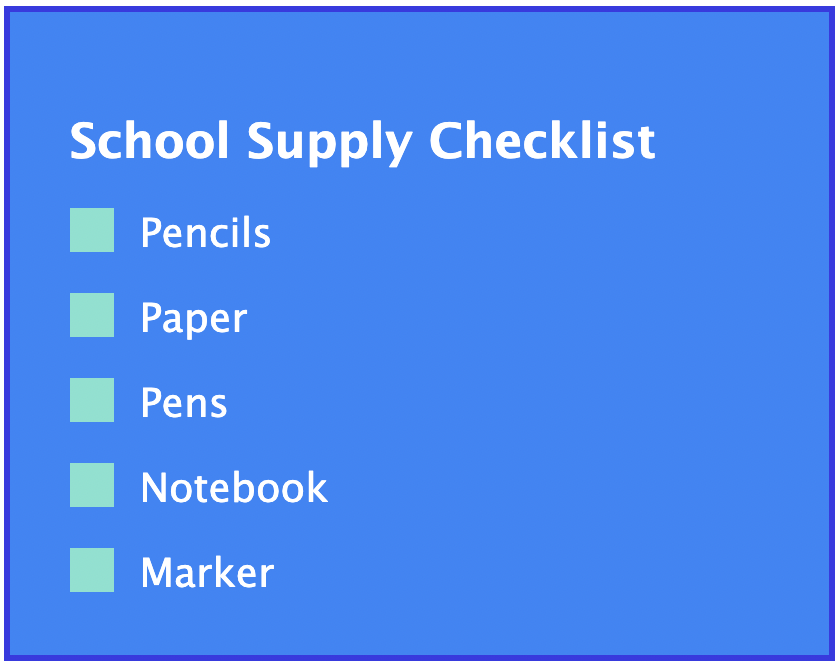
You have now created a great piece of art (your own customized checklist!). To further your skills consider a few more CSS add-ons:
.checklist {
background-color: #2386f9;
padding: 30px;
margin: auto;
width: 50%;
border: 3px solid #373ae6;
font-family: 'Lucida Sans', 'Lucida Sans Regular', 'Lucida Grande', 'Lucida Sans Unicode', Geneva, Verdana, sans-serif;
color: white;
}
The output:

## Conclusion
Creating custom checkboxes are beneficial to enhance your website branding and improve the user experience. You can now successfully:
* Create a checkbox in HTML
* Add labels to a HTML checkbox
* Style the checkbox using CSS


Top comments (0)