DEV Community

Cover image for Wide section for Notion
Thiago Braga
Thiago Braga

Posted on • Updated on

Wide section for Notion

💾 TL;DR
Duplicate the template here


Hi, guys. How are you? A long time since my last post. I hope everyone is well and healthy.

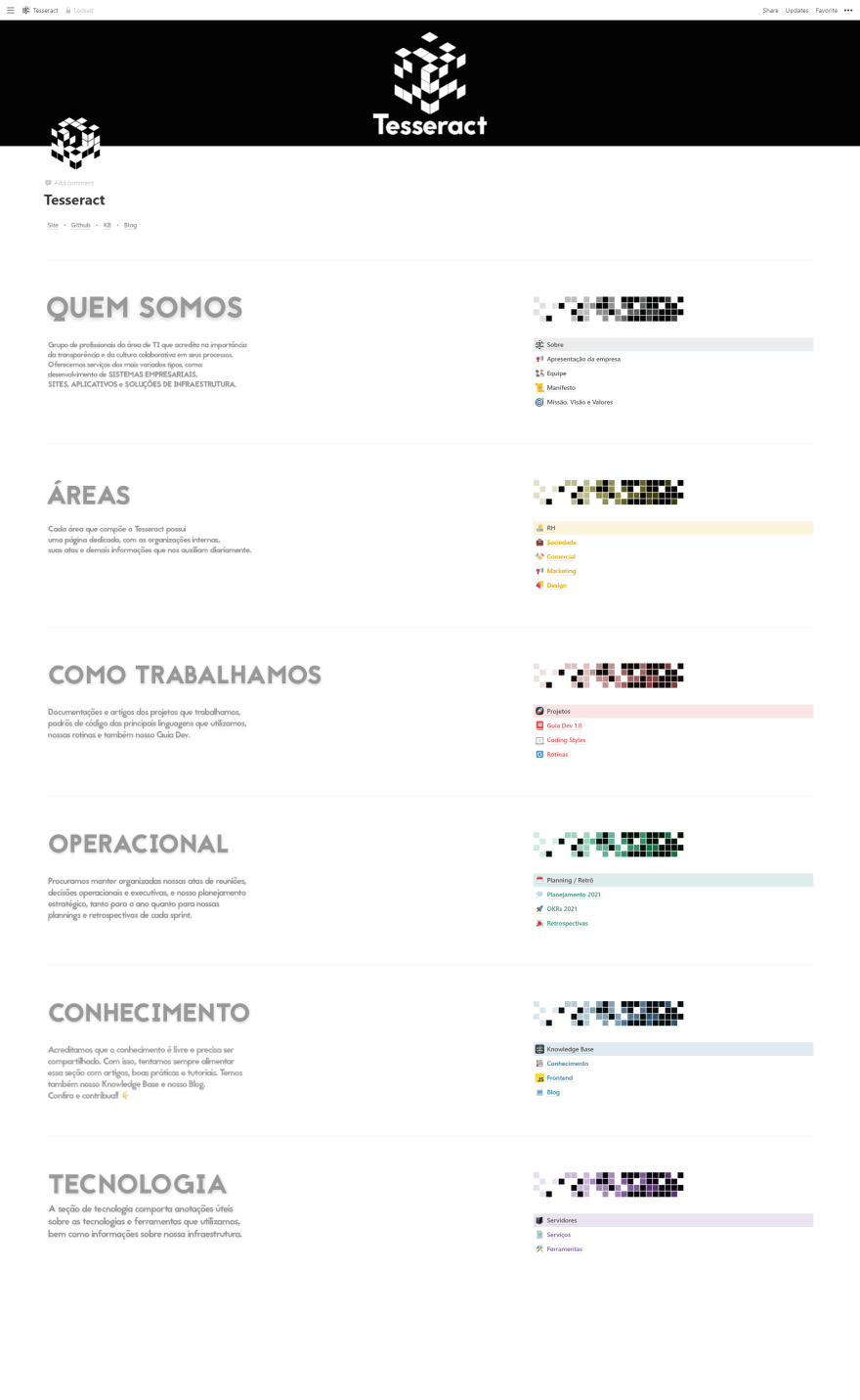
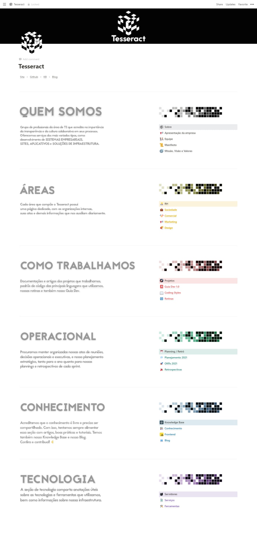
Last Saturday, I had an idea for my company's Notion. This idea made it easier to separate the categories into a larger section. And on top of that, I wanted to come up with a result that was responsive and that worked on both themes. The only downside is that each title and paragraph on the left side is made with images. 🥲

I would like to share some screenshots I took. I hope you all like it 🥰 (click image to enlarge and open in another window).
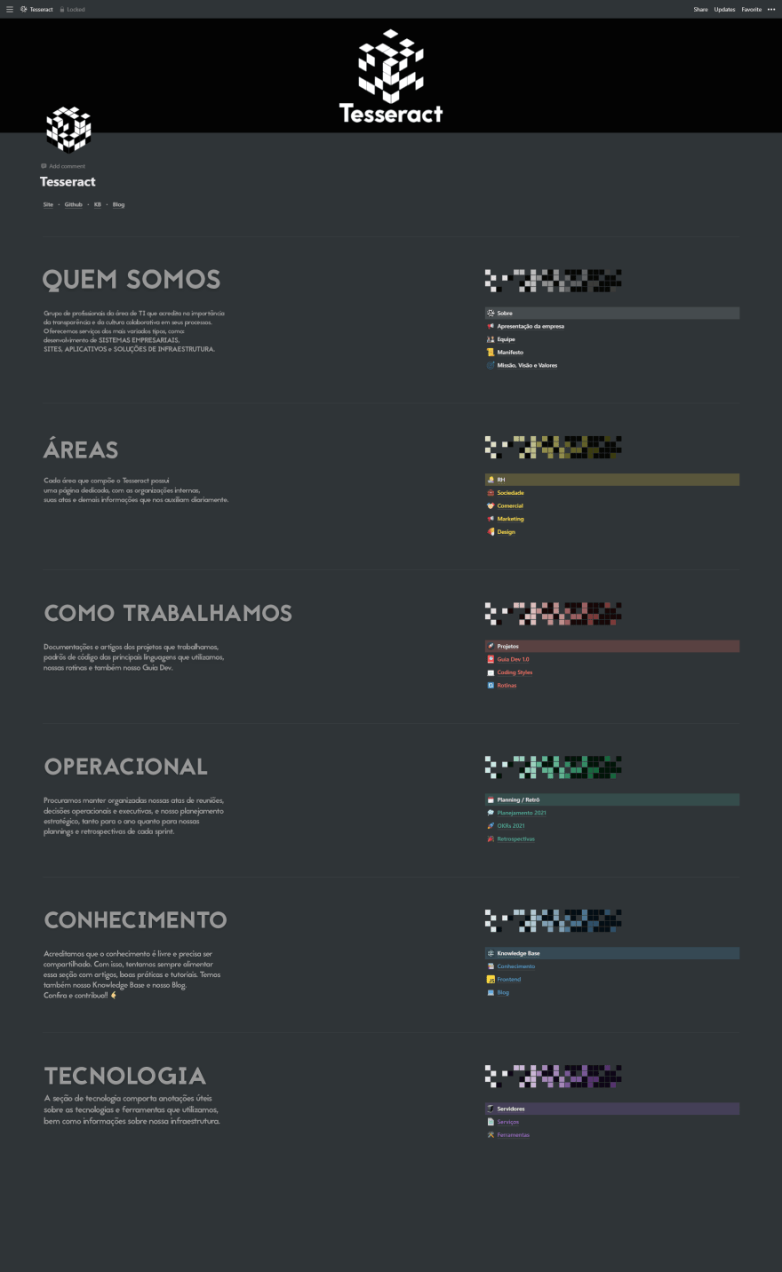

Notion of Tesseract company in dark mode and wide sections


Dark theme on 1920px wide monitor


Notion of Tesseract company in light mode and wide sections


Light theme on 1920px wide monitor


Notion of Tesseract company in dark mode and laptop wide sections


Dark theme on 1366px laptop monitor


Notion of Tesseract company in light mode and laptop wide sections


Light theme on 1366px laptop monitor


Notion of Tesseract company in dark mode on mobile


Dark theme on mobile screen


Notion of Tesseract company in light mode on mobile


Light theme on mobile screen


Top comments (0)