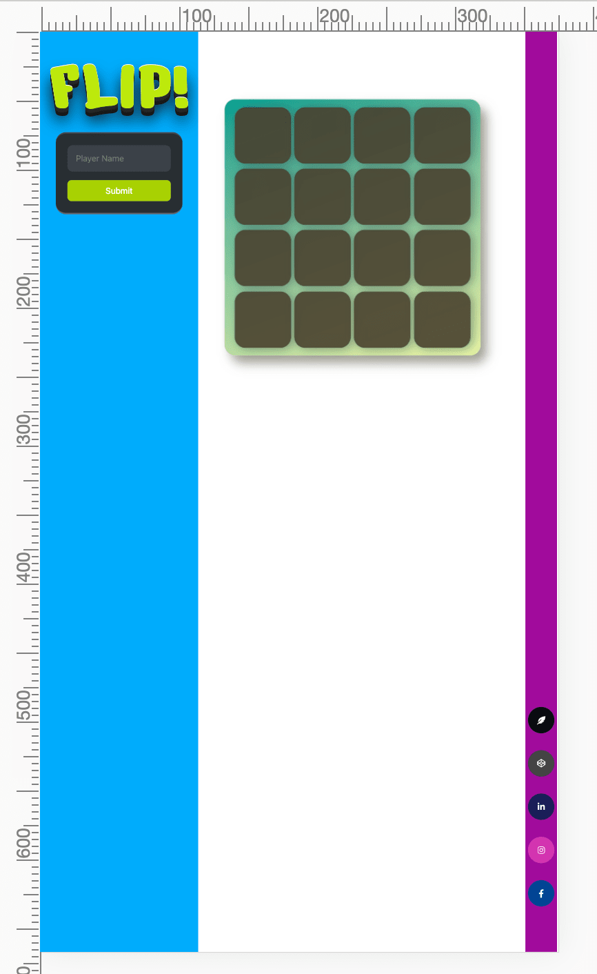
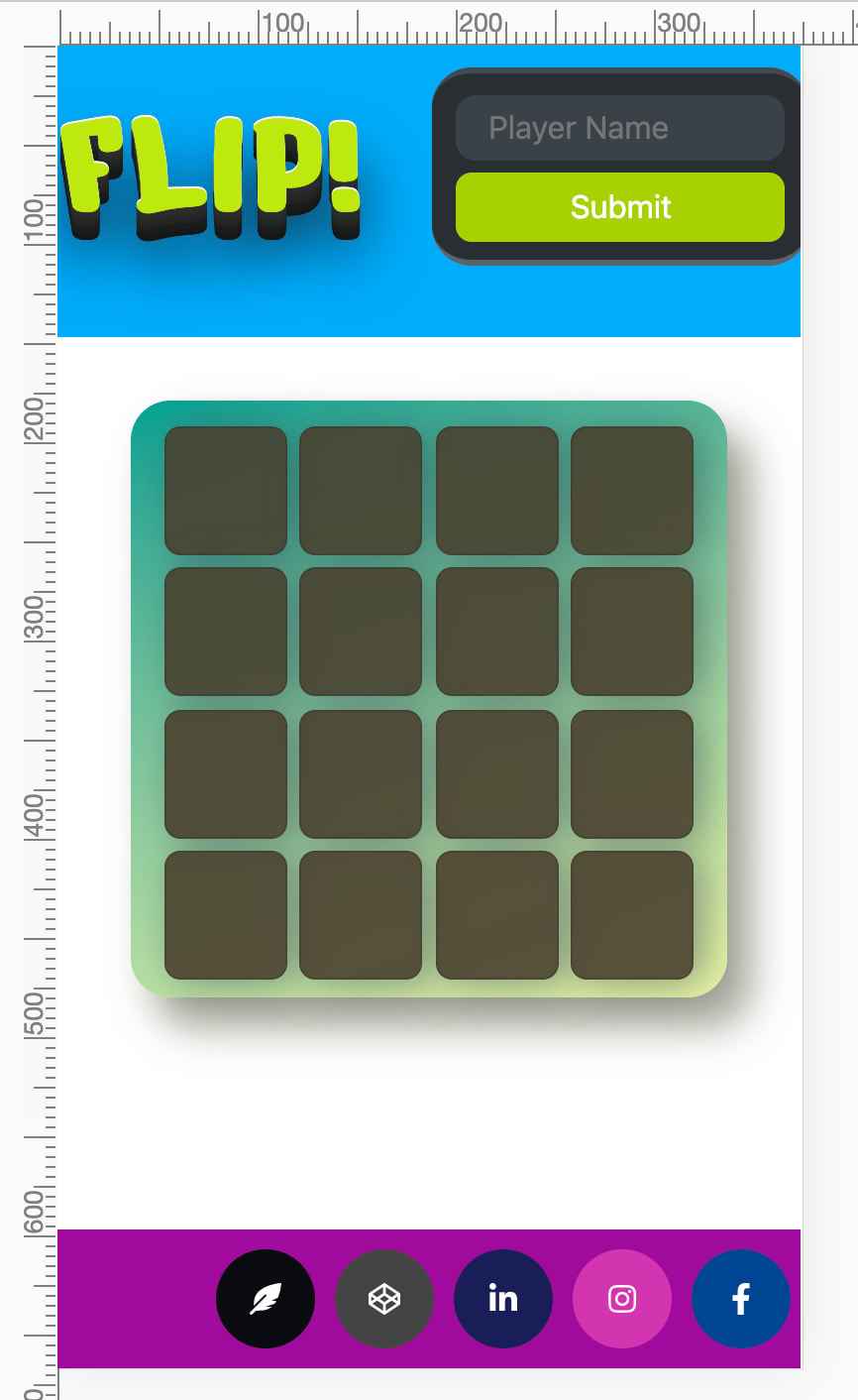
The inspiration of this blog came from a vanilla JS project I worked on during bootcamp. I revisited my code to make it responsive for mobile. As I was adding media queries for mobile and tablet, it wasn't working...
Checked my stylesheets on my index.html and everything was there but why are my media queries not working?? I searched and searched.. I found this meta tag inline with web responsiveness!
Are you familiar with a meta tag like this?
<meta name="viewport" content="width=device-width, initial-scale=1"/>
According to GeeksforGeeks, this meta tag was firstly introduced by Apple inc. for Safari iOS.
This tag specifically declares the initial-scale value and will determine the zoom level when the page gets visited. Want to see it in action?
This is my page before adding meta tag
This is on mobile view (iPhone 6/7/8)

After adding the meta tag (and a tad bit CSS adjustments)
Without the CSS adjustments for my media queries, it looked all zoomed in

There are still a lot more work to do with my web app to fully have it responsive, but I am glad I get to share this experience to you. It's amazing how one line of code can open opportunities to learn and have your code working properly the way you want it!
Location
That <meta> tag should be placed inside your <head> tag. The content of the <meta> tag won't be seen on your DOM. Web responsiveness is only one out of the many uses of <meta> tags.
Other usage
<meta> tags can also be used and various ways! See examples below:
- Author
- Description
- Title
- Keywords
For more, feel free to visit GeeksforGeeks and try the other ones on your project!
All the details above can help give a better website traffic for your webapp also known as SEO or Search Engine Optimization. The more detail you add, the easier it is to redirect visitors to your site. Neat right?
Let me know other unique meta tag usage you know if you have any and I would love to try it!
Until the next!


Top comments (0)