1. Background for text
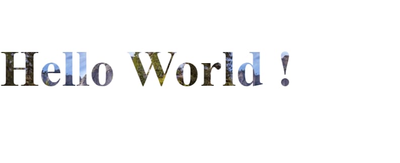
Tired of traditional colors like red, yellow, green...? and want to try something new? This trick is for you, besides colors, you can use images, videos, and linear-gradient, radial-gradient,... to "paint" your text.
An example:
Look so cool, right? It would be more stunning if you have some effect with the background image of the text (like move around,...).
The snippet for the above code is:
background: url(...);
-webkit-background-clip: text;
color: transparent;
But the downside of this trick's that it's not well supported by all browsers:
https://caniuse.com/?search=-webkit-background-clip
So be careful when using it if you want your website to work perfectly in all browsers.
2. Round border
I think most of you guys have ever made a button/link that has round borders like this:
A very simple way to retrieve this is using border-radius then set that attribute to a number in pixel. But a thing that newbies usually struggle with is what number is enough? Remember back these days when I was a newbie, I always opened the devtools and then set a random number, then change it back and forth until I got the exact result I wanted. If you spend time considering border-radius attribute you will figure out that after a specific value in pixels if you keep increasing the value of border-radius then the roundness of the border will remain the same. So this is when our idea comes into play. 🤤 You just need to set border-radius to a very large value then we will archive the round borders no matter the width, height, padding, margin of our button. My favorite value is 999px. It's very easy to remember and in my opinion, it's a nice number.
3. Dividing columns for text content
Instead of normal content, with CSS you can show text content in columns (like when you read the magazine or newspaper for saving area purposes) like this:
You can use this code snippet:
-webkit-column-count: 3 // the number of columns
column-count: 3
-webkit-column-gap: 40px; // the gap between column
column-gap: 40px;
Change the column-count and column-gap to whatever number you want to fit with your requirement.
4. Parallax scrolling
Parallax scrolling is a stunning effect that nowadays, more and more designers and front-end developers like to put in their websites, portfolios.
According to w3school, Parallax scrolling is a website trend where the background content (i.e. an image) is moved at a different speed than the foreground content while scrolling. Click on the links below to see the difference between a website with and without parallax scrolling.
This is an example of this technique: Link
In the beginning, I thought we had to use Javascript to retrieve that effect. Surprisingly, with CSS, it's just like a piece of cake. Create a section with a background image, in CSS of that section, add this line:
background-attachment: fixed
For example:
.parallax{
    background-image: url(...); // your background image
    ... // some attribute to make your background looks good
    background-attachment: fixed; // this is where the magic happens
}
W3School have a tryIt example, if you're interested in it, let's give it a shot: Link
5. Object-fit
Sometimes, you have to show a list of items, a list of images,... but the width and height of the images might not be the same which breaks your layout. At that time, if changing the size of images is not available, I think the best solution is to set a specific height or width (maybe both of them) to the images? But since when you set sizes of the image that way, you might break the image ratio aspect which leads to some problems i.e the image will be stretched or squished (in an uncontrolled way). Like this:
This is the original example (400x300)
If we set the size of that picture to 200x300, it would be like this:
Awful, we have a completely new picture, so it's time for object-fit comes into play. The CSS object-fit is used to specify how an img or video should be resized or fit its container.
Here is where the object-fit property comes in. The object-fit property can take one of the following values:
-
fill- This is the default. The image is resized to fill the given dimension. If necessary, the image will be stretched or squished to fit -
contain- The image keeps its aspect ratio, but is resized to fit within the given dimension -
cover- The image keeps its aspect ratio and fills the given dimension. The image will be clipped to fit -
none- The image is not resized -
scale-down- the image is scaled down to the smallest version ofnoneorcontain
In most cases, I usually use cover and contain.
If we use object-fit: cover; we will have a picture like this:
The image will remain its aspect ratio but will be clipped. It's not really good in some case, but it's a trade off.
You can read for more examples and detail here: Link
6. Limit text length to x lines
To limit the length of text, we can use Javascript, but at that time, we can only control the number of characters not the number of lines. What if I want text should be shown in 4 lines than if the text is longer than that, we will show something else (maybe ... or something). Yeah, if we want, we also can do that using Javascript, but it would be more complex than just limit the number of characters.
We can retrieve that using CSS only, sounds great, right?
The snippet code for doing that job is:
display: -webkit-box;
-webkit-box-orient: vertical;
-webkit-line-clamp: $line;
overflow: hidden;
text-overflow: ellipsis;
Replace $line with the number of lines you want the text to be displayed.
Check out the example: Link
text-overflow property defines how the remaining text will be displayed, if text length exceeds the number of lines we want in the above code snippet, it will be cut off and displayed as "...". For more details, you can go here
The box-orient property sets whether an element lays out its contents horizontally or vertically. For more details, you can go here
⚠️ The bad news is that the attributes I mentioned in this trick aren't supported by all versions of all browsers. So once again, be careful when you use it. Even though the downside, I think it's still a powerful trick you might want to take a look at and, maybe you will want to use it sometimes.


Top comments (1)
I like the background-clip, tnx :)