How a little Javascript helped us make peace with CSS Grid and IE11.
A few months ago, we decided it was time to re-work our core platform. The idea of starting from scratch was both exciting and challenging: how to choose sustainable technology and tools while making sure the team can handle them? On the frontend, the decision came down to three pillars: a) using a known naming convention for CSS classes: BEM, b) using an atomic component design approach, and c) ideally building every layout using CSS Grid. This article will focus on the latest choice and its consequences.
CSS Grid is a relatively new approach to layouts, and it has been proved simple for junior developers to learn. Wes Bos has a great free tutorial on this. Grid’s concepts were also flexible enough to meet our needs – our backend platform is mainly used on desktop, and our layout includes a high number of elements per page: tables, buttons, and a high volume of data to be displayed.
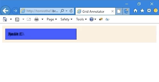
The decision to adopt CSS Grid worked very well for us, although very early on the process of coding our new layout, we stumbled upon an impediment: the need of building layouts that would work – and look good – on IE11 browsers. With 35% of our current users still browsing with IE11, we could not ignore the fact that CSS Grid does not work on IE as seamlessly as on Chrome or Firefox: IE browsers don’t understand implicit row-column positioning, so they display every element overlapped in the first column/row.
The very first solution that we came up with was to always use CSS to make the row and column positioning of each element explicit.
.header {
  color: yellow;
  font-size: 24px;
  grid-column: 2; /* explicit positioning */
}
Since we were working with reusable components, in most cases we could not add the above declaration directly to the element’s global CSS (e.g. not all headers will be in column 2 throughout the whole platform). A solution for this issue was to add specific classes directly to our code: this enabled us to keep all our elements in the right layout position – even in IE11.
/ adding block classes for IE11 (HAML)
%header.block--col2.block--row2
/* CSS for the element and the block classes */
.header {
  color: yellow;
  font-size: 24px;
}
.block--col2 { grid-column: 2; }
.block--row2 { grid-row: 2; }
This solution, while giving us the result we were looking for on IE11, made our markup incredibly complicated and hard to read:
/ before
.container
  .company-logo
  .side-menu.block--row2
    .menu-item
    .menu-item.block--row2
    .menu-item.block--row3
  .banner-area.block--col2
  .main-content-area.block--col2.block--row2
    .intro-bar
      .header
      .buttons.block--col2
      .info.block--col3
        .info-detail.block--col1
        .info-detail.block--col2
        .info-detail.block--col3
    .content
      .hero
This approach was error-prone, and the more complex our layout became, the more complicated it was to maintain it: we were in need of a more sustainable solution. Here’s where the idea for our grid-annotator polyfill was born: we needed a simple JavaScript that automatically annotates column and row positioning to our components if the browser is IE111. For every other browser, the script simply doesn’t kick in. After only a few hours hacking good old JavaScript, we had our first prototype. We could finally remove all these annoying block classes and this resulted in the markup becoming simpler and more maintainable:
/ after
.container
  .company-logo
  .side-menu
    .menu-item
    .menu-item
    .menu-item
  .banner-area
  .main-content-area
    .intro-bar
      .header
      .buttons
      .info
        .info-detail
        .info-detail
        .info-detail
    .content
      .hero
Of course, our grid-annotator doesn’t solve all CSS Grid issues on IE112: some of its other features such as repeat or grid-area are not addressed, but we might add them in the future.
While implementing the polyfill in our product, we noticed a small issue: obviously, IE11 loads the page before the JavaScript is able to untangle our grid columns and rows. This causes the page components to overlap for a split second. After discussing the issue with product managers and running tests on different computers, we agreed that the “glitch” was not compromising the performance of the pages.
If you are in a similar situation, feel free to take a look at the grid-annotator repository. Do you have more ideas or want to contribute? Do you have a comment or just send kudos our way, get in touch with Tom or Valentina.
This article was first published on Tom's blog.


Top comments (0)