Come on, it is twenty-twentysomething now, we really should know everything about accessibility, standards, usability, etc.. But how much time do we usually spend with styling, and how much effort is taken away with the N+1 JavaScript framework released every Monday?
It is a pain..
...I read it on several pages, hear it from the community. That is why Tailwind CSS shines so bright, but rather learning all the tags of a CSS framework, people can actually do their own styling. So jump into our today's pick, the magical padding.
The box model
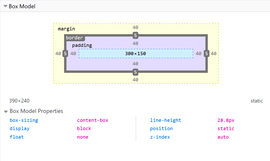
I hope that everyone is familiar already with the box model, but let me attach a picture and the docs.
In CSS, usually everything has a box around it and it can be either inline or block. When the browsers parses your HTML, it will logically organise these super fancy squares that a 2 year old can draw already.
Give me some space
So you want to give your element a little free-space, not to look that bad. Okay, there is no good or bad, so just to add some spacing around it. I mean, with padding, your elements still be so close to each other like you to your commuting-fellows at 5 p.m. on the underground, but at least your arm will be 8px away from your coat sleeve on the inside. That is padding. Hope it helps during your next interview. :)
The problem arises when..
..when you only think about yourself. Really. Do you read from top-to-bottom/left-to-right? Awesome, than you are actually part of ~70% of the people from this point-of-view, but you miss out a few people, who reads from right-to-left/top-to-bottom, etc.
Example
Okay, enough from anecdotes, jump into the code. The following
code shows what I was trying to point out.
- in the first paragraph, it works as intended
- on the other hand, the second (if the direction is rtl) we can immediately see the issue.
The padding is there, but.. :)
You can say that use padding: 0 8px instead, but come-on...
Writing mode
You may come up with the idea, that instead of rotating the title of your Y-axis on a diagram, you end up using the less-known writing-mode CSS property. Docs here.
In this case, what happens? With padding-left (which you originally set for to give some extra space for the 'beginning' of your element) is actually on the left-hand side now.
Which is the bottom of your text, and the top is the left.
What?! Let me demonstrate:
There is even more
Things can get to be really complicated when you throw in some text-orientation as well - apart from writing-mode. I do not want to really go into the nitty-gritty details of all of these, MDN documentation is always there for edge cases.
Conclusion
Rather than sticking to the well-know and easy-to-use padding-left/right/top/bottom take into consideration, that accessibility and usability is not just some buzz-words, but actual user-experience depends on you! :)
There is always room for improvement, some minor one is padding-inline, but it's big brother padding-block is worth a mention as well.
Hope you enjoyed this article and I was able to show you something new. If you have anything to add, I welcome every comment.


Top comments (1)
I always stick to classic
paddingeven knowing about the other properties 😅 but I sure will take it in mind when working on a project that requires RTL!Thanks for sharing and for reminding me about this! :)