The CSS clip-path property allows us to set the area of an element we want to display. This cool property is very handy to create complex shapes in CSS, such as a circle, polygon, ellipse, star, pentagon, hexagon - and many more. In this post, I am going to show you how to create a cool circle clip-path effect on a mouse hover using Bonita UI Designer. Although this step by step is specific to the Bonita UI Designer, you can use the CSS for this effect in any user interface designer. (If you are using something other than the Bonita UI Designer for your interface design, you may write your own HTML and define the CSS classes for all the elements so that you can use the same CSS codes for this effect.)
Steps to follow
First of all, create a new application page in Bonita UI Designer.
Step 1
- Drag and drop a container widget into the blank area on the page.
- Set these properties:
- Width = 3
- CSS classes = card-container
- Go to Assets > style.css (Click on the pencil icon to edit CSS)
- Write the following code and save it.
.card-container {
    position: relative;
    width: 280px;
    height: 380px;
    margin: 20px 15px;
    box-sizing: border-box;
    overflow: hidden;
    }
Step 2
- Drag and drop another container widget inside the “card-container”.
- Set the properties:
- Width = 12
- CSS classes = image-container
- Open style.css and write the following code:
.image-container {
    position: absolute;
    top: 0;
    left: 0;
    width: 100%;
    height: 100%;
    clip-path: circle(380px at center 100px);
    -webkit-clip-path: circle(380px at center 100px);
    transition: 0.6s;
    transition-delay: 0.6s;
    padding: 0;
}
.card-container:hover .image-container {
    clip-path: circle(90px at center 100px);
    -webkit-clip-path: circle(90px at center 100px);
    transition-delay: 0s;
}
Step 3
- Go to Assets and add all the images you want to use on this page. Here, I am using some superhero images as examples and if you would like to use the same images, get it from here.
- Now, drag and drop the image widget inside the “image-container”.
- Set the properties as given below;
- Width = 12
- Source Type = Asset
- Asset Name = captain.jpg (asset name is an image file name which we added as an asset).
- Open style.css and write the following code:
.image-container img {
    top: 0;
    left: 0;
    width: 100%;
    height: 100%;
    object-fit: cover;
}
Step 4
- Drag and drop another container widget just below the “image-container” inside “card-container”.
- Set the properties:
- Width = 12
- CSS classes = card-content
- Open style.css and write the following code:
.card-content {
    position: absolute;
    left: 0;
    bottom: 0;
    width: 100%;
    height: 55%;
    padding: 30px;
    box-sizing: border-box;
    text-align: center;
}
Step 5
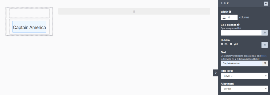
- Drag and drop a title widget inside the “card-content”.
- Set the properties:
- Width = 12
- Text = Captain America
- Title level = Level 3
- Alignment = center
Step 6
- Drag and drop a text widget inside the “card-content”.
- Set the properties:
- Width = 12
- CSS classes = description
- Text = Captain America is an American superhero film based on the Marvel Comics character. Alignment = center
- Open style.css and write the following code:
.card-content .description {
    overflow: hidden;
    text-overflow: ellipsis;
    height: 55px;
}
Step 7
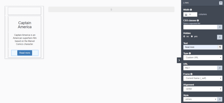
- Drag and drop a Link widget just below the Text widget (description) inside “card-content”.
- Set the properties:
- Width = 12
- Text = Read more
- Alignment = center
- Style = primary
- Open style.css and write the following code:
.card-content h3,
.card-content .description,
.card-content a {
    opacity: 0;
    transition: 0.5s;
    transform: translateY(20px);
}
.card-container:hover .card-content h3 {
    opacity: 1;
    transform: translateY(0);
    transition-delay: 0.5s;
    margin: auto;
}
.card-container:hover .card-content .description {
    opacity: 1;
    transform: translateY(0);
    transition-delay: 0.7s
}
.card-container:hover .card-content a {
    opacity: 1;
    transform: translateY(0);
    transition-delay: 0.9s
}
Output
Now, you can repeat the steps above to create more and more cards as per your requirement.
I would love to know what other CSS clip-path examples you would like to implement with Bonita UI Designer. Please share your tips and examples.
Have fun with Bonita!


Top comments (0)