As every Android developer, I also started building my layouts by hard-coding values into them. Later on, I have realized that I should probably extract them into resources. Next step was not to have values in layouts if they are going to be changed from the code (always keep the state of your view in code). But at that point, my layout preview got broken. The layouts were full of TextViews without texts, ImageViews without images, etc. And then I discovered the power of tools:. Fast forward one year and I had layouts full of tools:text="Test text", tools:text="Jake Wharton", tools:src="@drawable/ic_random_res" … you get the point. Is there a better way to do this, you may ask?
Actually, there is. And it’s pretty easy. There are predefined sample resources that you can use to make your layout preview nice and clean. By using these, we can go from this:
to this:
And why is this better? If your TextView is inside a repeatable element like, for example, an item inside RecyclerView, and you set up your preview correctly, then your TextView will have a different text in every item. Speaking of RecyclerView, let’s make a deep dive into making a preview of your RecyclerView as sleek as possible, using this and some other tricks.
It all starts with a normal and rather ugly RecyclerView in your layout XML file. In a preview, it looks like this:
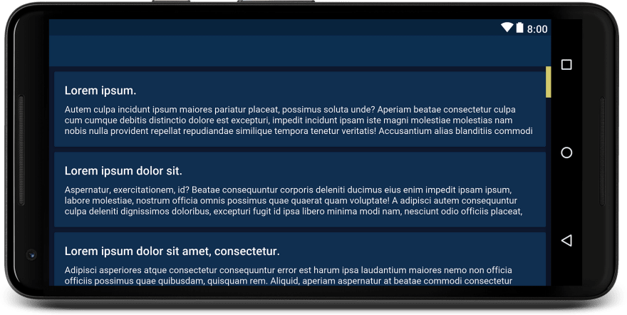
It would look much nicer if we could show the real item used in our RecyclerView, and even more so if that item uses sample texts tools:text=”@tools:sample/lorem” and tools:text=”@tools:sample/lorem/random” for TextViews inside. And as a result, we get the following preview:
It looks much better, almost like a real application. The only problem is that our application in horizontal orientation has GridLayout with two spans. Can we do something in that regard? Of course, we can. By adding tools:layoutManager=”GridLayoutManager” and tools:spanCount=”2", we are getting exactly what we want.
Well, almost. Our Activity has some menu items in the Toolbar, and if we could display these as well, it would be perfect. Accomplishing this isn’t really that difficult. Simply adding tools:menu=”menu_test” to the root element of your layout does the trick. It’s important to know that for this to work you need to have predefined menu item @menu/menu_test.xml, and your Toolbar needs to be defined in a theme and not added in layout’s XML. The final result looks like this:
The final code looks like this (minus some margins, styles etc., that are removed to make it a bit more compact):
As you can see, tools: gives you great power to prototype and experiment with your layout without writing a single line of Java or Kotlin code or adding unnecessary states to your view’s XML. If you start using it now, you will have a much more pleasant time developing UI on your new project, and it will be a breeze to modify it later on.
Documentation for all tools attributes is available here.
The full source code of this and some other examples can be found in the GitHub repository.
Thanks for reading! If you enjoyed this story, please click the ❤️ button and share to help others find it! Feel free to leave a comment 💬 below.
Have feedback? Let’s be friends on Twitter.


Top comments (1)
I had not been using
tools:at all and did not know android had pre-defined resources. Great tip!