There is something exciting about starting a new programming project! I love that it feels fresh, all the problems from the last project are (theoretically) solved and here we are, embarking on a new journey to create some radical new problems that have yet to rear their ugly heads. My next project will be different from anything I've done to date. It's the Etch A Sketch project from The Odin Project (Etch A Sketch).
Overview:
Etch A Sketch is a "doodling" app of sorts that will allow the user to draw on a grid of square <div>'s. The requirements per the project guidelines are to:
Use JavaScript to create a grid of square div's (not directly coded into the HTML). The grid can be created using any method of my choosing so long as it's not coded directly.
Set up a hover effect that changes the grid background colors when the mouse passes over the divs. I plan to deviate from this instruction slightly and will use a click-and-drag technique as I feel it offers more control over the "painting" on the canvas.
Add a button that will clear the grid and ask the user for the number of squares to use for a new grid. Again, I will do something different here. In trying out others' version of this where they strictly adhered to the instructions, the popup caused the user to immediately start coloring the grids in after clicking "ok" on the popup box which I found counter intuitive.
Optional: Use a random button that paints in a range of colors that gives a rainbow effect. Then have another button that paints each pass at 10% of black so that after 10 passes the grid is completely black.
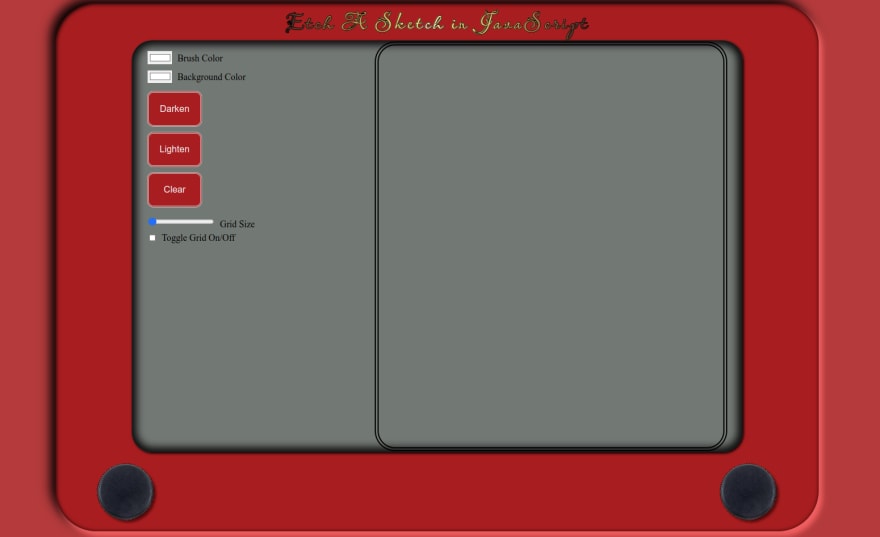
In going over these instructions while writing this, I realized that I left off the "RGB" rainbow button, but I did add other options to expand on this project just a little bit to give it my own flair. This is a sneak peek of my GUI that I finished last week before I took a three day weekend to spend time with family:
As you can see, I added a "brush color" button, a "background color" button, a "lighten" button, and a "grid size" range slider input, and a grid toggle checkbox. These were added in addition to the optional and required elements above.
For the grid size slider, as you increase the size of the grid, the size of the cells will get smaller as the canvas will be a constant size. One of the things I haven't seen thus far is a background color changing option. Most everyone has had a white background which is common for a canvas, but someone may want to have a pink background and paint on it with blue, so I felt like mine should provide other options that were useful and forced me to think outside the box.
One of my peers' renditions of this project implemented a grid toggle button that gave the canvas effect which I loved. I thought it was cool that you could use the grid to line things up, then turn it off if you needed it for a preview. So, I decided then, when I saw it, that I was going to implement the same thing in my own project.
Having the GUI done, aside from minor changes such as adding the rainbow color option, I will shoot to have the rest of the project completed this week. Once done, I will add a new blog post that will summarize the project and what bumps in the road I faced etc. I did spend half a day last week working on the grid and I was a bit stumped, but I did come up with some things to try while spending time with family this past weekend and I look forward to trying those out and making some progress! Until the next one...be good!
Photo by @felipepelaquim on Unsplash


Top comments (0)