Recently, Full Site Editing (FSE) has been constantly mentioned daily in many WordPress forums and communities. This feature is considered an outstanding transformation of the way we work with WordPress, including the transition from traditional themes to block themes.
Block Themes, also known as Block-Based Themes, are the themes that are designed to be compatible perfectly with Gutenberg blocks and full-site editing. There are a few block themes since Full Site Editing (FSE) is still currently under development. The present block themes are generally in a basic state, mainly serving the requirement to research and develop FSE's features.
Along with that, a completely new block theme, named Quadrat, has been developed recently by the Automattic team. This is a pretty complete block theme for blogs and podcast websites with an eye-catching look. Among the existing Gutenberg block themes, this theme is seen as one of the few having its own "personality".
Today, we'll take a look at the Quadrat theme and see what makes it distinctive and intriguing. I also use FSE with this theme to build a front page for a podcast website at the end of this post.
Let's start!
Introduce The Quadrat Block Theme
At the end of July 2021, Quadrat officially hit the shelves and became the 4th block theme from Automattic in the WordPress repository. Quadrat is a child theme of the Blockbase Project - a project of Automattic for the Gutenberg block themes development from the beginning.
On the WordPress repository, Quadrat theme is introduced as a theme for blogs and podcasts. At the moment, this block theme is version 1.1.2, compatible with WordPress from version 5.7, PHP 5.7, and higher. Quadrat theme also supports ready-to-use translation and RTL (right-to-left) languages as well.
Quadrat is described to be inspired by colorful and minimalist square blocks and flat illustrations. The theme itself doesn't have a sidebar but employs a one-column layout instead to provide a large amount of free space for simple and easy user interaction.
Like other themes on the WordPress theme repository, you can download and activate the theme directly in the Dashboard. Or you can download Quadrat theme and its parent theme Blockbase from the WordPress library, and then upload it to the site. With the first way, you just need to download and activate Quadrat, and Blockbase is always automatically downloaded along with Quadrat.
If you want to use FSE, you also need to install the latest version of the Gutenberg plugin.
After activating the Quadrat theme, you will see that this block theme still keeps 2 items: Customizer and Menu, which are not completely removed. Maybe that's because the customizing with block or Global Styles, which replace the Customizer, have not been fully featured at this time.
Interesting Things about Quadrat Block Theme
During my experience with Quadrat theme, I have found something special and interesting. So, I want to share them with you.
The Harmonious and Beautiful Color Palettes
The first element we can see is that Quadrat theme uses this default color palette in the demo:
- Primary: #ffd1d1
- Secondary: #151853
- Background: #292c6d
Also, you can choose another based on your own preferences, or select one of the preset color palettes in tones such as Blue, Dark Blue, Green, Red, Light Green, White, Light Pink, Light yellow. And of course, all of these available color palettes have been optimized by the designers in the Automatic team to be very harmonious and beautiful.
When using Quadrat, changing the color palette in the Customizer leads to the change of the color settings in the Gutenberg Editor and vice versa. Each block's color settings will also be changed following the color palette you've chosen. As a result, while utilizing WYSIWYG, you'll see that the display on the backend is the same as the display on the frontend. This is interesting because not every theme has this feature, even ones that are compatible with Gutenberg, as I've reviewed here.
Quadrat's Fonts
Quadrat uses DM Sans as the default font. This is a San Serif font, very easy to read and suitable for small screens. The author of this font is co-author of the very popular front, Poppins. You can refer to read more information about the DM Sans font here.
In the Customizer section, you can also choose other fonts for your website if you want. With Heading and Body, you have up to 31 different fonts built into the Quadrat block theme to choose from.
Of course, you can completely set up the font and color palette in the Global Styles section, because this is a block theme. But I will talk about this in the next section.
More Choices when Setting up for Block
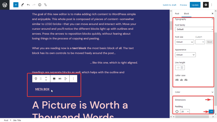
This may be the most important part. Quadrat added some further details to the block settings, so you can easily customize your own blocks.
With blocks like Site Title, Site Tagline, and Site Navigation, you can customize and edit many elements such as:
- Font family
- Line height
- Letter case
- Spacing
- Appearance (font-weight)
- Dimension
 \
\
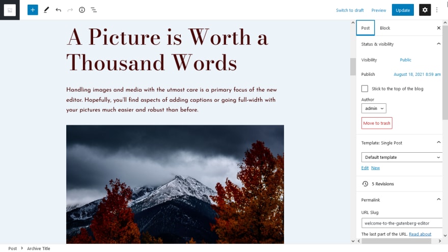
Other blocks like Archive Title and Page Title also have settings for font families. However, Quadrat only allows you to choose up to 2 fonts instead of an unlimited number of fonts from among the theme's 31 fonts. This limitation is also quite reasonable because using many fonts at the same time will be very confusing and may lead to slow loading speed.
With Quadrat, you can adjust the roundness of all four corners of an image (border radius) at once or individually in the Image block.
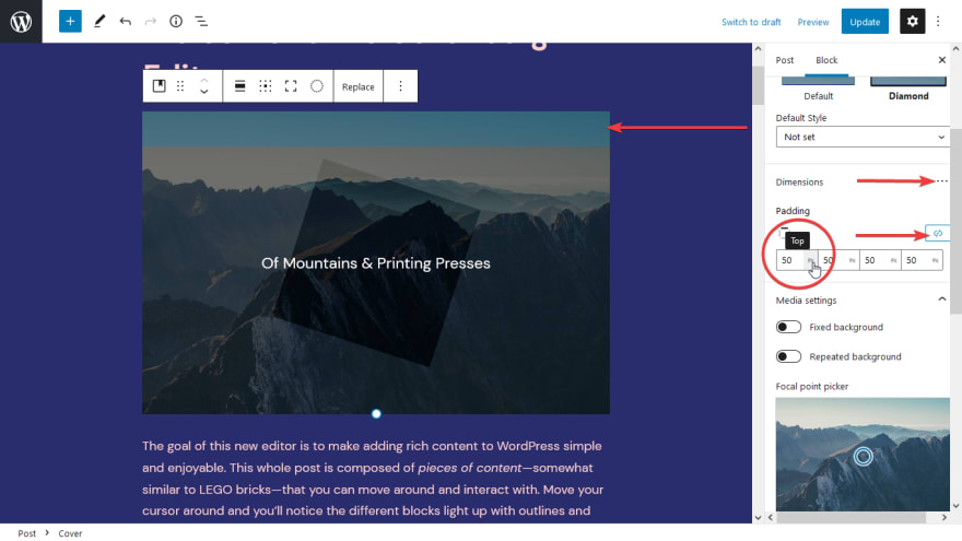
For the Cover block, you can also adjust the padding at the same time for all 4 sides or one by one.
Two New Styles for Blocks
The Quadrat has 2 new styles for blocks. They are Diamond for Cover and Diamond Posts for Query.
The Diamond style for the Cover block will add a slightly diagonally square overlay in the middle of the image as below. It is different from the default style with the overlay which covers the entire image.
As for the Query block, the Diamond Posts style will display the Featured Image and Title nested like this:
These two styles stylize blocks more beautifully, right?
Block Patterns of Quadrat
Honestly, before the review, I expected that Quadrat theme block will have some additional blocks or at least block variations for podcasts (because the theme introduced is specific for podcast sites). However, I rummaged through the theme's block list and didn't see any new blocks or variations. I think this is a minus point.
Just to be sure, I also tried adding Audio, Spotify, or Soundcloud blocks to see if there was anything new, but there was absolutely nothing. As far as I can see, this theme just focuses on the design, but the specific functions for podcasts are still left open.
As compensation for that, you will find a various number of block patterns in Quadrat. They are divided into 8 groups as follows:
- Quadrat
- Quadrat illustration
- Buttons
- Columns
- Gallery
- Headers
- Text
- Query
These block patterns are designed with layout, colors, fonts, and so on with a quite pretty and well-balanced style. I feel quite good without any modification when applying.
However, the blocks used for those patterns are mostly static content. This does not make much sense because we will need completely manual editing when changing the content. If possible, the used blocks should also support dynamic content for more convenience.
Site Editor
Once you have installed both the Gutenberg plugin and Quadrat theme, you will see the Site editor (beta) section in the admin menu bar. This is the place to edit the theme's template and settings for the Global Styles as I said in the previous post about Full Site Editing (FSE).
Templates and Template Parts
As I said in the previous post about FSE overview, we can directly edit the theme's templates without using a single line of code with FSE. You can take full advantage of the blocks to add, remove, drag and drop them easily in order to edit the templates. It is the same with creating your own new templates.
Because Quadrat is the theme that supports FSE, you also can create and edit templates in the same way. Quadrat has the following available templates:
- Single post
- Page
- 404
- Search
Page templates
Page-without-title: may use for homepage or any page where you don't want to use the default title of the theme;
General templates
Header-footer-only;\
Blank: you can use it to create a new landing page from scratch to have a specific layout;
Unused templates
Singular: is a fallback template for Post, Page, and Page templates. It is used in case these templates do not exist.
The Single Post's Template is also made slightly different from Page's template. In Single Post, Quadrat has additional navigation with Next / Prev buttons and comment section that Page does not have.
Template Parts as Headers and Footers are available in both of these templates
Global Styles
In the Global Styles section of Quadrat, you can configure elements to apply on the entire website or set them to default for each block.
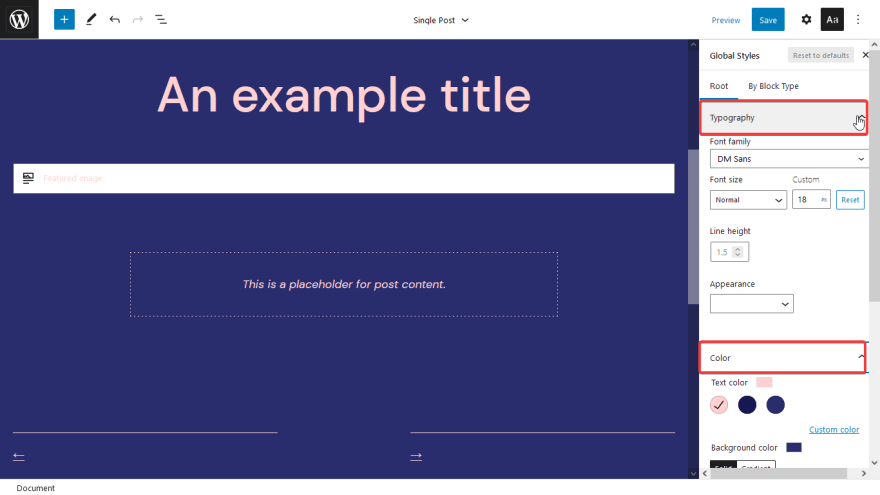
To use Global Styles, click on the Aa icon in the top right corner of the Site editor.
In the Root section, Quadrat allows editing Typography and Color. Note that any changes in the Root section of Global Styles will be applied to the whole website.
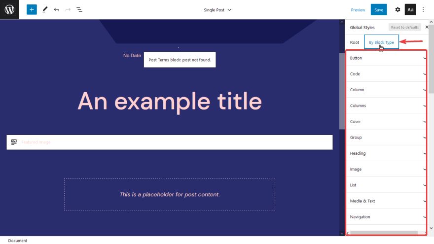
If you want to set the default parameters for each one of 35 block types in Quadrat, you can switch to the By Block Type tab.
Create a Simple Frontpage with Quadrat
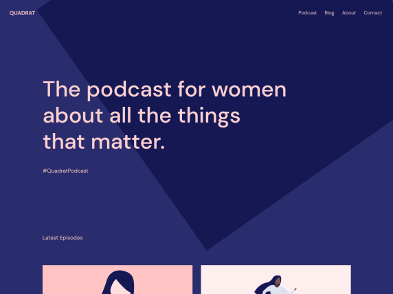
I used Quadrat and tried most of the mentioned features to create a homepage for a podcast website like this.
It looks pretty good, right? The execution is not difficult. The whole process is as follows:
Step 1: Create a Template Part for Header and Footer
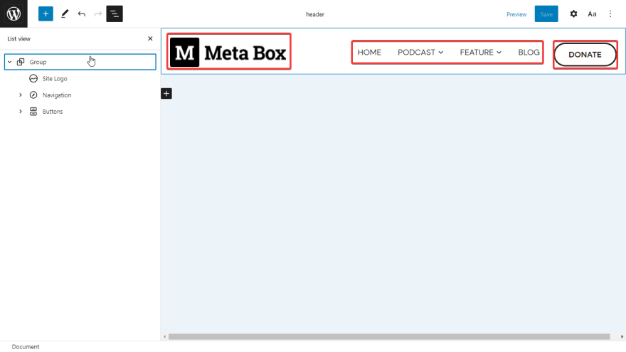
First, I will customize the header and footer to look better. With Full Site Editing, go to Site Editor > Template Parts menu and choose to edit Header or Footer.
Editing the header or footer is very simple thanks to the blocks. I just need to drag and drop and do not need to code, so it is fast and quite convenient.
For the header, I added 3 parts: Site logo, Navigation, and Buttons. Then I changed the background color of the header to white.
In addition, I added the Paragraph, Social icons, and Separator blocks to the footer and changed the background color as well:
Look! Is it pretty but easy to do? Next, move on to creating a template for this page.
Step 2: Create a Template for the Front Page
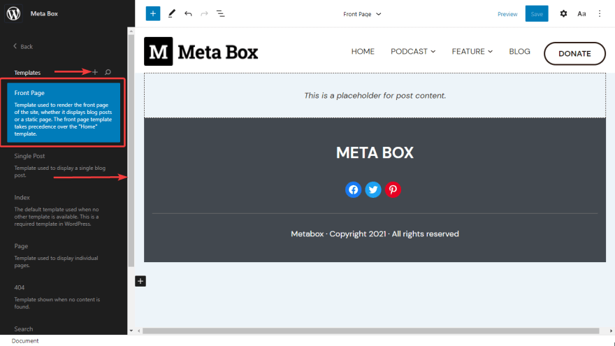
After editing the header and footer of the website, go back to the main menu of Site Editor and go to the Templates section then press (+) to create a new template.
 \
\
At this time, I will delete the default title of the page because I do not want to use it. The Next / Prev buttons or Comment section are also not necessary for my page, so I removed them as well. I left 3 main parts: Header, Content, and Footer on the page.
Now only the main content of the page is missing.
Step 3: Add Content to the Page
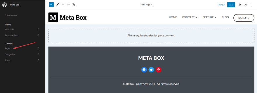
You can add and edit the content of the page right in the Site Editor by going to Content > Pages and selecting the page that you want to edit.
As mentioned above, the Quadrat theme provides a lot of beautiful block patterns. So, to save time, I used them to save time.
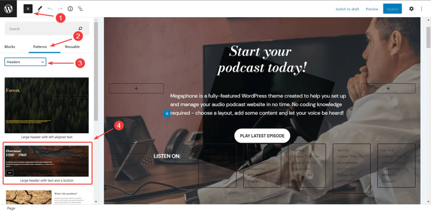
In the first section of the page, I put a hero image by going to (+) to add a new block. Go to the Patterns tab, select Headers from the list. Then, Quadrat will show you a bunch of available patterns for Header to choose from. I tried the Large header with text and a button pattern to create this hero image.
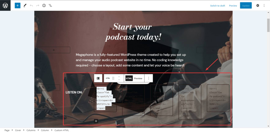
With a bit of customization, I got the header image I wanted. In addition, to make this part more attractive and unique, I used the Diamond style for this photo. In the Listen on section, I added some Font Awesome icons by using HTML blocks with simple code.
In the Feature Shows section of this front page, I chose a prebuild pattern called Latest Episodes in the Quadrat section. So I have a two-column layout with two beautiful illustrator images:
In the Latest Episode section, there is nothing complicated as well. I just use the Query block of WordPress and choose the Grid style. In my opinion, this Query block is one of the very useful blocks that WordPress recently added. With this block, you can easily query the posts with different information.
Moreover, I also added a Query Pagination block with Next/Prev buttons at the end of the Query block.
Then, save it and look at the result, which is the photo I introduced at the top. In total, it took only 15 minutes to build this front page. The making process is very interesting and simple.
Last Words
After reviewing and experiencing, I just want to summarize that this Quadrat block theme is quite easy to use, beautiful, and well-proportioned from fonts, color palettes, flat image blocks, etc. The harmony is clearly shown. The overall design is colorful, modern, simple, and clear. I think people who love minimalist, modern, and professional design will love this theme.
The theme's templates have also been written quite fully. However, the new theme is only suitable for building simple blogs or podcast websites. If you want to build more complex podcast websites, we need more advanced features and block patterns that Quadrat is still missing now.
So far, Quadrat is still a good product for experiencing Gutenberg and FSE. And if you are still confused between page builders and Gutenberg, try to read our post about comparing them here.











Top comments (0)