This article is an English translation of みんなに知ってもらいたいデザインシステムのこと written in December 2019.
Hello everyone. My name is @yamanoku and I have been working at CrowdWorks, Inc since October 2019.
I usually go to study meetings and conferences, wander around the Internet, drink alcohol, and take care of my father. He is currently a front end engineer joining the design system team.
In this article, I would like to introduce you to the design system, where you need it, what engineers and designers need to know, and what you need to know.
About the Design System
design system. If you work on the web as well as the front end, you may have heard this word recently. Here's what it's all about.
The design system is defined in the following article.
A design system offers a library of visual style, components, and other concerns documented and released by an individual, team or community as code and design tools so that adopting products can be more efficient and cohesive.
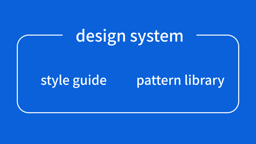
When you say "Documentation" or "Library" you might think of it as a style guide that contains the rules for UI color and shape, or a pattern library that allows components to be deployed in different ways.
However, the difference in the design system is "The ability to extend the product" that style guides and pattern libraries cannot.
Style guides and pattern libraries were nothing more than list-oriented guides, and they were not designed to be complete or to keep up with product growth.
The design system encompasses these and defines design principles, information design, infrastructure, and accessibility. They also embody the identity of the product, not just the guides and libraries, but what they can do and what they can solve.
The principles and principles will also be documented, making it easier to understand "On what basis should I do it?" when creating new functions or modifying products.
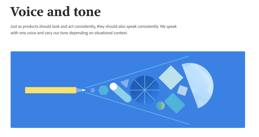
In addition to the UI components that define a product's identity, Adobe's Spectrum design system, which was announced earlier this year, also has a system for broader design, with words like "Voice and Tone" and "Grammar and Mechanics" and style guidelines for writing.
- https://spectrum.adobe.com/page/voice-and-tone/
- https://spectrum.adobe.com/page/grammar-and-mechanics/
In 2017, the United States announced its national design system , and efforts are under way to create a consistent website for each country.
Also in Japan, various companies are starting to give examples of their use. The following is an example. (Only Japanese text)
- ReX: Rakuten Experience:キャリア採用|楽天株式会社
- デザインシステムの勉強会『designsystems.tokyo』を開催しました - freee Developers Blog
- Our little design system | 僕たちの小さなデザインシステム - eureka design
- Design Systemへの取り組み 〜Frontend編〜 - Mercari Engineering Blog
- プロダクト間共通の React コンポーネントライブラリを運用する話 - SmartHR Tech Blog
In March of this year, a voluntary community called designsystems.tokyo, which is working on design systems at an operating company, started to discuss and discuss how to introduce the system. CrowdWorks is also a member of this community and participated in each study group.
When is a design system needed?
Here's when you'll need it.
It's a waste of time to say this, but if you don't feel the need to build it (and communication and so on.), you don't have to force it. It's not just a design system, there's nothing more scary than something that just starts.
- 結局デザインシステムは何なのか : could (Only Japanese text)
However, if you are asked to define advanced requirements and need to release them quickly, it seems difficult to tackle them without a design system. This is because we can make the collaboration between designers and engineers more smooth, and we can develop products with consistent quality even if the service expands.
I don't know if a new UI can be properly evaluated when starting a new business. However, the design system has developed components that provide a consistent experience.
By combining them properly, even a small team can efficiently develop products while maintaining quality.
Furthermore, by preventing the mixing of components and ensuring uniformity, it is possible to reduce the wasteful process called wheel redevelopment.
If you have 25 teams in your company and each team makes a button, it costs $1 million to make a good button.
ー Nathan Curtis
Previously a $1 million conference was held in our company to develop a functional and visual relationship between these components.
- デザインシステムの基本の基を考えていくお仕事をしています。 - CrowdWorks Designer Blog | クラウドワークス デザイナーブログ (Only Japanese text)
With that in mind, here are some things that need to be considered from the perspective of engineers and designers.
What we want our engineers to know
What we need to communicate with designers is representation of the state in words.
Consider a component called a button.
There are various states, whether it is default, in focus, active, or disabled, even with just one button.
And if the button itself is a link (a tag), you have to define it differently (Disabled not allowed etc.).
These may be easy to imagine for implementors, but if you don't specify what the component is in, you can leak it when designing, so you need to make it clear.
There is also a design system called Design Tokens . This allows you to replace these values in bulk using the defined tokens.
The design system can guarantee a single source of truth (Only reliable source of information).
You can think of it as something like CSS Custom Properties or Sass variables.
$brand-primary: rgb(21, 137, 238);
$brand-primary-active: rgb(0, 122, 221);
$brand-primary-transparent: rgba(21, 137, 238, 0.1);
When defining tokens, you should also consider the term itself What kind of state does it show?, How much responsibility do you have? when creating your design system.
Confusion in the definition of words can lead to design breakdowns in the future.
- Design Tokensを考える前に俺たちは変数名について考え直すことがあるのではないか - yamaScrapbox (Only Japanese text)
What I want designers to know
Designers are often responsible for visual representation, but they need to make sure that the "Why does it express that?" is understood by others.
An example of Shopify's design system "Polaris" is to capture cultural differences in internationalization.
For example, in Japan, we have added the input items of the prefecture after the country, and we have not set up the name input form in North American style. These examples will help you better understand why this design works.
The design also requires that the tools used be carefully selected.
Sketch, Figma, Invision, Storybook, and other tools are available to help designers collaborate with other industries. However, there is no clear answer, such as "You can do it with this.". I think it's better to use them based on the idea of what kind of world they are trying to realize.
Figma's ability to build a design system isn't just about cross-linking, it's also about making it more practical, with analytics visualizations and limited onboarding and other design data.
As for collaboration, Sketch also announced simultaneous editing. It's a good idea to keep an eye on tool updates.
What I want everyone to know
In the end, I want to make it more comprehensive and make it known to everyone involved in a non-executive design system.
As you build a design system from a single product, is there something called a completion? That's the question. The answer is "NO".
As I mentioned earlier, the design system will be expanded, and it is assumed that everyone can design with the maintained quality.
Therefore, it is necessary to operate to be able to expand on the assumption that there is no clear answer such as 0 or 1.
The design system is a living thing. Let's raise them little by little.
If you're building a design system, you want to make it more perfect for every pattern. But I realized that the design system is not perfect.
As products and organizations grow and change, so does the design system. The design system is a living thing.
- デザインシステムのプロジェクトの実践で学んだ3つの大切なノウハウ - CrowdWorks Designer Blog | クラウドワークス デザイナーブログ (Only Japanese text)
Because the design system is a product, it can fail.
In the article explaining the failures, there are examples such as lack of organizational support and communication, lack of initial investment, and lack of use.
Even though the article was written in 2017, it is still well understood.
Sustainability and development are essential, and failure to do so can lead to a vicious cycle of design. It is desirable to have a solid acceptance system.
If the design system goes in the wrong direction, it can result in bad things. Depending on the design, you can hurt people or remove certain layers, so what is the purpose of your product? What kind of future are you trying to paint? We should not forget to have such a viewpoint.
Conclusion
That's all I wanted you to know about the design system.
Using a design system allows you to be creative flexibly while maintaining a certain level of quality. However, if you proceed without a clear sense of purpose or understanding what you should not do, you may spread incorrect designs.
The frontend team, which started last year, is working on a design system for CrowdWorks by trial and error.
It is still closed inside, but I hope to show it to everyone in the future.


Top comments (0)