This is the fourteenth post in a series examining modern CSS solutions to problems I've been solving over the last 13+ years of being a frontend developer. Visit ModernCSS.dev to view the whole series and additional resources.
This episode will explore expanded usage of box-shadow and border-radius and conclude with a landing page demo using these properties to enhance the image presentation.
You will learn:
- the expanded syntax of
border-radius, and when to use which type of units to set values - how to create multiple
box-shadowlayers - about the
box-shadowvalueinset - how to "hack"
box-shadowwithinsetto apply popular image filter techniques
Overview of border-radius
Kids these days will never have to deal with creating a gif for each corner of a div that you want to appear rounded 😂 Truly, the release and eventual support of border-radius was one of the most significant milestones in CSS.
For a refresher, here's how it's often used:
border-radius: 50%;
Which for a square element will result in a circle appearance.
Or scale it back for just a slight roundedness to otherwise sharply square corners, such as for a button or card where you might use:
border-radius: 8px;
One way to begin to take this a bit further is to use two values, where the first value sets top-left and bottom-right, and the second value sets top-right and bottom-left:
border-radius: 20% 50%;
Whiiiich... kind of looks like a lemon?
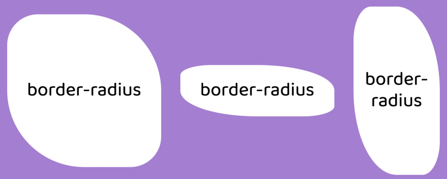
Now, given the same values but a different size div those results will vary quite widely:
We can also set all four corners:
/* top-left | top-right | bottom-right | bottom-left */
border-radius: 3vw 4vw 8vw 2vw;
But wait - there's more!
There's a super uber expanded syntax which allows you to define both the horizontal and vertical radius each corner is rounded by. Whereas the default is rounded very circularly, adding the additional radius alters the "clipping" that occurs to produce the corner, allowing the trendy "blob" shapes:
Check out this border-radius playground by Jhey with a config panel and live preview to generate expanded syntax
border-radiusstyles.
There are a few more ways to define the syntax, you can check those out on the MDN docs.
Units for border-radius
Notice that we've used a few different units: %, px, and vw which is the "viewport width" viewport unit.
Percentage values are relative to the size of the element which means less predictability if the element is expected to be various sizes. For the 50% example, once the element is no longer square it begins to appear more elliptical.
Absolute units such as px or rem are preferred when you want consistent results not based on the element but based on perhaps design specs.
Relative units such as viewport units or em can be beneficial if you want consistency but also an element of scale:
- viewport units will compute to be larger on "desktop" and smaller on "mobile" but remain consistent in rounded appearance
-
emwill vary based onfont-size, resulting in more rounded corners on elements with larger fonts and less rounded corners on elements with smaller fonts
Overview of box-shadow
Personally, upon it reaching decent support, the thing that made box-shadow the most exciting for me was for popping models off the page in a far more native fashion 🙏
And for awhile, they were mission critical for what we called "skeumorphic design". And they made a bit of a comeback over the past year for "neumorphic design".
Were those new terms to you? Here's a nice overview comparing each with examples by UX Collective.
But what I usually use box-shadow for these days is just a subtle hint at elevation for things like buttons or cards:
/* offset-x | offset-y | blur-radius | spread-radius | color */
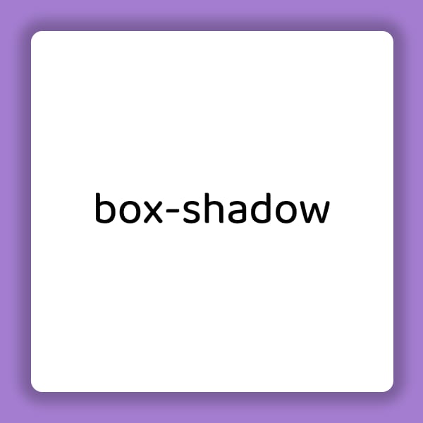
box-shadow: 3px 4px 5px 0px rgba(0, 0, 0, 0.38);
It is acceptable to omit the blur-radius and spread-radius, which leads to a sharper shadow due to loss of blur. The shadow will also not extend beyond the offset values since the spread is intended to scale beyond the element's dimensions.
In the above example, we essentially gave the shadow a "light source" that was slightly above and left of the element which "cast" the shadow slightly right and below.
Instead, you can set the offsets to 0 for a shadow that is equal around the element, although at least blur-radius is required. If spread-radius is also supplied, that will apply scale to the shadow to extend it beyond the element's dimensions:
box-shadow: 0 0 .25em .25em rgba(0, 0, 0, 0.25);
I enjoy using box-shadow to provide a custom visual :focus state on buttons. Unlike border, box-shadow does not alter the elements computed dimensions, meaning adding or removing it does not cause either it or elements around it to shift from reflow. Check out the episode on buttons to see that method.
A unique feature of box-shadow is the ability to apply multiples:
box-shadow: 2px 4px 0 4px yellowgreen, 4px 8px 0 8px pink, 8px 10px 0 12px navy;
The "stacking order" is such that the first set is "on top", or visually closest to the element, and down from there. That's why the spread-radius has to be increased, else the "lower" layers would not be visible (except where the offset doesn't overlap).
We can also flip box-shadow to the inside of the element by adding the inset value:
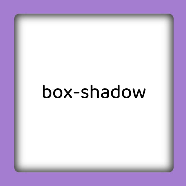
box-shadow: inset 0 0 12px 4px rgba(0,0,0,0.8);
These values will apply a very literal "inset" shadow appearance, where the element appears "sunk" into the page:
box-shadow Hacks for Images
Two alternate ways I like to use inset shadows are for images.
The key is in the stacking order and the fact box-shadow is placed above images applied via background-image.
Vignette
The first is as a "vignette" which is a photography technique where the edges of the photo softly fade into the background. This helps highlight the subject of the photo particularly if the subject is centrally located.
However, the inset property cannot be directly used on an <img/> since it is considered an "empty" element, not a container element.
Going with a background-image instead, the following CSS is applied to the container:
.vignette-container {
  width: 30vmin;
  height: 30vmin;
  box-shadow: inset 0 0 4vmin 3vmin rgba(0,0,0,0.5);
}
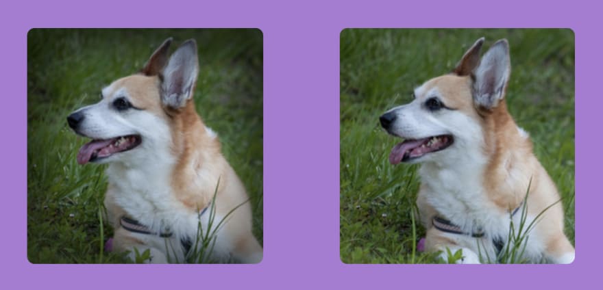
Here's a comparison where the left image has the vignette applied and the right does not.
We used vmin units so that the box-shadow would scale relative to the overall image size which was also set in vmin. This is due to the inability for box-shadow to be set using percent, which makes it a little difficult to set values relative to the element. So the hack within a hack is to use viewport units to set expected size of the element to have more predictable results for the box-shadow across viewport sizes.
Image Color Screen
I found this technique when I was using background-image but also wanted a color "screen" - which means needing to place a translucent color fill over the image. This is a helpful technique to help defend the contrast of any text placed over background images, and also to create visual consistency among an otherwise unrelated set of images.
My previous solution - used for many years - was an extra absolutely positioned :before on the containing element with the screen color applied there as background-color.
Here's the new inset box-shadow solution:
box-shadow: inset 0 0 0 100vmax rgba(102, 76, 202, 0.65);
And a comparison with the screen on the left and without on the right:
Did you catch the hack? I mentioned that percentages aren't allowed - but since viewport units are, we set the spread to 100vmax which is likely to cover any element unless your element is greater than double the max-width or max-height of the viewport.
Hold up - why double? Because the spread is created from all sides of the element so it's at least double the vmax value. You can test it out by using the above value and setting your container to at least width: 100vw; height: 100vh and see at what point the middle of the container is not covered.
If you're using it for something more than a hero image, for example, just increase as needed, such as to 200vmax.
If anyone is aware of taking performance hits for this, let me know!
Demo
The demo goes a bit further and shows how to use object-fit on images to make them behave like background-image while still retaining the semantics of an image, which is great when use of the alt property is necessary (spoiler: you should go this route most of the time for accessibility).
In addition, the h1 headline has text-shadow applied, which is animated on :hover of the header. The main difference between box-shadow and text-shadow is that text-shadow does not have a spread property.
It also combines techniques by showing border-radius in conjunction with box-shadow for the content images. And, the content images show how box-shadow can be animated by pulling back the vignette fade on :hover for a highlighting effect.
The extra trick on the box-shadow animation is re-supplying the inset values to ensure the pull-back of the fade uses our translucent black instead of white. This is because box-shadow in most browsers (except Safari) defaults to the value of the current color if not explicitly supplied, and the list items have set color: #fff.
Bonus: My favorite "position:absolute killer" using CSS grid and assigning all elements to the same grid-area - maybe a future episode and/or egghead video will cover that 😉








Top comments (8)
Woohoo! I like that. No need to using a blob generator!
It won't get quiiiteee as bubbly as an SVG version, but to make more "organic" shapes it's a nice alternative!
Ah yes! Right 💯
awesome content ..
wow!!! This is cool , thank for sharing!
This is great. Creative and useful.
This helped a lot. 🙏
Awesome, glad to hear it! 💫