Today, I'm going to summarize the fourth chapter. It's an easy and small one, so let's dive into it
Chapter 4: Animal, Vegetable, or Mineral?
"It doesn’t matter how many times I have to click, as long as each click is a mindless, unambiguous choice"
[KRUG’S SECOND LAW OF USABILITY]
How many times can users click without getting frustrated?
Krug's opinion is: that users don’t mind a lot of clicks as long as:
- Each click is painless: "Doesn't need a lot of thinking or efforts"
- And they have continued confidence that they're on the right track. they're on the right way to achieve their goals
If you have to confront your users with difficult choices, there should be guidance too
Guidance should be:
1. Brief: the small amount of information that will help the user
2. Timely: placed so a user can encounter it exactly when he needs it
3. Unavoidable: Formatted in a way that a user will notice it
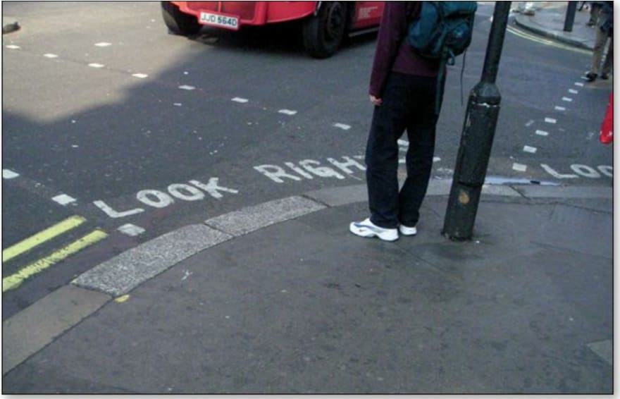
An example from real life mentioned in the book:
"street corners throughout London"

- It’s brief: “LOOK RIGHT” and an arrow pointing right
- timely: you see it at the instant you need to be reminded
- unavoidable: you almost always glance down when you’re stepping off a curb

![Cover image for "Don't Make Me Think" Summary for UI/UX designers [Fourth Chapter]](https://media2.dev.to/dynamic/image/width=1000,height=420,fit=cover,gravity=auto,format=auto/https%3A%2F%2Fdev-to-uploads.s3.amazonaws.com%2Fi%2Fpyovtge1iz432aqbrpm3.jpg)


Top comments (0)