The app is live and working, but still looks a bit "basic" and doesn't have much data. Today's goal is to fix that.
More data!
Let's add more dictionaries:
- Sports:
- Soccer: teams and soccer players twitter handles.
- Basketball: here is a list of NBA teams and players
- Formula 1: list of 50 accounts to follow in F1 (racers, teams, commentators)
- Cricket: Here is a list of 20 people, another 10, and another 10. Some are duplicated though.
And we could add more from different sports: baseball, rugby, the NHL, the NFL... maybe even the Olympic games, tennis,
I think I mentioned earlier that we could also use icons/flags for this. Replace the names of the countries for their flag... but that could lead to confusion as not everyone knows the flags and some of them look close.
Adding that and a dictionary of English contractions and other ways to reduce sentences/words would do for now. I will do that once I'm done with the design and accessibility.
Different design
The app is working... let's make it pretty! As I mentioned in another post, I'm not a designer and I'm doing this project by myself, so the design/artistic choices may not be the best ones. But we are here for the fun :)
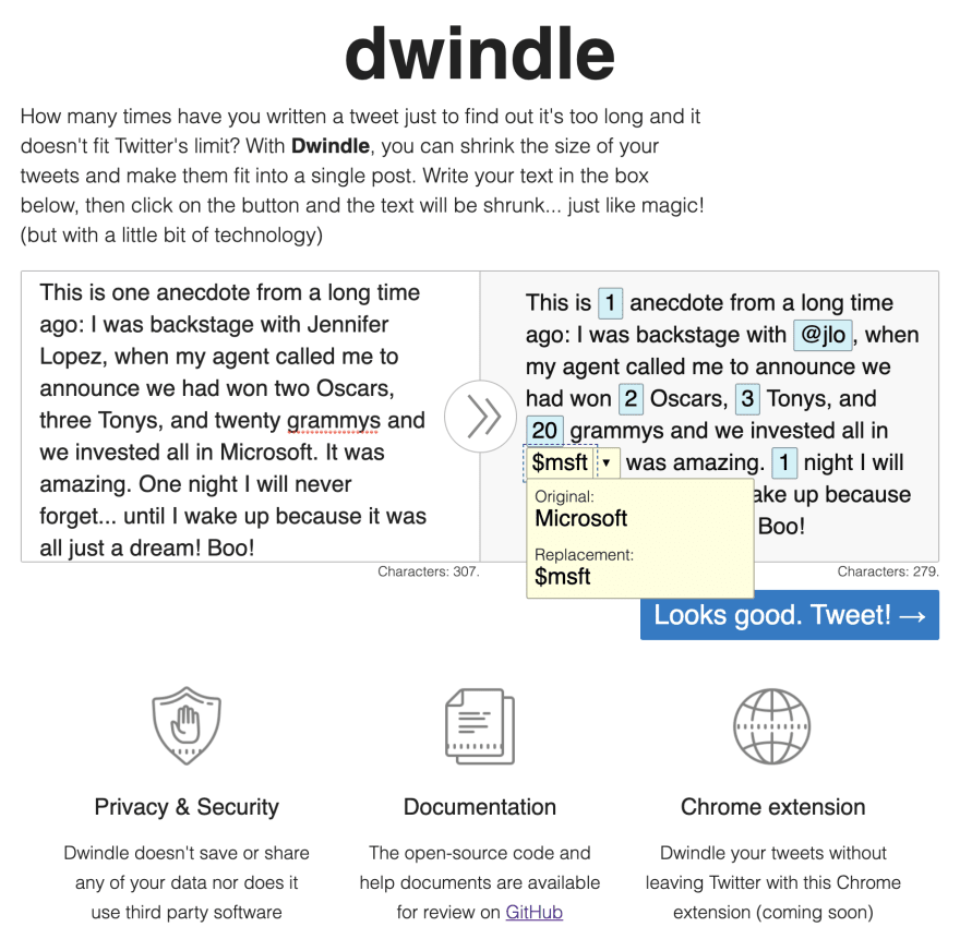
We are going to start by changing the colors a little so they pop a bit more. Also, replace the text in the "Dwindle" button for an icon (keeping the text visible to screen readers).
And let's add a section with some project keywords. This is 100% decorative (but factual) and doesn't add any extra functionality (apart from adding a link to the GitHub page).
With those three changes, the app looks like this now:
There is still a lot of work to be done design-wise (especially on the header and footer), but let's focus on functionality first.
Functionality
There is a piece of functionality that I've mentioned in previous posts but that I haven't added yet: reverting some of the changes.
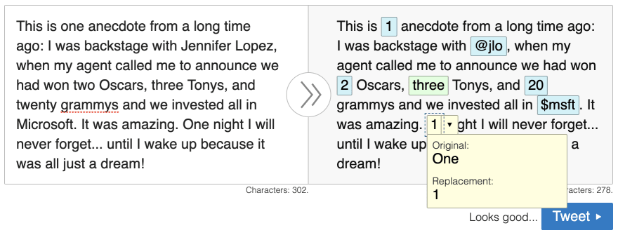
Right now, the user can click on the replacement and a pop-up will show up with the original and new terms. Wouldn't it be great if clicking on them would swap the value?
If you have been checking the code, you may have noticed that the popup bubble has the original and changed term inside two buttons... we were already planning this all along!
But notice that this change is not trivial, it will require a lot of moving pieces:
- Update the key value
- Keep track of which key triggered the popup to open
- Visually show the old/new value
- Update the character count
- Show/hide the Tweet button depending on character count
- Handle the events on key and window slightly differently so the buttons can actually be pressed.
Not trivial, but not excessively complicated... and it will require more code refactor than expected. Still, the result will be worth it.
...and here it is:
This looks fine, but there's a problem. A big one. So far the app works using the mouse and the keyboard, but this replacement functionality does not work with the keyboard! Our app is not fully accessible! (even when Wave is showing 0 errors and 0 warnings).
We need to fix that.
What we are going to do is:
- Keep track of when the bubble is open and close
- If the bubble is open and the user hits the down/up keys, the focus will move to the buttons
- If they hit enter, then the selection will happen normally
While this doesn't sound that bad (it could have been a lot worse), it requires a lot of changes... probably a lot of them because of poor design/coding on my side :S
But it seems to be working fine (maybe more detailed instructions would be better)... let's hope it is.
Metrics
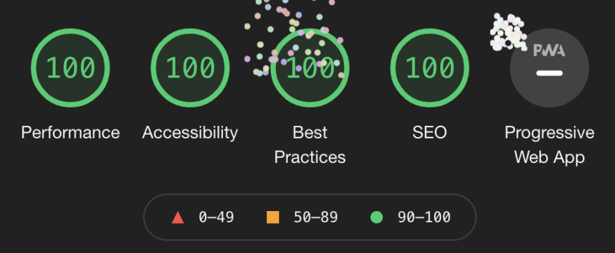
One good thing: after adding the three columns with the information below the main section, Lighthouse shows 100 across all measurements:
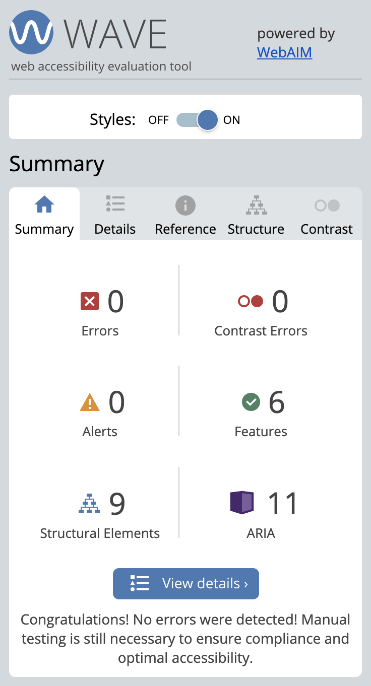
Also, the results from Wave are still good:
And there's something important: the screenshot above was taken BEFORE fixing the keyboard issue. This is why it is essential to point out that Automated accessibility tests can be all positive and nice, and the app still be non-accessible.
Remember: web accessibility is a right, not a luxury or a privilege. All your web apps should be accessible. And with that, I'm not claiming that all my work is super-accessible (it is not), but it is important to at least try and go beyond.
Digital Ocean
I kept exploring the Digital Ocean platform, although I was not able to do much because everything requires to activate a payment (time to claim the promotional $60?)
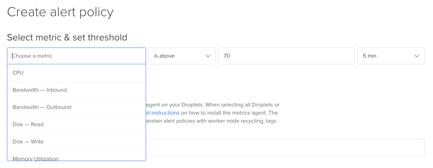
One option that didn't seem to require anything was the Notifications/Alerts.
As the figure caption says, creating notifications in Digital Ocean is extremely easy, in part because the options are limited. But the menu makes it simple to customize and configure everything.
...Unfortunately, this app should not trigger any warning because it's too small. Maybe I should try to put a really small value and see what happens 😋
Summary of the day
Some positives:
- Slightly improved look-and-feel
- Revert changes (this is a big one especially with the keyboard!)
- Back to straight 100s at Lighthouse!
Not so positives:
- No new dictionaries yet
- The design is not impressive
- Some functionality (filtering what to replace and how is optional but a nice-to-have and it's missing)
- 4 days left!!


Top comments (0)