Hey All,
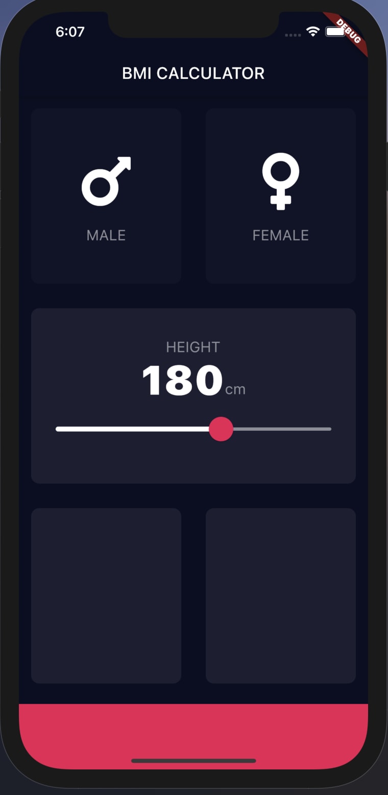
I back with yet another app which I built while following the Angela Yu course which I am going to share with you guys. This BMI Calculator app is heavy on design and does need more improvements to functionality perspective. Let me give you a glimpse of what we are going to build in this blog 😁
| Input Page | Result Page |
|---|---|
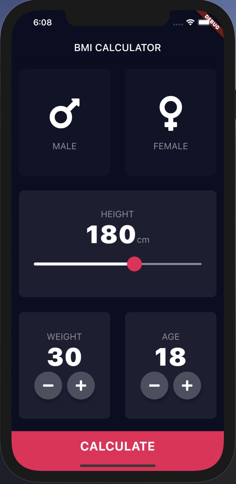 |
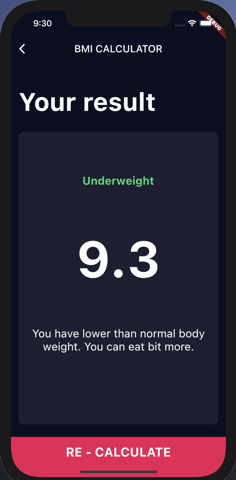 |
Introduction
So by creating this BMI Calculator app we are going to learn a few concepts of the Flutter. So let me make a list of it :
- Route Navigation
- Custom widget Creation
- Slider Theme
- Customizing the In-Built widgets
So let's get started.
Building the App
So, as usual, let's start by creating the flutter project by using the flutter command
flutter create BMI_Calculator
which got default app code so let's just remove it. Also as I don't know how to write flutter test so I will just delete the test folder. Also, let's add the App icon by changing the images in respective Android and iOS folders. (I have heard that there is a package which takes care of changing the app icon need to check it out 😅)
Customising the App Theme
So you all know that our app has the default white colour theme for our app and we can change the theme to black changing the themeData parameter of MaterialApp to ThemeData.dark()
So now let's try to our custom touch to the existing dark theme we only need to make changes in the places we want to rest will be taken from the dark theme
import 'package:flutter/material.dart';

void main() {
  runApp(BMICalculator());
}

class BMICalculator extends StatelessWidget {
  @override
  Widget build(BuildContext context) {
    return MaterialApp(
      theme: ThemeData.dark().copyWith(
        primaryColor: Color(0xFF0A0E21),
        scaffoldBackgroundColor: Color(0xFF0A0E21),
      ),
      home: InputPage(),
    );
  }
}
As you can see we can make changes to the existing dark theme using the .copyWith() method of the theme_data class. So what we are doing here is we are providing the Our custom colour as the primary colour of the theme which will be changing from the back to our own colour. Same goes of the scaffolds background as well so inside of the app also get's the same colour. So our app now looks like this:
Creating container By creating Custom Widget
So If we have some collection of widgets which we used to build something if we are going to use it again and again just like the function we can create our own widget so that we just have to call the widget we don't have to repeat the same line of code again and again. So let's Just try to Build this.
So we'll build the widget which will build the containers as you can see in the above image
import 'package:flutter/material.dart';

class InputPage extends StatefulWidget {
  @override
  _InputPageState createState() => _InputPageState();
}

class _InputPageState extends State<InputPage> {
  @override
  Widget build(BuildContext context) {
    return Scaffold(
      appBar: AppBar(
        title: Text('BMI CALCULATOR'),
      ),
      body: Column(
        children: [
          Expanded(
            child: Container(
              margin: EdgeInsets.all(15.0),
              decoration: BoxDecoration(
                color: Color(0xFF1D1E33),
                borderRadius: BorderRadius.circular(10.0),
              ),
            ),
          ),
        ],
      ),
    );
  }
}
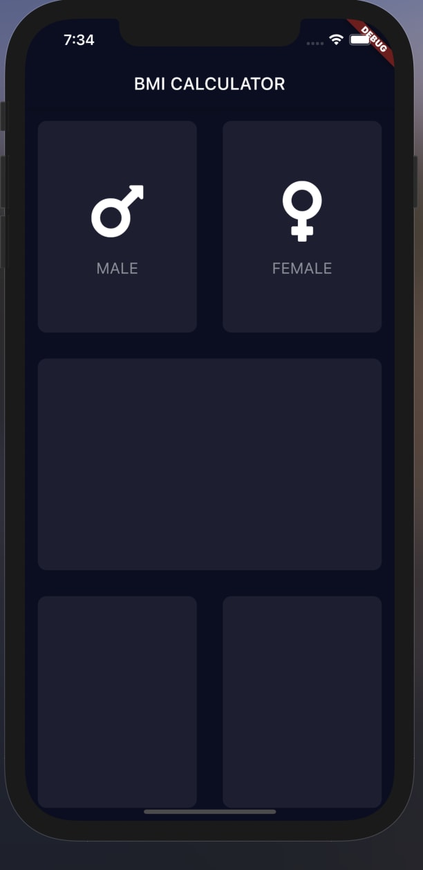
So as you can see right now we have a container which is covering the whole screen as we are using the Expanded widget 😅. So as per the image, we need 4 more of these containers 2 at the top, 2 at the bottom and 1 in the middle which we can handle using the Column and Row widgets.
So now we can convert this widget into a custom widget so we can use it at multiple places which can be done with simple steps with the android studio (Not sure about vs code as I don't have much experience with it for a flutter. 😔).
Now click on Flutter outline at the top right of the screen then you will be given with the widget tree so click on the widget at which you want to create a custom widget then select the Extract widget so then you can see that there will new widget created at the bottom of the dart file. make the changes as you require and give a name to your widget (You can use this widget across the project you just have to copy and paste this class in your required project though 😅).
import 'package:flutter/material.dart';

class ReusableCard extends StatelessWidget {
  const ReusableCard({@required this.colour});
  final Color colour;

  @override
  Widget build(BuildContext context) {
    return Container(
      margin: EdgeInsets.all(15.0),
      decoration: BoxDecoration(
        color: colour,
        borderRadius: BorderRadius.circular(10.0),
      ),
    );
  }
}
So I have extracted the widget and created a different file for this widget and named it as ReusableCard 😎 So now if you want to use this widget you just have to import the class and you can use the widget in your page.
So now let's update the Our input page to use this custom widget to get our required UI design.
const activeCardColor = Color(0xFF1D1E33);
class _InputPageState extends State<InputPage> {
  @override
  Widget build(BuildContext context) {
    return Scaffold(
      appBar: AppBar(
        title: Text('BMI CALCULATOR'),
      ),
      body: Column(
        children: [
          Expanded(
            child: Row(
              children: [
                Expanded(
                  child: new ReusableCard(
                    colour: activeCardColor,
                  ),
                ),
                Expanded(
                  child: new ReusableCard(
                    colour: activeCardColor,
                  ),
                ),
              ],
            ),
          ),
          Expanded(
            child: new ReusableCard(
              colour: activeCardColor,
            ),
          ),
          Expanded(
            child: Row(
              children: [
                Expanded(
                  child: new ReusableCard(
                    colour: activeCardColor,
                  ),
                ),
                Expanded(
                  child: new ReusableCard(
                    colour: activeCardColor,
                  ),
                ),
              ],
            ),
          ),
        ],
      ),
    );
  }
}
So now we are importing our custom ReusableCard however we require and get our required design done. Also, you might have noticed we have to change the colour to variable name so we don't have to change it manually wherever we used the widget.
Adding Icons to the Container
So we are have achieved the current design requirement now let's get to the next goal of our Design requirement which is adding the icon to the Containers.
So as we have seen we can again create a custom widget which handles the adding icon and adding the Text below that icon. So let's try to create it.
But now we have a problem that as we are using our own custom ReusableCard widget we can't pass any child parameter to it so we need to add a parameter that can pass our widget to the class so we can add it as the child widget in ReusableCard widget.
import 'package:flutter/material.dart';

class ReusableCard extends StatelessWidget {
  const ReusableCard({@required this.colour, this.cardChild});
  final Color colour;
  final Widget cardChild;

  @override
  Widget build(BuildContext context) {
    return Container(
      child: cardChild,
      margin: EdgeInsets.all(15.0),
      decoration: BoxDecoration(
        color: colour,
        borderRadius: BorderRadius.circular(10.0),
      ),
    );
  }
}
to achieve the above-discussed solution we now have added the Widget data variable named as cardChild which helps us in assigning the passed Widget to the child parameter in the class.
import 'package:flutter/material.dart';

const labelStyle = TextStyle(
  fontSize: 18.0,
  color: Color(0xFF8D8E98),
);

class IconContent extends StatelessWidget {
  const IconContent({@required this.icon, @required this.label});

  final IconData icon;
  final String label;
  @override
  Widget build(BuildContext context) {
    return Column(
      mainAxisAlignment: MainAxisAlignment.center,
      children: [
        Icon(
          icon,
          size: 80.0,
        ),
        SizedBox(
          height: 15.0,
        ),
        Text(
          '$label',
          style: labelStyle,
        )
      ],
    );
  }
}
So for the icons, we are going to use a package named font_awesome which provides us with a lot of the icons to use in our app. we can add this package to our project by updating the pubspec.yaml file.
name: BMI_calculator
description: A new Flutter project.

publish_to: 'none' # Remove this line if you wish to publish to pub.dev

version: 1.0.0+1

environment:
  sdk: ">=2.7.0 <3.0.0"

dependencies:
  flutter:
    sdk: flutter

  cupertino_icons: ^1.0.0
  font_awesome_flutter: ^8.11.0

dev_dependencies:
  flutter_test:
    sdk: flutter

# The following section is specific to Flutter.
flutter:

  uses-material-design: true
So to use the above widget we just have to pass it as a child to the ReusableCard widget.
class _InputPageState extends State<InputPage> {
  @override
  Widget build(BuildContext context) {
    return Scaffold(
      appBar: AppBar(
        title: Text('BMI CALCULATOR'),
      ),
      body: Column(
        children: [
          Expanded(
            child: Row(
              children: [
                Expanded(
                  child: new ReusableCard(
                    cardChild: IconContent(
                      icon: FontAwesomeIcons.mars,
                      label: 'MALE',
                    ),
                    colour: activeCardColor,
                  ),
                ),
                Expanded(
                  child: new ReusableCard(
                    cardChild: IconContent(
                      icon: FontAwesomeIcons.venus,
                      label: 'FEMALE',
                    ),
                    colour: activeCardColor,
                  ),
                ),
              ],
            ),
          ),
          Expanded(
            child: new ReusableCard(
              colour: activeCardColor,
            ),
          ),
          Expanded(
            child: Row(
              children: [
                Expanded(
                  child: new ReusableCard(
                    colour: activeCardColor,
                  ),
                ),
                Expanded(
                  child: new ReusableCard(
                    colour: activeCardColor,
                  ),
                ),
              ],
            ),
          ),
        ],
      ),
    );
  }
}
So now we have our Male and Female containers in our UI. Now let's try to make the container selectable and when one card is selected other card needs to deselect.
So let's start once again by Updating our ReusableCard widget to support click action.
As we know only buttons can have on press support if we want to add the same onPress to other widgets we have to wrap our widget inside the GestureDetector widget which looks for different sorts of the action can be performed on the screen such as click, double click or long-press etc.
import 'package:flutter/material.dart';

class ReusableCard extends StatelessWidget {
  const ReusableCard({@required this.colour, this.cardChild, this.onPress});
  final Color colour;
  final Widget cardChild;
  final Function onPress;

  @override
  Widget build(BuildContext context) {
    return GestureDetector(
      onTap: onPress,
      child: Container(
        child: cardChild,
        margin: EdgeInsets.all(15.0),
        decoration: BoxDecoration(
          color: colour,
          borderRadius: BorderRadius.circular(10.0),
        ),
      ),
    );
  }
}
Now we are accessing Function which tells us what action to be performed when user taps on our widget. So now we have made certain changes in inputPage class so when the user clicks on that card the colour of the card changes.
enum Gender { Male, Female }
const activeCardColor = Color(0xFF1D1E33);
const inActiveCardColor = Color(0xFF111328);

class _InputPageState extends State<InputPage> {
  Gender selectedGender;

  @override
  Widget build(BuildContext context) {
    return Scaffold(
      appBar: AppBar(
        title: Text('BMI CALCULATOR'),
      ),
      body: Column(
        children: [
          Expanded(
            child: Row(
              children: [
                Expanded(
                  child: new ReusableCard(
                    onPress: () {
                      setState(() {
                        selectedGender = Gender.Male;
                      });
                    },
                    cardChild: IconContent(
                      icon: FontAwesomeIcons.mars,
                      label: 'MALE',
                    ),
                    colour: selectedGender == Gender.Male
                        ? activeCardColor
                        : inActiveCardColor,
                  ),
                ),
                Expanded(
                  child: new ReusableCard(
                    cardChild: IconContent(
                      icon: FontAwesomeIcons.venus,
                      label: 'FEMALE',
                    ),
                    onPress: () {
                      setState(() {
                        selectedGender = Gender.Female;
                      });
                    },
                    colour: selectedGender == Gender.Female
                        ? activeCardColor
                        : inActiveCardColor,
                  ),
                ),
              ],
            ),
          ),
          Expanded(
            child: new ReusableCard(
              colour: activeCardColor,
            ),
          ),
          Expanded(
            child: Row(
              children: [
                Expanded(
                  child: new ReusableCard(
                    colour: activeCardColor,
                  ),
                ),
                Expanded(
                  child: new ReusableCard(
                    colour: activeCardColor,
                  ),
                ),
              ],
            ),
          ),
        ],
      ),
    );
  }
}
So now we are creating an enum for genders so we can access them easily. Next, we creating setState() method to the onPress parameter which tells us about which gender card is selected.
Next, we change the colour of the card based on which gender card is selected.
Moving all global variables to Constant file
As you might have observed we are having so many global variables all over the place. To refactor the code let's just move all those global variables to the constant file which we are going to use to store all the global variables.
import 'package:flutter/material.dart';

const kBottomContainerHeight = 80.0;
const kBottomContainerColor = Color(0xFFEB1555);
const kActiveCardColor = Color(0xFF1D1E33);
const kInActiveCardColor = Color(0xFF111328);

const labelStyle = TextStyle(
  fontSize: 18.0,
  color: Color(0xFF8D8E98),
);
So you also update these variable names in appropriate classes as I can't show changes by that I have to display all the code once again 😔 as already this post is large let's just don't make it any bigger 😣.
Add Slider to Add Height data
Now let's add a slider which will be used by the user to provide height for the BMI calculations.
So now In the container in the middle of the screen, we are going to add our slider along with header saying HEIGHT along with cm bottom of this will be having slider.
          Expanded(
            child: new ReusableCard(
              colour: kActiveCardColor,
              cardChild: Column(
                mainAxisAlignment: MainAxisAlignment.center,
                children: [
                  Text(
                    'HEIGHT',
                    style: kLabelStyle,
                  ),
                  Row(
                    mainAxisAlignment: MainAxisAlignment.center,
                    crossAxisAlignment: CrossAxisAlignment.baseline,
                    textBaseline: TextBaseline.alphabetic,
                    children: [
                      Text(
                        height.toString(),
                        style: kNumberTextStyle,
                      ),
                      Text(
                        'cm',
                        style: kLabelStyle,
                      )
                    ],
                  ),
                ],
              ),
            ),
          ),
So we have added the Top text using the Text widget next we are trying to read the data set by the slider to display the height of the person followed by cm in subscript. The constant values for the kNumberTextStyle and kLabelStyle are
import 'package:flutter/material.dart';

const kBottomContainerHeight = 80.0;
const kBottomContainerColor = Color(0xFFEB1555);
const kActiveCardColor = Color(0xFF1D1E33);
const kInActiveCardColor = Color(0xFF111328);

const kLabelStyle = TextStyle(
  fontSize: 18.0,
  color: Color(0xFF8D8E98),
);

const kNumberTextStyle = TextStyle(
  fontSize: 50.0,
  fontWeight: FontWeight.w900,
);
Next comes the main thing of this container that is adding the slider to the app. which canbe done through using the SliderTheme widget.
          Expanded(
            child: new ReusableCard(
              colour: kActiveCardColor,
              cardChild: Column(
                mainAxisAlignment: MainAxisAlignment.center,
                children: [
                  Text(
                    'HEIGHT',
                    style: kLabelStyle,
                  ),
                  Row(
                    mainAxisAlignment: MainAxisAlignment.center,
                    crossAxisAlignment: CrossAxisAlignment.baseline,
                    textBaseline: TextBaseline.alphabetic,
                    children: [
                      Text(
                        height.toString(),
                        style: kNumberTextStyle,
                      ),
                      Text(
                        'cm',
                        style: kLabelStyle,
                      )
                    ],
                  ),
                  SliderTheme(
                    data: SliderTheme.of(context).copyWith(
                      activeTrackColor: Colors.white,
                      inactiveTrackColor: Color(0xFF8D8E98),
                      thumbColor: Color(0xFFEB1555),
                      overlayColor: Color(0x29EB1555),
                      thumbShape:
                          RoundSliderThumbShape(enabledThumbRadius: 15.0),
                      overlayShape:
                          RoundSliderThumbShape(enabledThumbRadius: 30.0),
                    ),
                    child: Slider(
                      value: height.toDouble(),
                      min: 120.0,
                      max: 220.0,
                      onChanged: (double newValue) {
                        setState(() {
                          height = newValue.round();
                        });
                      },
                    ),
                  ),
                ],
              ),
            ),
          ),
First let's use the Slider offered by the flutter make our own custom changes Like activeTrackColor, inactiveTrackColor etc.
Next, we have got the data from the slider which can be done through by setting setState() function to get the value at which the slider is at. also, the min and max value that can be set by the slider.
Thank you
So If you have got here then you also have the half the app done with you now you can try to complete the next half of the design till I come back with next part of this post.
So by Now Half our design work is done also, we came across many problems and solution throughout the process. we started with customizing the theme of the app then created the custom widgets then we also customized the slider to suit our design.
Initially, I thought of completing the whole app in a single post but as I progressed I came to know it is so large I won't be able to complete it in a single post so I have decided to split this post into 2 posts. I think I will post both posts at the same time so you guys can have a complete post at the same time don't have to wait for the next part of the post.
So now if you found this post interesting and likeable leave a like or comment for me (Both is also fine with me 😉). If you found any mistakes then do let me know so I can correct myself. till then
αντιο σας 👋






Top comments (1)
it's very good congratulations