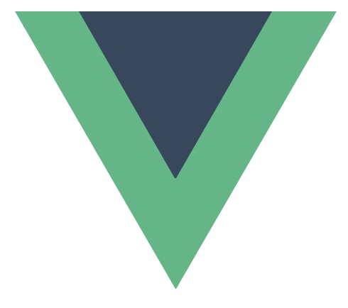
The Strava logo from the previous article inspired me to try and recreate the Vue logo.
It uses similar shapes, allowing me to try different techniques.
For the Vue logo, I challenged myself only to use one div, and the logo must be responsive.
The logo looks like this:
Analysing the logo
We can see the logo is based on V symbols that sit on each other. Another way to look at this is triangles.
We can even see three triangles, the green layer, the dark layer, and the white top.
The main difficulty in this challenge is to make it scaleable.
CSS Vue logo
We'll only use one div to start, so let's set that up.
<div class="vue"></div>
Then a critical trick is to set everything to box-sizing: border-box to ensure the border counts towards our element's total size.
We need this as we will use borders to style our actual element.
*,
*:before,
*:after {
  box-sizing: border-box;
}
Then we also want to set the default size for the logo as a root variable:
:root {
  --size: 50vmin;
}
Let's get started on our main element.
We want to set the width to our size variable for the basic styling. Then we use aspect-ratio to proportional set it to the correct size.
A trick I applied is to set the font size of this element to the width. By doing this, we can create "scaleable" borders.
As you might know, the border width doesn't accept percentages, so making them scale is challenging.
By using this trick in combination with em values, we make them scale to the element's width.
.vue {
  position: relative;
  width: var(--size);
  aspect-ratio: 15/13;
  border-style: solid;
  border-width: 0.865em 0.5em 0 0.5em;
  border-color: #41b883 transparent transparent transparent;
  font-size: var(--size);
  display: grid;
  place-items: center;
}
We only color on one side of the box, making the perfect triangle to show.
If we colored the other sides as well, we would end up with something like this:
This is already our main shape done. For the darker triangle inside, we can use the same approach on a :before element.
.vue {
  &:before {
    content: '';
    position: absolute;
    top: -0.865em;
    border-style: solid;
    border-width: 0.52em 0.3em 0 0.3em;
    border-color: #34495e transparent transparent transparent;
  }
}
The last element we need is the cutout effect.
For that, we'll use the :after selector.
.vue {
  &:after {
    content: '';
    position: absolute;
    top: -0.865em;
    border-style: solid;
    border-width: 0.2em 0.115em 0 0.115em;
    border-color: white transparent transparent transparent;
  }
}
This concludes the article, and you can see the result in this CodePen.
Thank you for reading, and let's connect!
Thank you for reading my blog. Feel free to subscribe to my email newsletter and connect on Facebook or Twitter


Top comments (4)
thats awesome
Thanks a lot, glad you enjoyed it 🥳
This one was Amazing!
Thanks so much 🙏