WHY USE FLEX?
Flexbox (CSS Flexible Box Layout) is a CSS3 box layout model, which allows elements within a container to be automatically arranged depending upon screen or device size.
Flex makes easier to design flexible responsive layout structure and manipulate children's alignment, order and growth, vertically and horizontally.
Flexbox layout is supported by all browsers. Only IE partially supports it, but the properties we will use in this post are 100% compatible.
FLEXBOX PROPERTIES
Now that you know the Flexbox concept, we are going to see the properties we need to shape our layout, distinguishing between the properties of the parent or child element.
Being the parent element, the one that contains one or more child elements, that will be aligned, ordered and redistributed by the available space. Let's see an example:
<div class="parent">
<p class="child"></p>
<p class="child"></p>
<span class="child"></span>
</div>
~~~
**Parent** (*flex container*) properties:
* **display** - specifies the type of rendering box of an element. With the value *flex* every direct child will be in a flex context.
> **Note**: 'flex' requires the *-webkit-* prefix to work in Safari.
* **flex-direction** - specifies the direction of the flexible items.
Once **display** has set to *flex*, we can choose our layout direction depending on the context. It could be horizontally, setting the value as row (*by default*), or vertically, as column.
> The reverse values have the same directions but in reverse order.
~~~css
flex-direction: row|row-reverse|column|column-reverse;
~~~
* **flex-wrap** - specifies whether the flexible items are forced onto one line, *nowrap* as a value (*by default*), or can wrap onto multiple lines, *wrap*/*wrap-reverse* as a value.
~~~css
flex-wrap: nowrap|wrap|wrap-reverse;
~~~
* **align-items** - specifies the default alignment for child items inside the flex container.
~~~css
align-items: stretch|center|flex-start|flex-end;
~~~
* **justify-content** - specifies how the browser distributes space between and around content items along the *main-axis* (*flex-direction* chosen) of a flex container.
~~~css
justify-content: flex-start|flex-end|center|space-between|space-around;
~~~
**Child** (*flex item*) properties:
* **flex** - specifies how a flex item will grow or shrink to fit the space available in its flex container. Composed by *flex-grow*, *flex-shrink* & *flex-basis*.
By default the value is *'0 1 auto'*, but setting the value to *auto* is equivalent to *'1 1 auto'*, check the whole possibilities [here](https://developer.mozilla.org/en-US/docs/Web/CSS/flex).
~~~css
flex: <number> <number> <length>|auto;
~~~
* **order** - specifies the order of a flex item relative to the other elements inside the flex container. 0 value *by default*.
~~~css
order: <integer>;
~~~
> If you want to see how every property works in detail I recommend you this [guide](https://css-tricks.com/snippets/css/a-guide-to-flexbox/).
##
Next, I am going to show you how I usually solve, with flexbox, different situations that we find on every website:
### Situation 1 - Text alignment
Imagine that you are developing a featured articles section with a header containing a title and a link to the main blog page.
Would you like the title and link to be centered vertically, even having different font sizes? And also, would you like the link to appear on the right side?
Here I show you a simple example of how it could be:

To do it, you only need to define 3 CSS properties as you can see in the following code block:
* **HTML**
~~~html
<header class="flex items-center justify-between">
<h2>Last news</h2>
<a href="#blog_url">View All →</a>
</header>
~~~
* **CSS**
~~~css
.flex {
display: flex;
}
.items-center {
/* Title & Link centered vertically */
align-items: center;
}
.justify-between {
/* Maximum space between title & link */
justify-content: space-between;
}
~~~
> **Note**: The examples will be styled with [TailwindCSS](https://tailwindcss.com/) classes, but I'm still going to add the generated CSS for those who don't use it yet.
---
### Situation 2 - Responsive layout
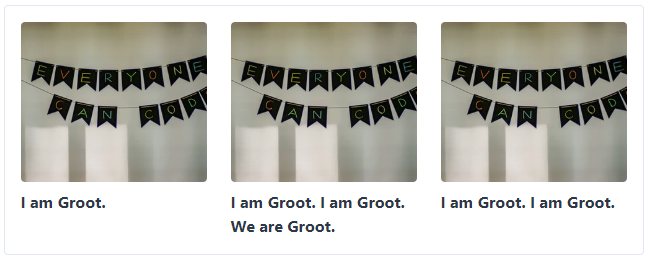
Continuing with the featured articles section, we will need a grid with several posts.
Imagine that we want to show 3 posts by row on large screens and 1 post by row in smaller ones.
For this, we will need the parent (*flex container*) to have the ***flex-wrap*** property set to *wrap*. Only then, the children can appear on multiple lines.
We want to implement something like this:

Setting the parent as *flex container* with **display: flex**, with the wrap option enable, we can manage a responsive grid layout. Now the child only needs to know its size in every screen, for that we use the media query to define which size will be set in a screen bigger than 768px.
We can set the space between children using padding in each one, but we will need to add negative margin in the parent to offset. Let's see the code needed:
~~~html
<!-- Parent: Flex container -->
<div class="flex flex-wrap md:-mr-6">
<!-- Repeated: Child item -->
<article role="article" class="w-full md:w-1/3 md:pr-6">
<figure>
<img src="image_url" class="w-full h-40 object-cover rounded" />
</figure>
<header>
<h2>I am Groot.</h2>
</header>
</article>
</div>
~~~
In this case we have to differentiate between the style applied to the parent and the one applied to the child:
* **CSS Parent**
~~~css
.flex {
/* Set the div as flex container */
display: flex;
}
.flex-wrap {
/* Allow multiple lines */
flex-wrap: wrap;
}
@media (min-width: 768px) {
.md\:-mr-6 {
margin-right: -1.5rem;
}
}
~~~
* **CSS Child**
~~~css
.w-full {
/* Full width until 767px */
width: 100%;
}
@media (min-width: 768px) {
.md\:w-1\/3 {
/* Since 768px the size will be 1/3 of the parent size */
width: 33.333333%;
}
.md\:pr-6 {
padding-right: 1.5rem;
}
}
~~~
---
### Situation 3 - Layout vertical alignment
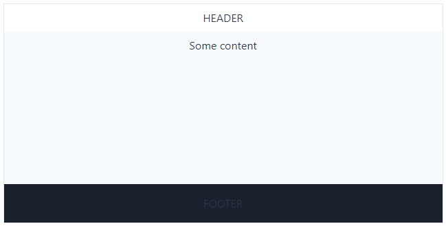
So far, the two situations we have seen had a horizontal direction, in this case we will use the vertical one.
When you develop a website of any kind, you will always find pages with little content that don't fill the user's screen. I recommend you a solution using **flex** to position the footer at the bottom of the page.

In this situation, the most important thing is to have the **header**, **content** and **footer** elements inside the same flex container. For example, *body* tag could be our parent, as a common layout.
We need to set the minimum height for the flex container. In this case, since we want the footer to be shown at the bottom of the screen, we will need it to be as high as the screen's height (*100vh*).
And finally, we need the tag which contains the main content (*div* in this example) to occupy all the remaining space between the header and the footer. Let's see the code to understand it better:
* **HTML**
~~~html
<body class="flex flex-col min-h-screen">
<header>HEADER</header>
<div class="flex-auto">Some content</div>
<footer>FOOTER</footer>
</body>
~~~
* **CSS**
~~~css
/* Parent element */
.flex {
display: flex;
}
.flex-col {
/* Vertical direction */
flex-direction: column;
}
.min-h-screen {
/* Set the page's minimum height to can realocate the footer to the bottom */
min-height: 100vh;
}
/* Child element */
.flex-auto {
/* Set the maximum height available to the content:
Equivalent to screen height minus header & footer height */
flex: 1 1 auto;
}
~~~
---
### Situation 4 - Responsive header
Now we are going to see an example related to the order of the child elements.
Let's imagine that we have a menu with a logo on the left and a navigation listing on the right on desktop. But, what if we want to display a burger menu on the left and the logo in the center on small screen sizes? In that case we will need to play with the **order** property.

As in the previous examples, we have defined the flex container with vertical and horizontal alignment.
~~~html
<header class="flex items-center justify-between">
<!-- Child elements -->
</header>
~~~
Now, we have a tricky situation, the first child (*logo*) needs to fill the available space on small screens to be centered, but it's not the case on big ones. So we have to play with the **flex** property and media queries. Let's see how we can do it:
* **Logo - Child element**
~~~html
<svg class="flex-auto md:flex-none -ml-10 md:ml-0 w-10 h-10">
<use href="logo_url.svg#id-logo"></use>
</svg>
~~~
* **Logo - CSS**
~~~css
.flex-auto {
/* Logo's length will be the space available on the flex container */
flex: 1 1 auto;
}
.-ml-10 {
/* To center the element, offset the size of the burger menu */
margin-left: -2.5rem;
}
/* These classes will be applied on large screens */
@media (min-width: 768px) {
.md\:flex-none {
/* Now the logo's width will be the one we set */
flex: none;
}
.md\:ml-0 {
margin-left: 0;
}
}
~~~
In the navigation element, instead, we have to change its order from the first to the last as we increase the size of the screen.
* **Navigation - Child element**
~~~html
<nav class="order-first md:order-last">
<svg>#burger menu</svg>
<div>#nav links</div>
</nav>
~~~
* **Navigation - CSS**
~~~css
.order-first {
/* A big negative number will change its position to the first one */
order: -9999;
}
@media (min-width: 768px) {
.md\:order-last {
/* A big positive one will change its position to the last one */
order: 9999;
}
}
~~~
Finally, the resulting HTML code, for this example, will be:
~~~html
<header class="flex items-center justify-between">
<svg class="w-10 h-10 flex-auto md:flex-none -ml-10 md:ml-0">
<use href="logo_url.svg#id-logo"></use>
</svg>
<nav class="order-first md:order-last">
<svg viewBox="0 0 100 40" class="block md:hidden w-10 h-10">
<rect width="30" height="4" rx="5"></rect>
<rect y="15" width="60" height="4" rx="5"></rect>
<rect y="30" width="45" height="4" rx="5"></rect>
</svg>
<div class="hidden md:block">
<a href="/projects" class="pr-4">Projects</a>
<a href="/blog">Blog</a>
</div>
</nav>
</header>
~~~


Top comments (0)