Storybook is a tool for developing UI components.
The tool enables developers to create components independently and showcase components interactively in an isolated development environment.
Storybook runs outside of the main app so we can develop UI components in isolation without worrying about app specific dependencies and requirements.
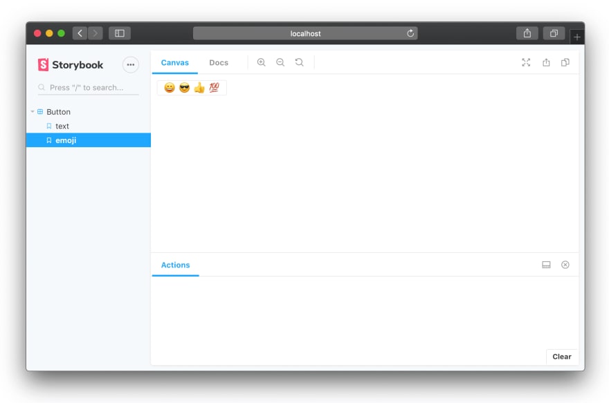
After running, Storybook looks like this ☝️
Here, Button is a component.
We will see how we can setup Storybook application for React components.
I will use CRA(create-react-app) tool to bootstrap the react app with webpack build and enable Storybook to it.
If you already have npm installed on your machine, then you can run
npx create-react-app sb-ui
After running successfully, we will see the simple react app created.
Now we will enable Storybook to this app. For this, I will run-
npx -p @storybook/cli sb init
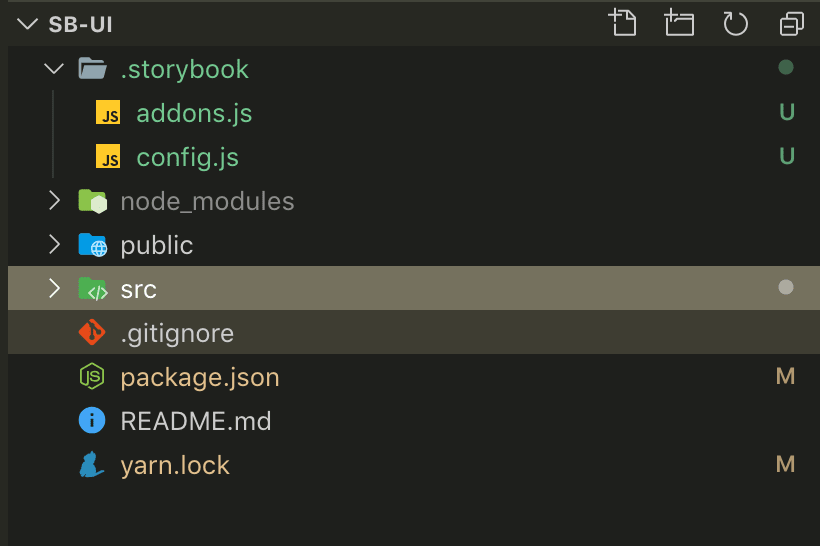
After executing, if we open our app with VSCode( or any editor ) we will see -

.storybook directory was created and it has 2 files.
Also if we check package.json file, we can see 2 commands were added in scripts section-
"storybook": "start-storybook -p 9009 -s public",
"build-storybook": "build-storybook -s public"
Now, we can run yarn storybook or npm run storybook and it will open the Storybook app in the default browser.
Awesome 🎉
Now our fresh Storybook app is up and running.
.storybook/addons.js file is used to keep all the addons we use for the Storybook(I will talk about addons in one of the later parts).
src/stories/1-Button.stories.js file has 2 sample test stories to show how we can add stories(it was added by Storybook tool)
export const text = () => <Button onClick={action('clicked')}>Hello Button</Button>;

export const emoji = () => (
  <Button onClick={action('clicked')}>
    <span role="img" aria-label="so cool">
      😀 😎 👍 💯
    </span>
  </Button>
);
Here ☝️,Button is the sample react component which is used to see inside Storybook UI.
In Part-2, I will show how to create a new component and add it to Storybook.
Till then, Cheers!
👋
UPDATE: Storybook : develop React components in isolation | Part-2
As I am trying to contribute contents on the Web, you can buy me a coffee for my hours spent on all of these ❤️😊🌸

My Blog: https://shahjada.me


Top comments (0)