It's one of those frustrating days. Coupled with stressors from work and building this Sign-up Form; I've been feeling drained. I had to reassure myself that the stress and frustration I am facing now is just a tiny spec in the massive opportunity to come in the future; I just have to suck it up and continue to learn. Keep progressing.
Update on the Sign Up Form
Issues I am facing
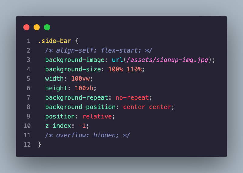
- Scaling the
background-imageto take up 1/3 of the browser.
- The above screenshot shows the CSS styling I have applied.
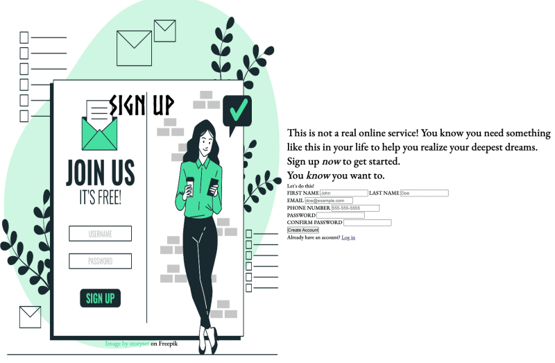
- The image is being distorted as the browser shrinks and I am struggling to keep it static.
- I have tried using non-responsive unit
pxbut that cuts off part of the image. -
max-widthdoes not do the trick either.
Random Question
Anyone heard of Dev10? If so, what are yall thoughts about them?


Top comments (0)